

PROJECT: ONE THING I LOVE ABOUT BRISTOL
CLIENT: EDWARDS ESTATE AGENTS
Edwards are an independent estate agents, based in Bristol. I previously worked on a brand refresh for them, which included the introduction of a new set of sale boards, incorporating my illustrations and those of fellow Drawn in Bristol members.
OBJECTIVE
To produce an ongoing set of illustrations for use across Edwards' marketing materials
The theme 'One Thing I Love about Bristol...' was developed as the basis of the campaign, with a new illustration being released quarterly, to be used on postcard flyers and print advertisements. Each illustration depicts a reason given by a member of the Edwards' team as to why Bristol is such a great place to live.
In addition to being a slightly different take on the kind of marketing materials usually produced for an estate agent, it is hoped these will help potential clients see Edwards as approachable and more ‘human’ than the usual perception of estate agents (!)
Pictured above, clockwise from top... (click on the images to enlarge)
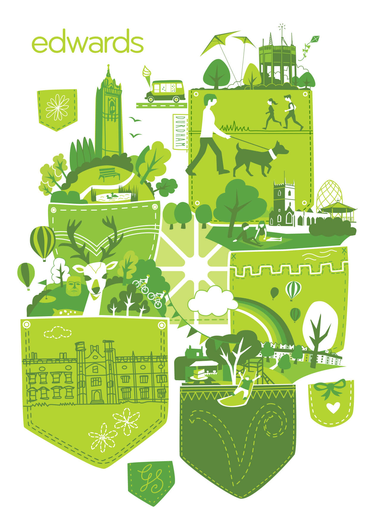
1. Based around the idea of 'green pockets' - in response to a comment from Managing Director, Mathew Edwards about all the areas of green space throughout the city. ( For an insight of the process involved from initial sketch to the finished artwork of this image, see my blog here )
2. Senior Negotiator, Nick's answer to the question "The shops on Park Street and the guys that skateboard down the middle of the road at the same speed as the cars, sometimes even faster!"
3. My illustrated response to Southville sales team member Helen’s story “…Seeing the SS Great Britain reminds me of my childhood. 35 years ago when she was first brought into dry dock, I donated my 50 pence pocket money to help with the restoration!”
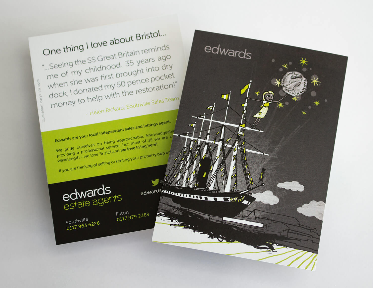
A6 postcard front / typographic back
Set of Edwards sale boards. The 4 designs on the left were introduced initially, with the bird design added at a later date to mark the opening of a new branch. Illustrations by (clockwise from top left): Carys-ink, Holly Maguire, Carys-ink, Slumber and Michelle Barker
CLIENT TESTIMONIAL
"Carys… just great! She has been instrumental in the design and implementation of our complete brand. A valued member of our creative team; and we would not be what we are today without her ongoing care and attention. Honest, inventive, creative and professional… "
Matt Edwards, Edwards Estate Agents. May 7, 2013
RELATED PROJECTS
Illustrations for Affinity Sutton (a large national housing association) and their new online customer portal
Promotional book illustrations for Zeke Creative - with a theme of 'elegance'. These illustrations also use a limited colour palette.
SEE MORE
Brand Identity | Illustration | Art Projects
SEE MORE: illustration | branding | art projects