PROJECT: BRAND IDENTITY
CLIENT: RUBY HUE
Ruby Hue make amazing chocolate. They are a small business based in Bristol, with a new chocolate shop and cafe in Finzel’s Reach near the harbourside.
They are ‘bean to bar’ chocolate makers - A luxury brand, making delicious, ethical chocolate from single origin, specially sourced raw cacao beans in a range of exciting and innovative flavours.
The products and ingredients are fully traceable with great care taken to ensure everything is farmed and produced in a highly sustainable way.

OBJECTIVE
To create a new identity for Ruby Hue, to be used across their range of chocolate products
The founders of Ruby Hue, Ruth and Tom, wanted the brand to reflect the quality and luxury of their products, but not in a clinical way. They were keen for a retro-inspired vibe to portray their brand as approachable, fun, loud, and ‘bouncy’. Their products are quality, quirky and very tasty!

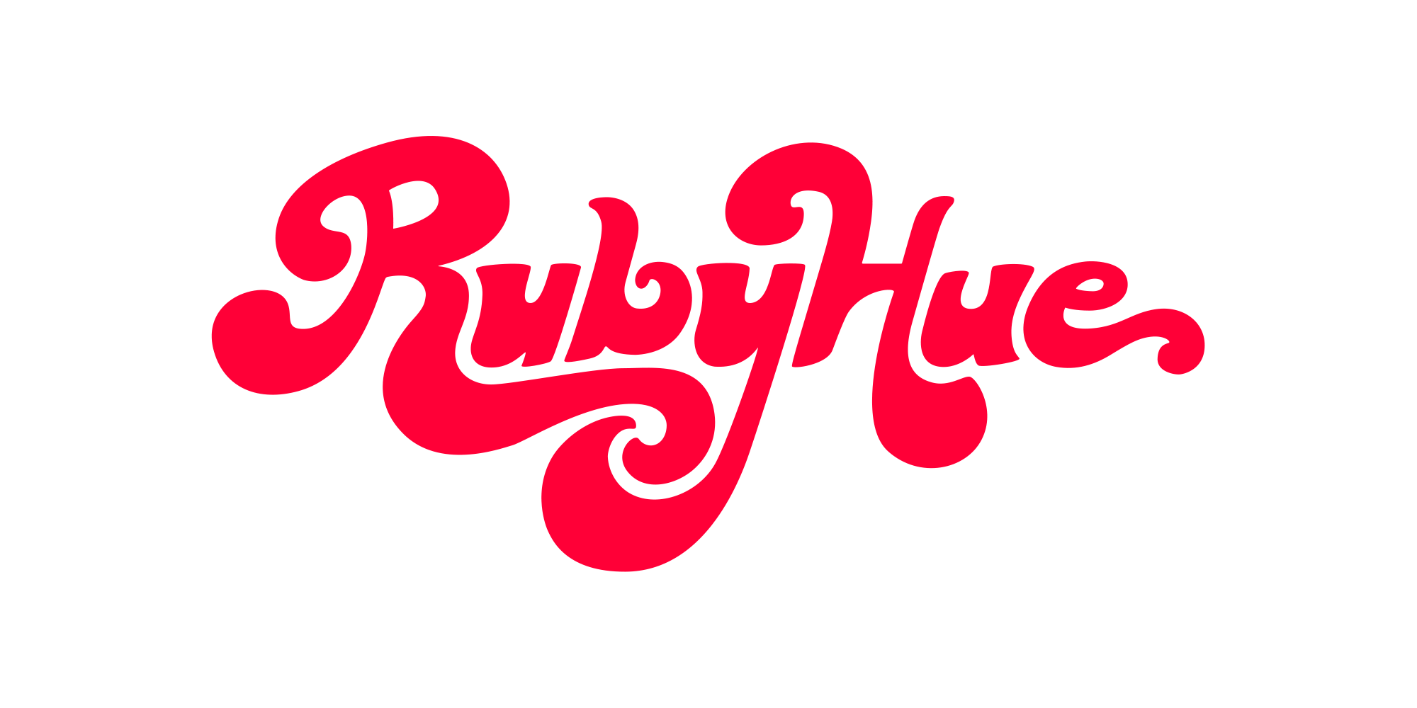
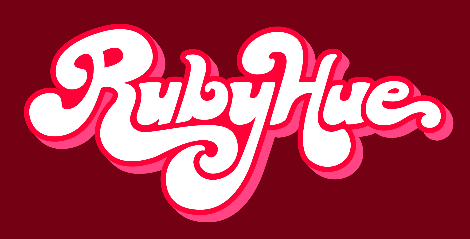
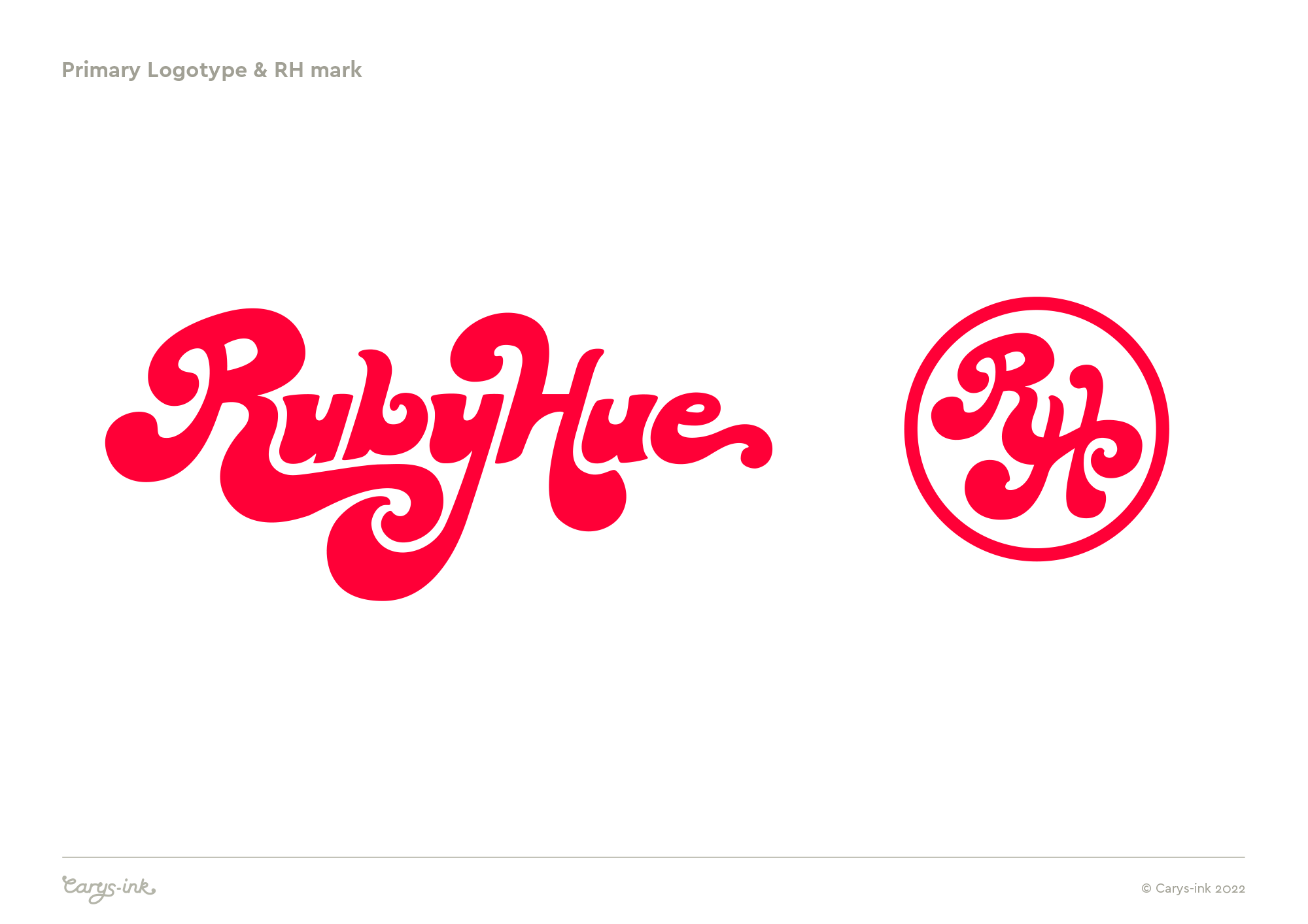
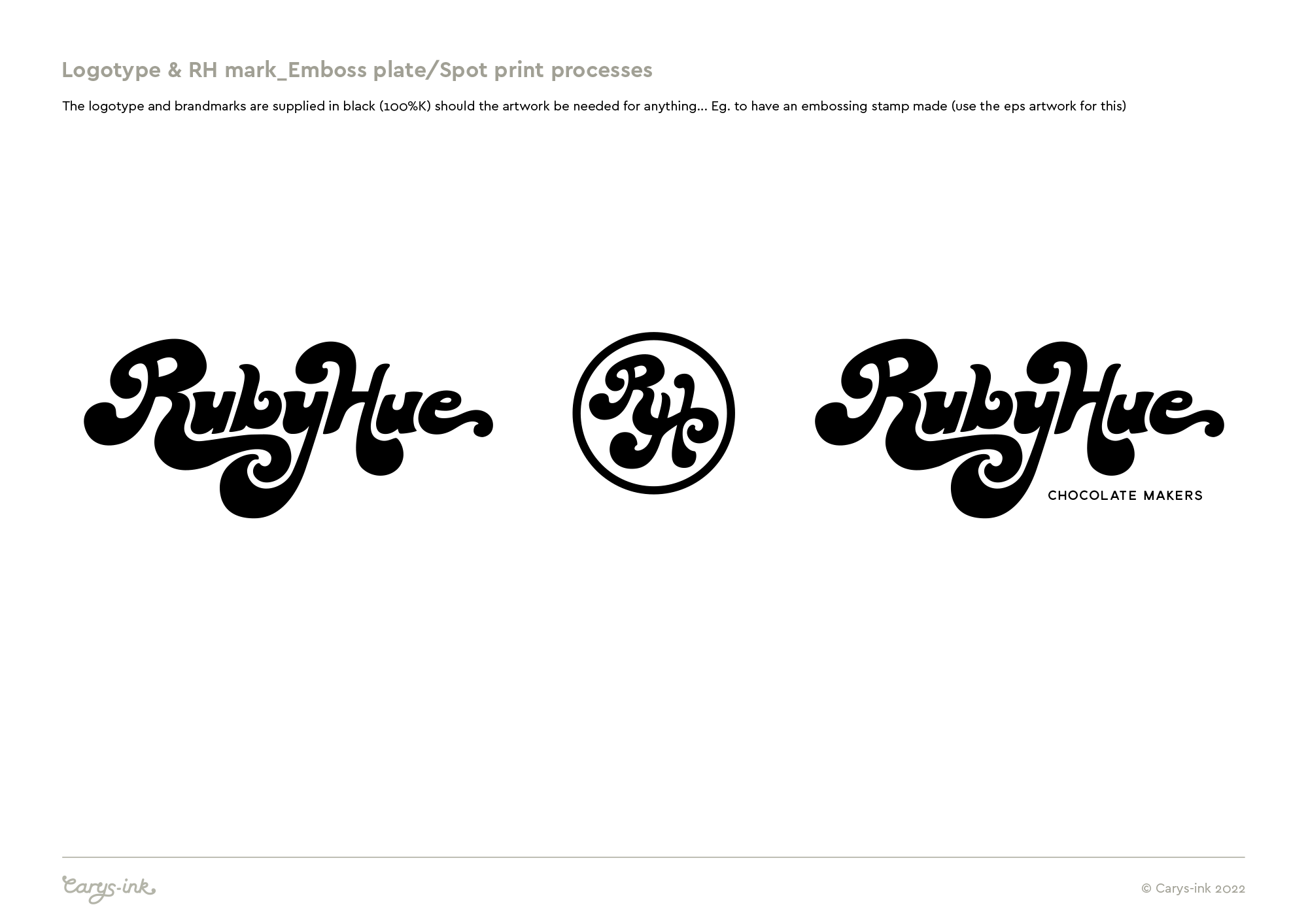
Primary logotype

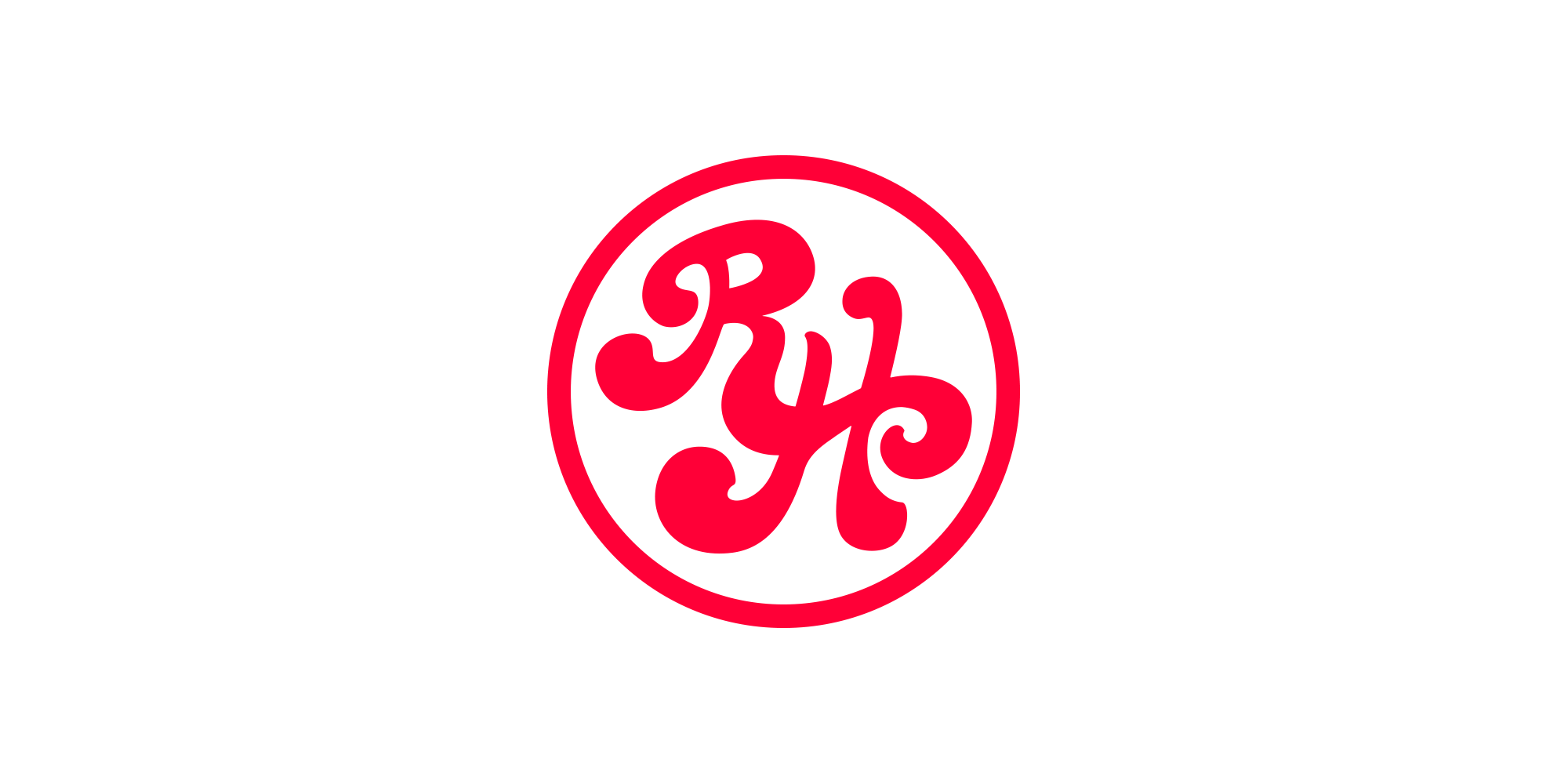
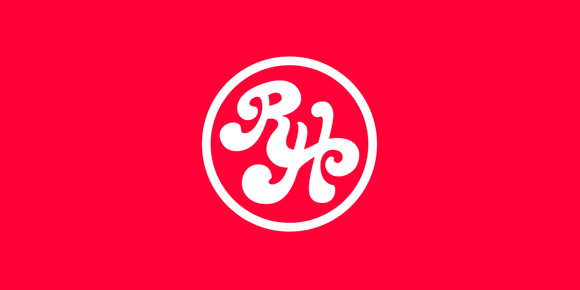
RH Brandmark
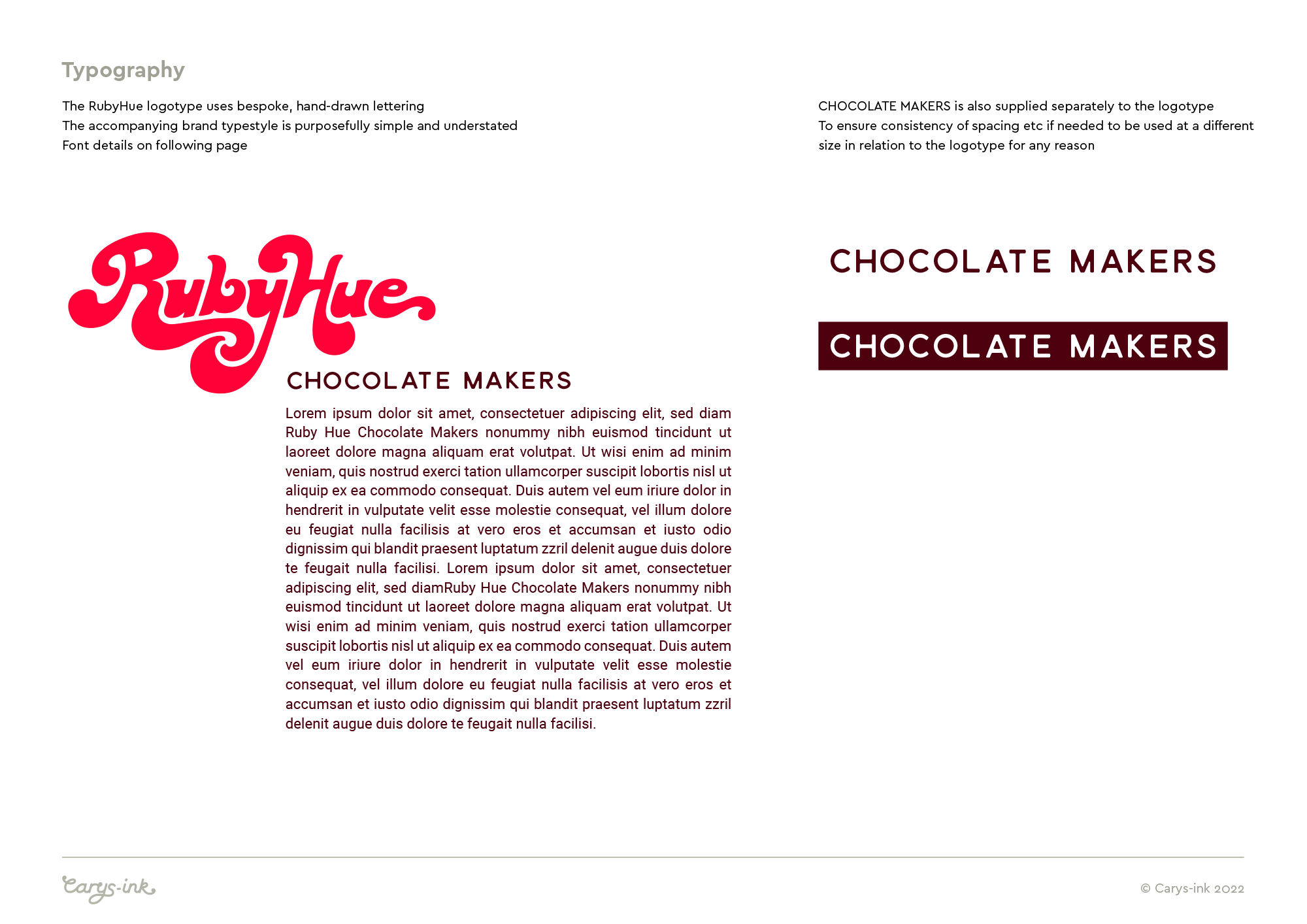
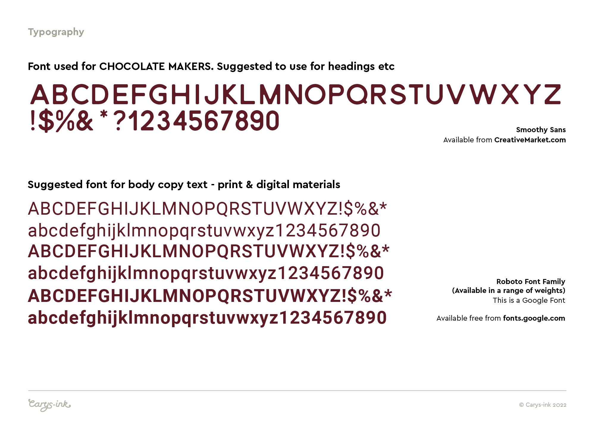
The logotype and brandmark are both based on bespoke, hand-drawn lettering. Retro-style typography and the flow of swirly, molten chocolate inspired the letterforms.

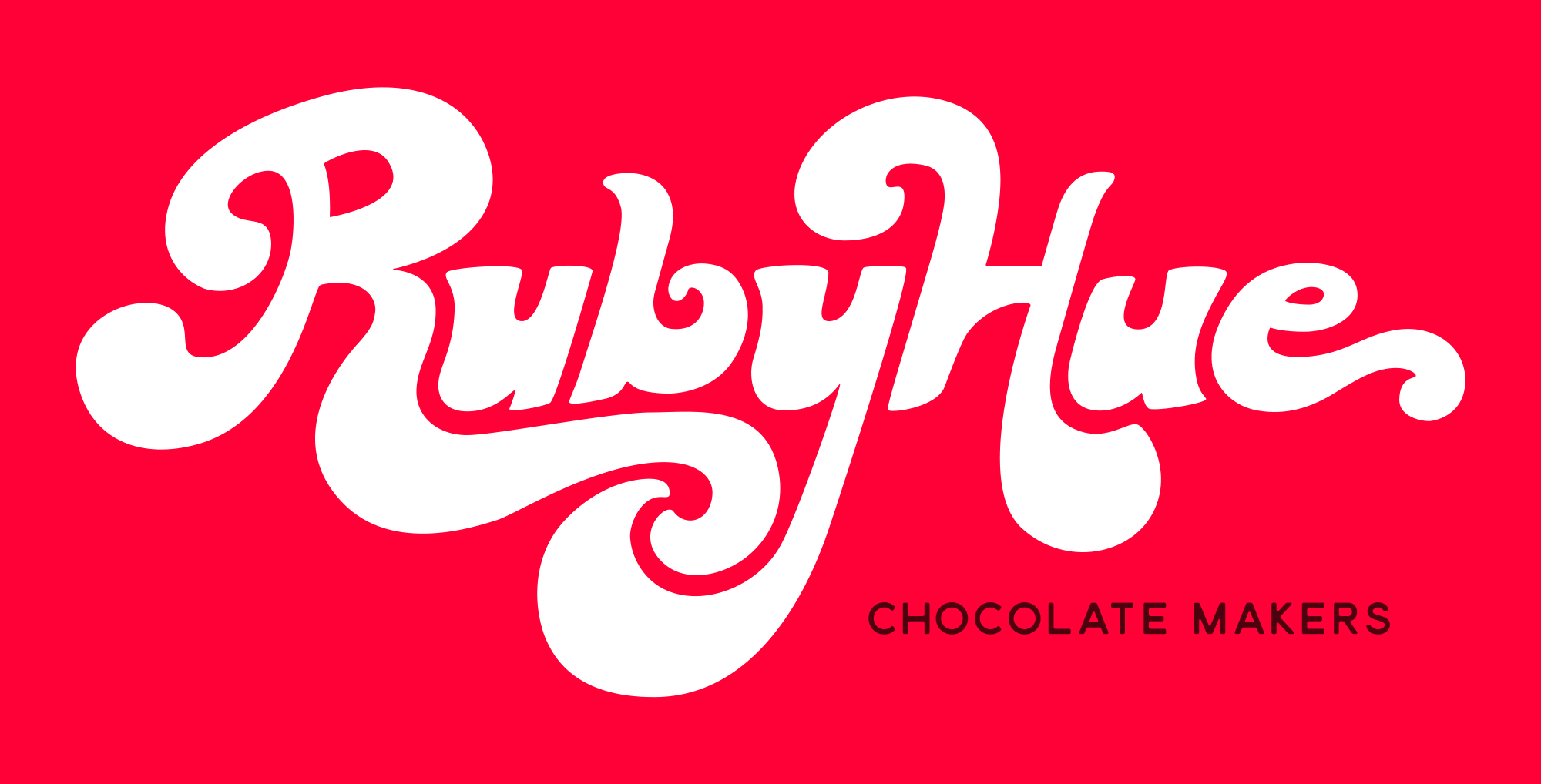
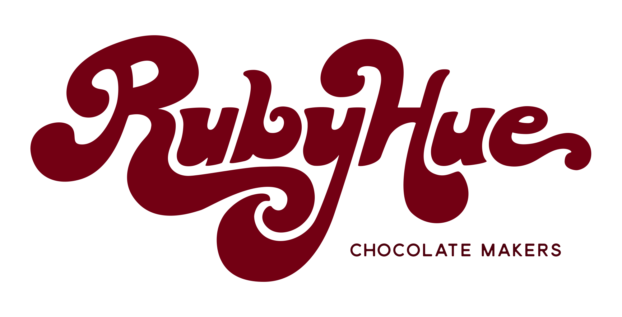
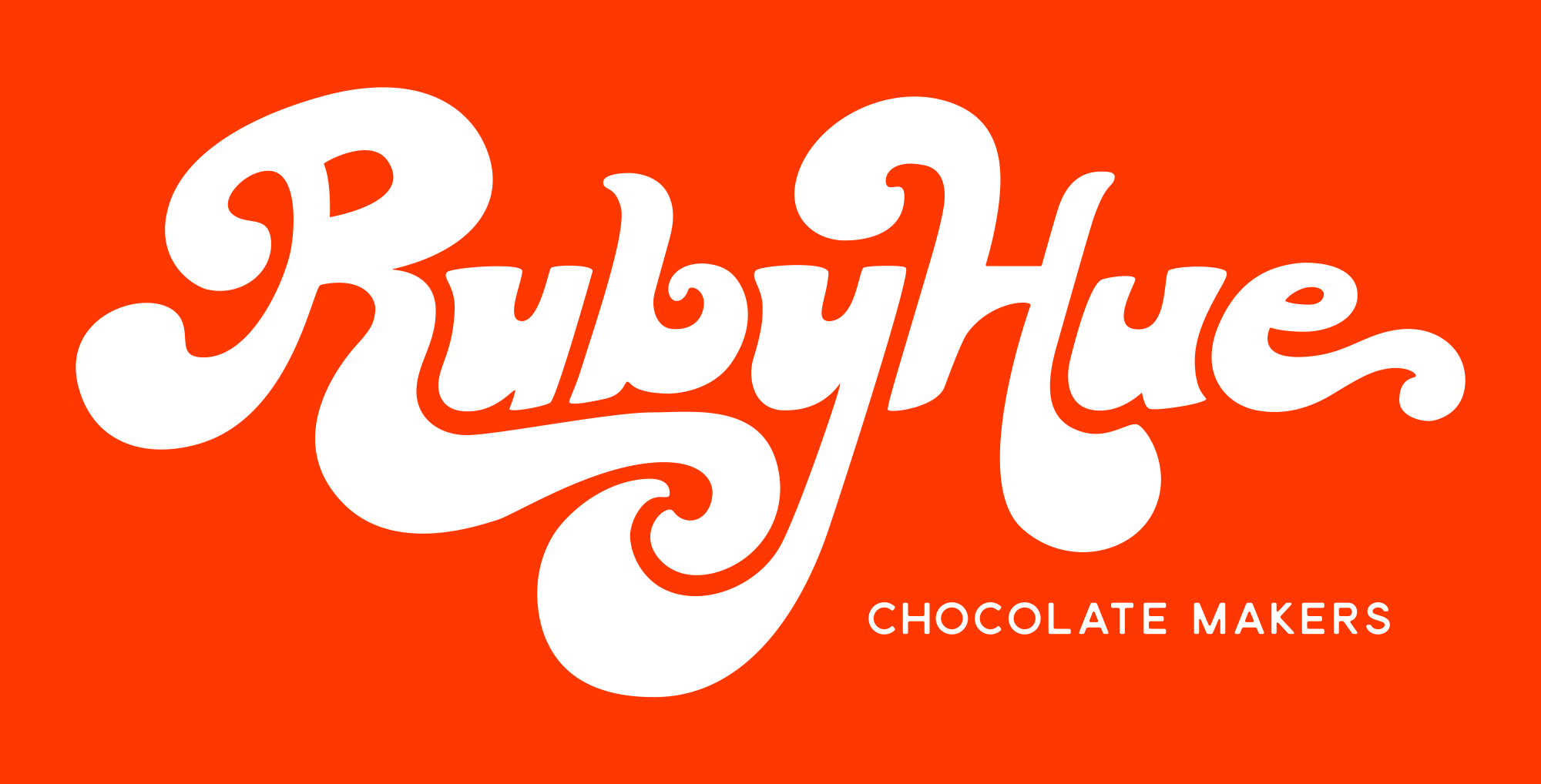
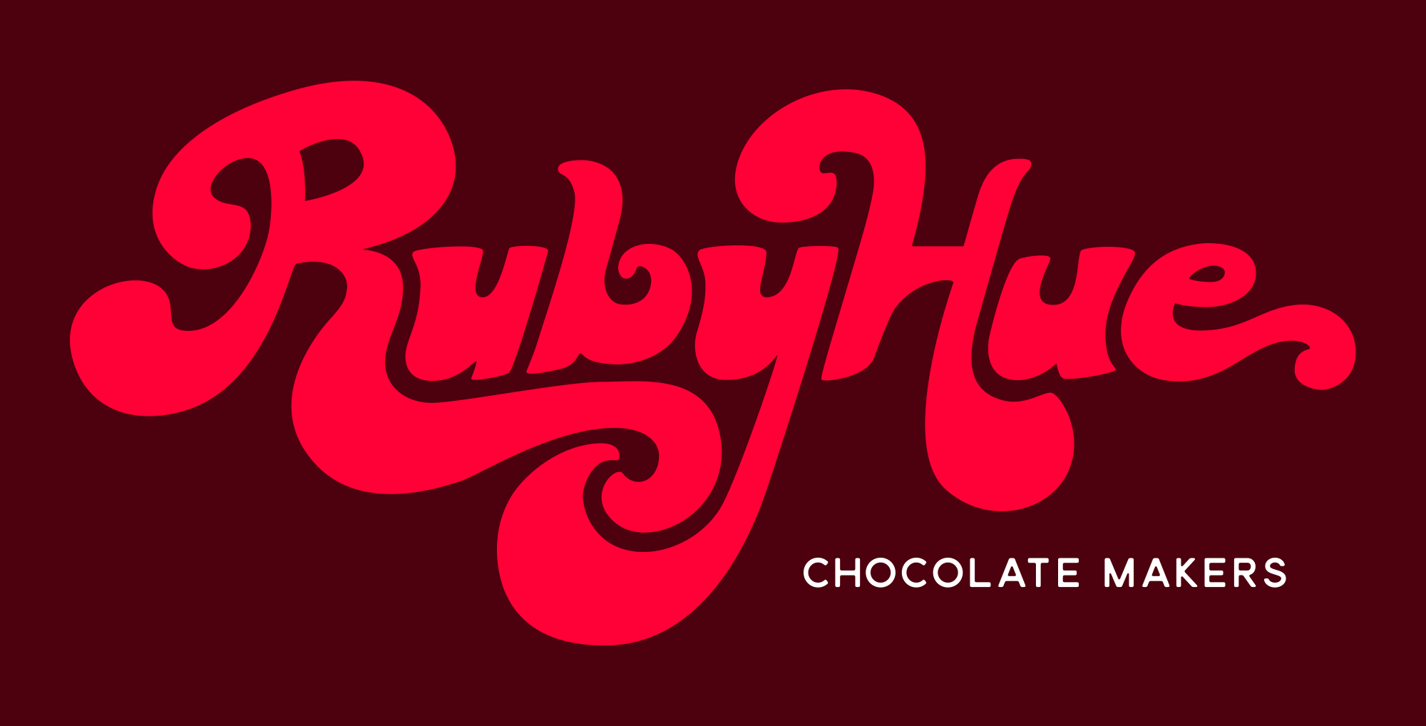
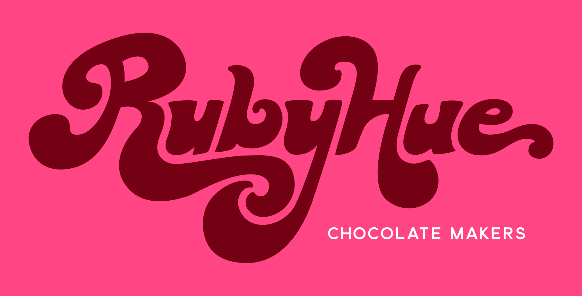
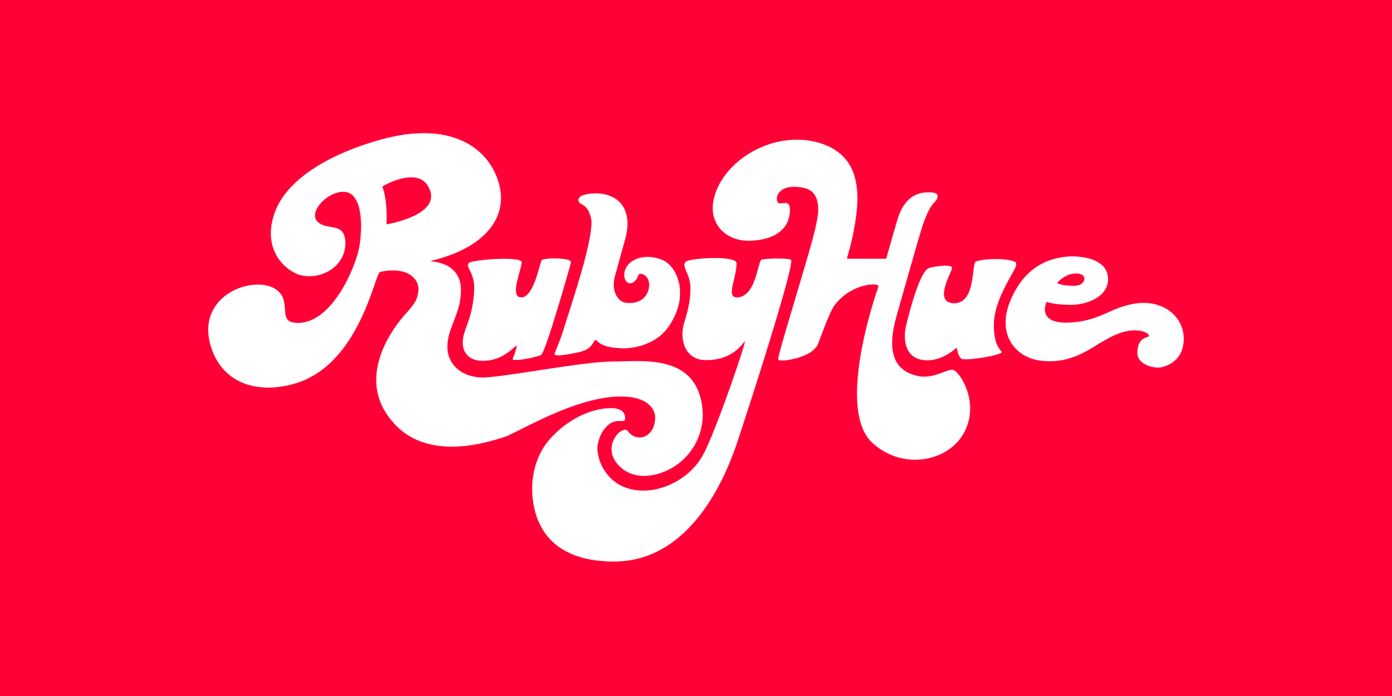
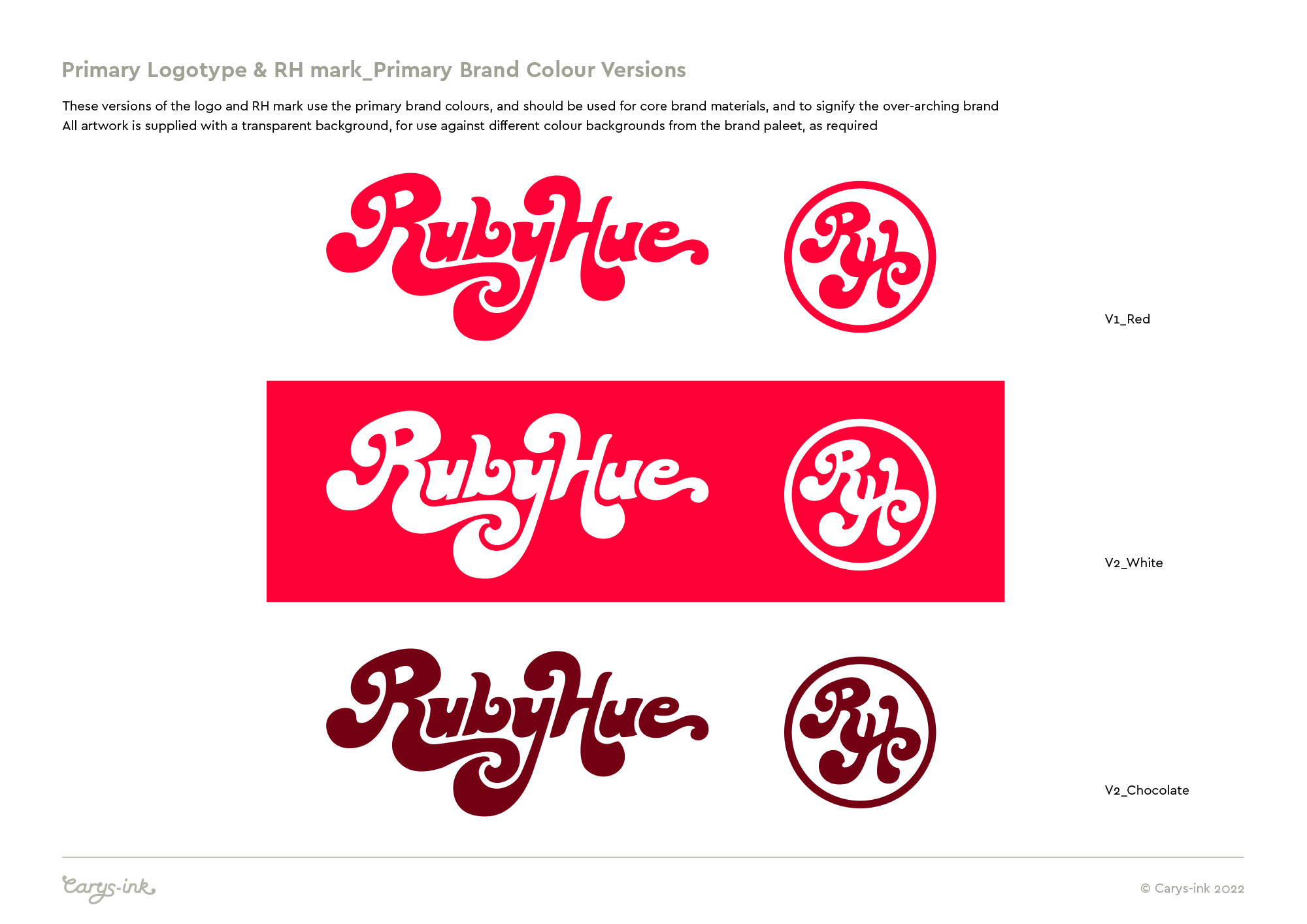
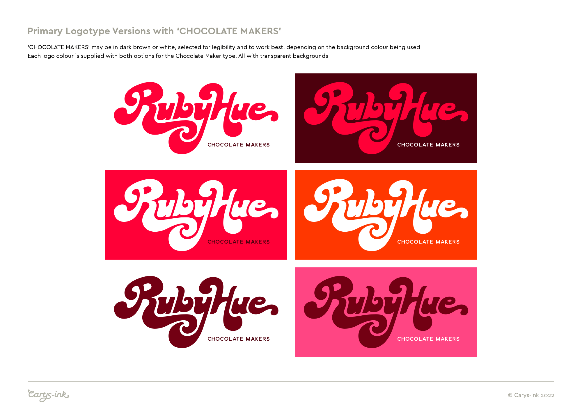
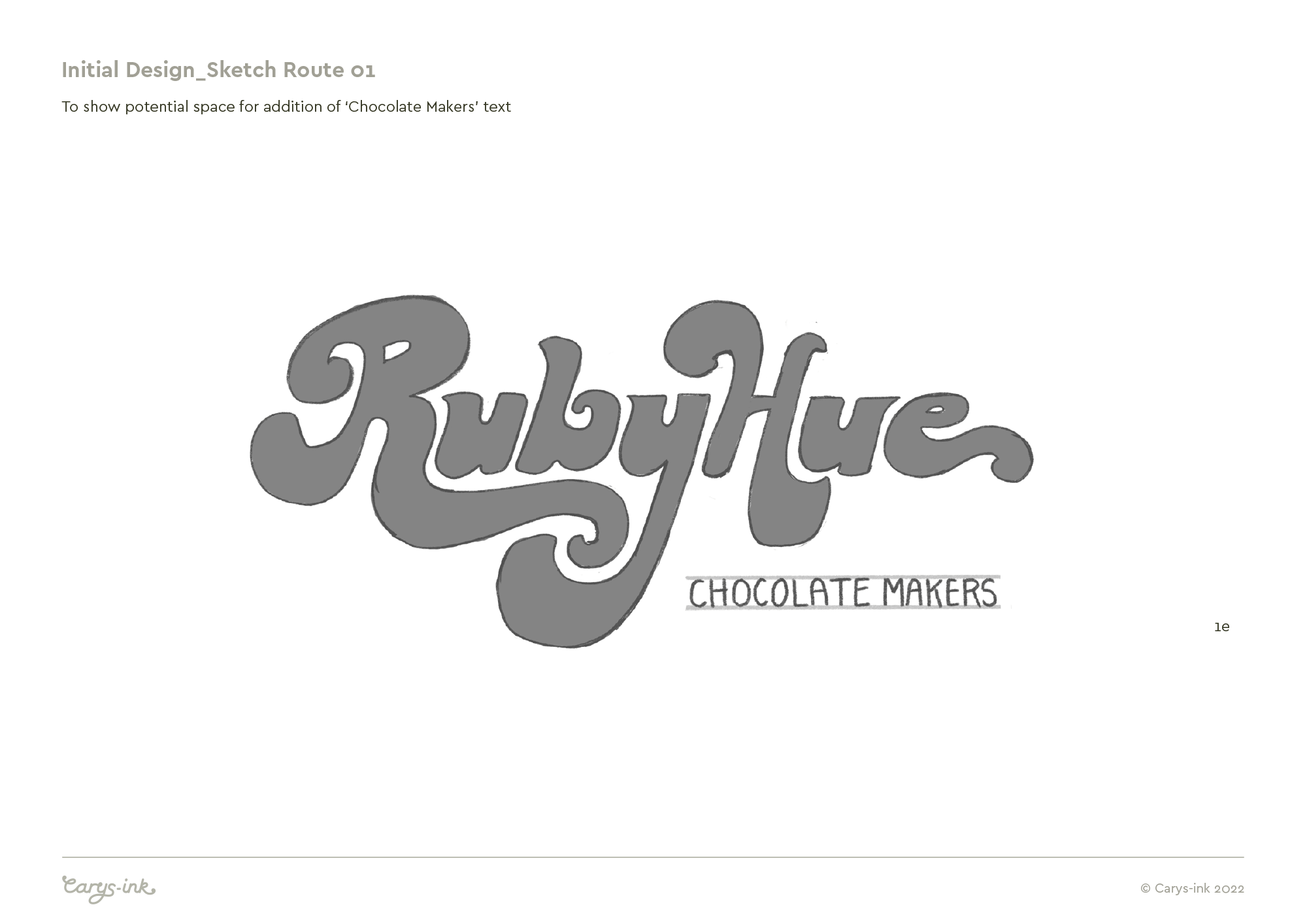
Pictured above: The logotype with ‘CHOCOLATE MAKERS’ as a subtle underline. Also showing examples of how the brand can appear in different colourways.
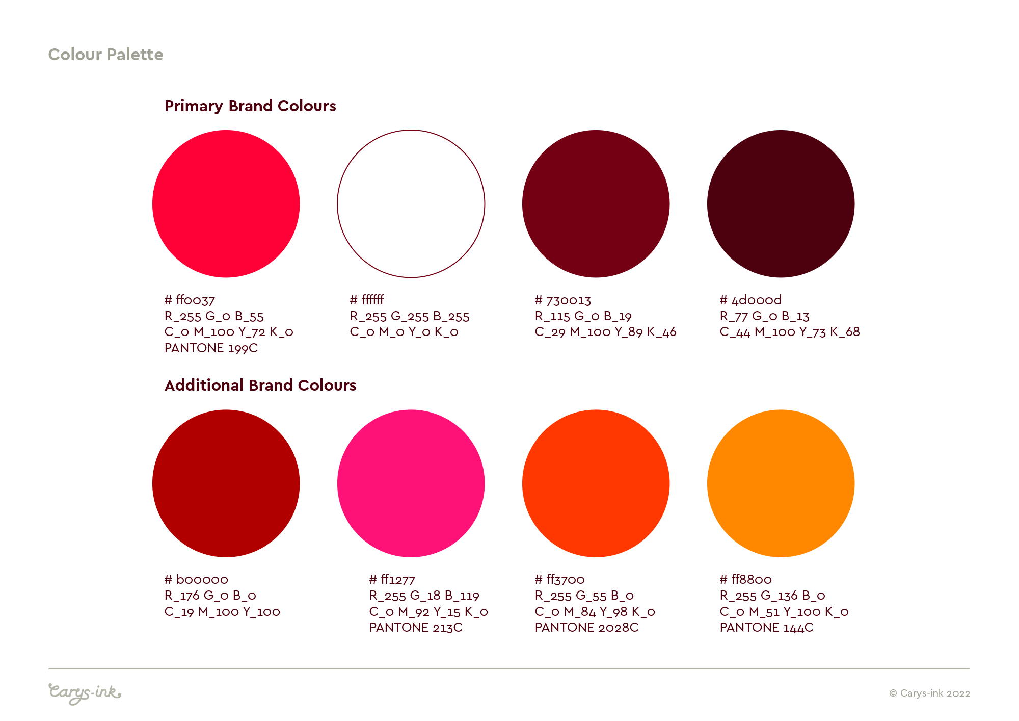
There is a bold, playfulness integral to the brand through the use of colour.
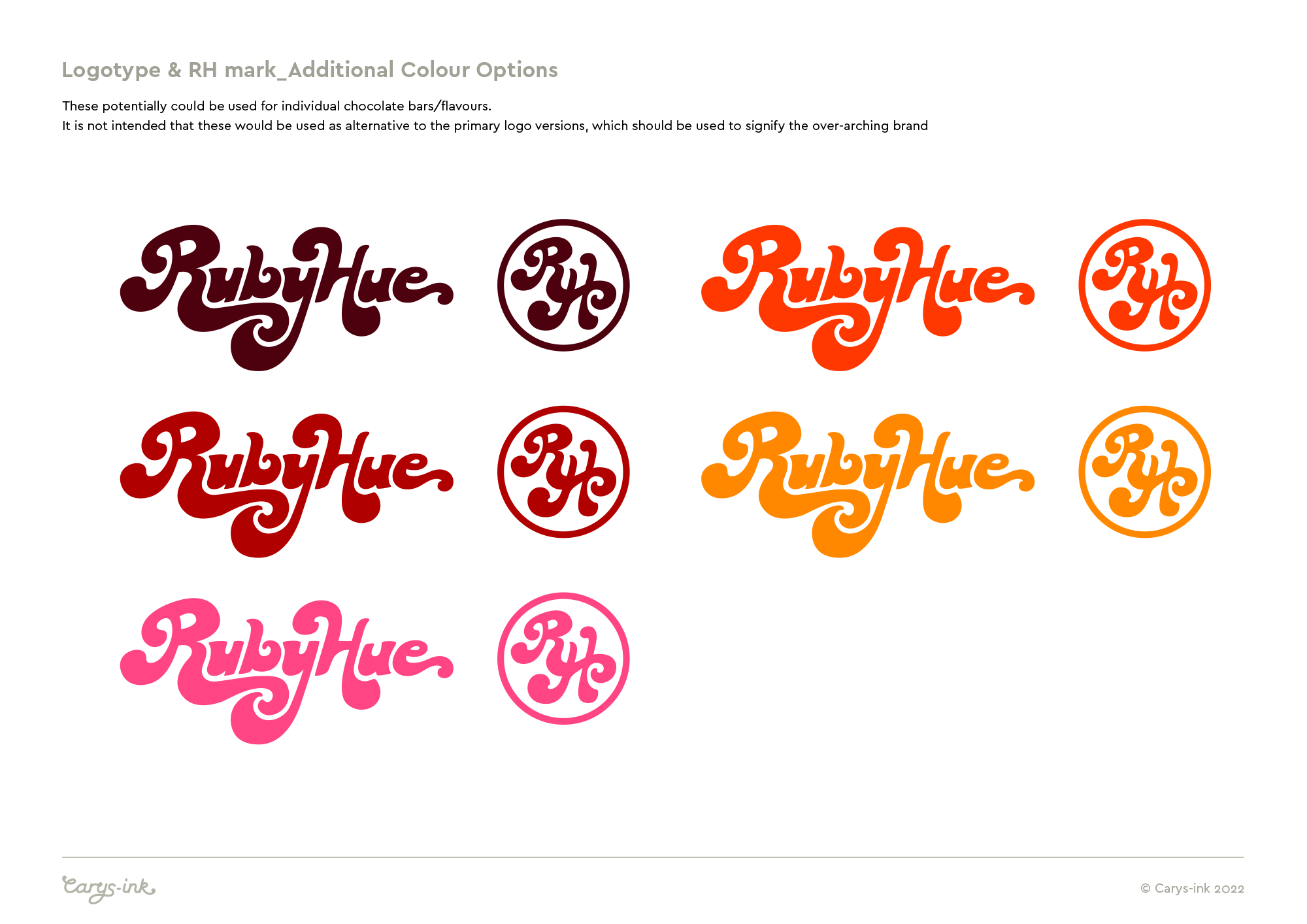
Ruby red, white and chocolate are the primary brand colours, but additional colours have been included as part of the brand, to provide scope for flexibility in the product packaging - to denote different origins of chocolate, %age Cocoa and flavours. Colours can be applied with a ‘ mix’n’match’ approach, as appropriate.

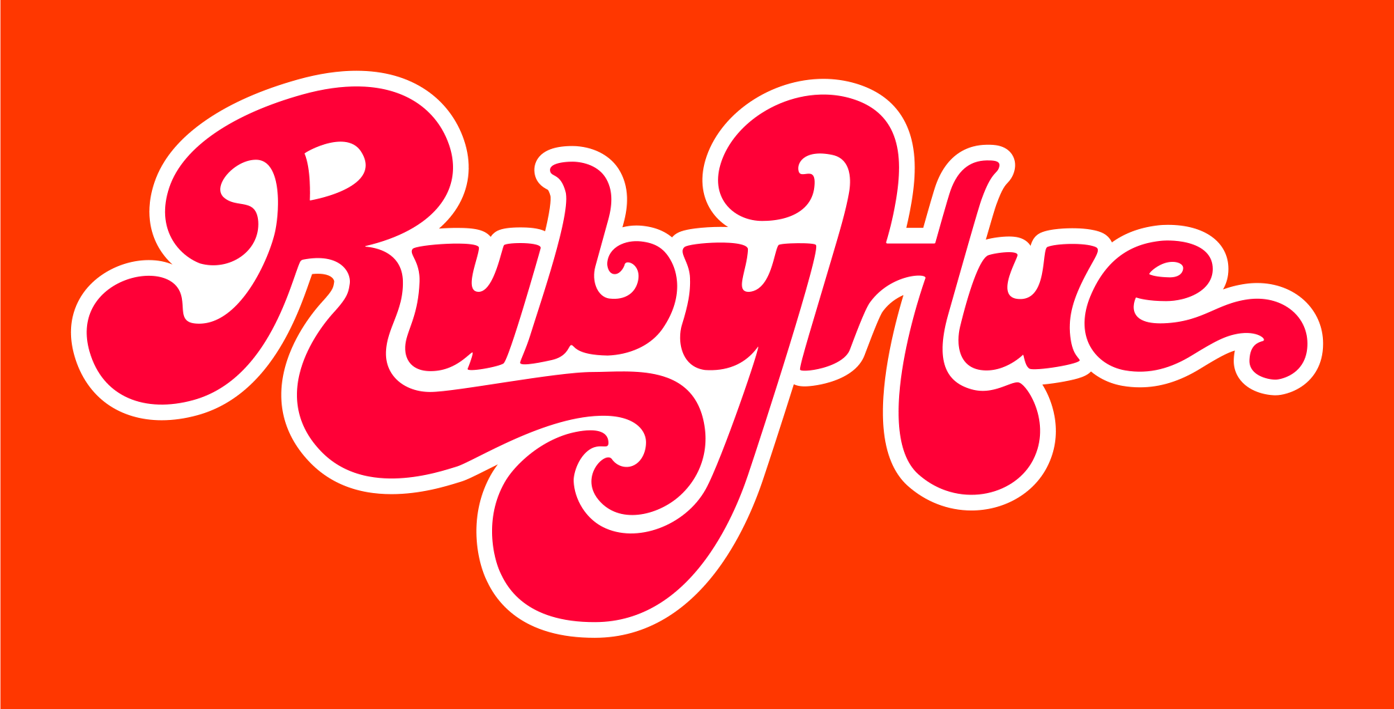
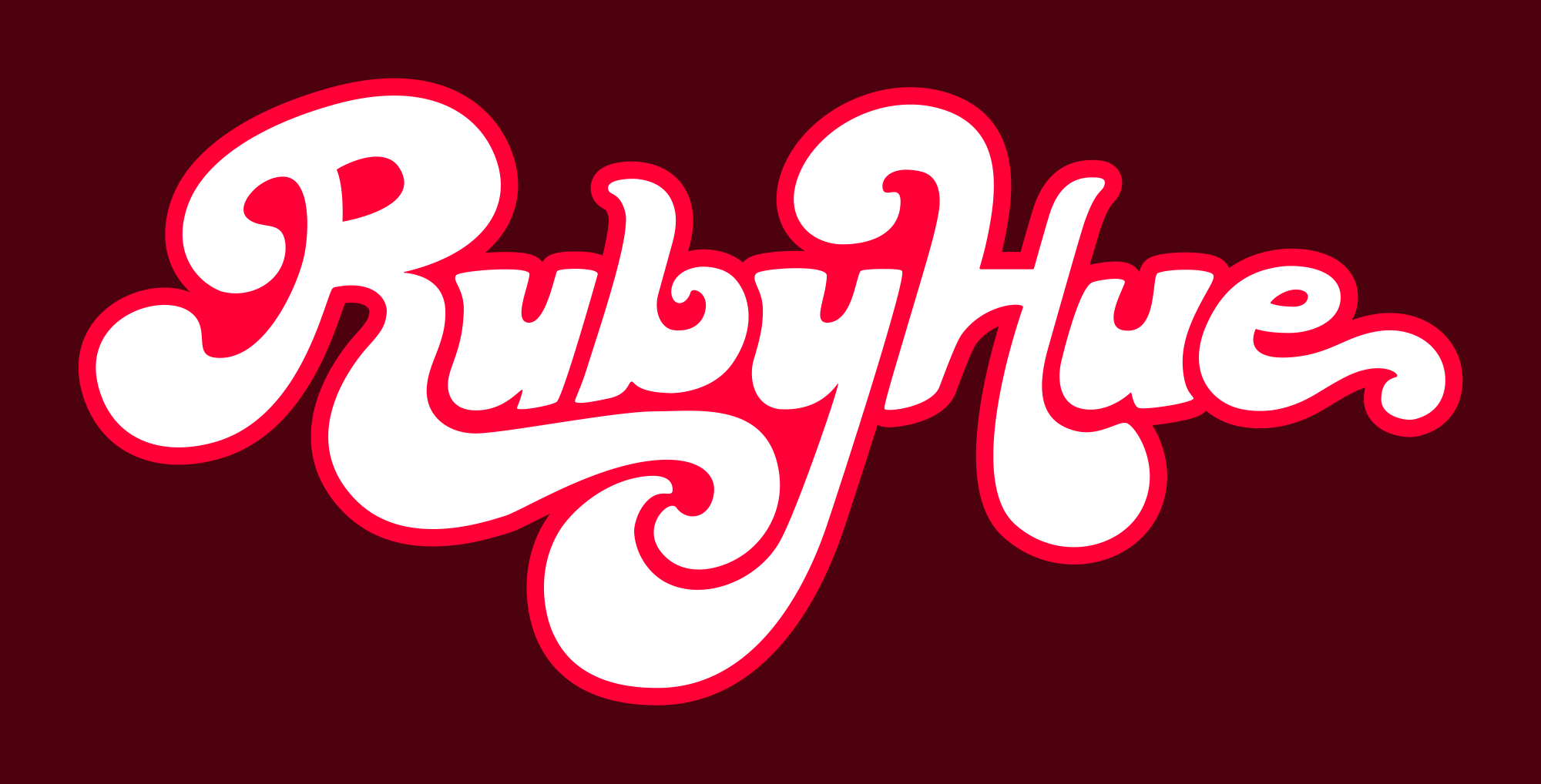
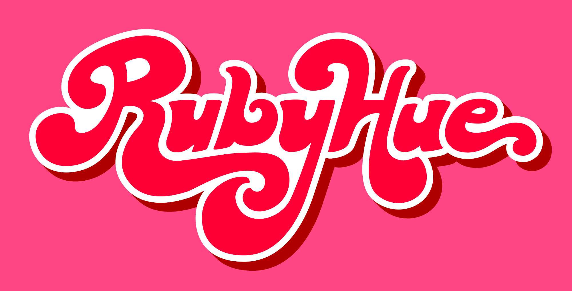
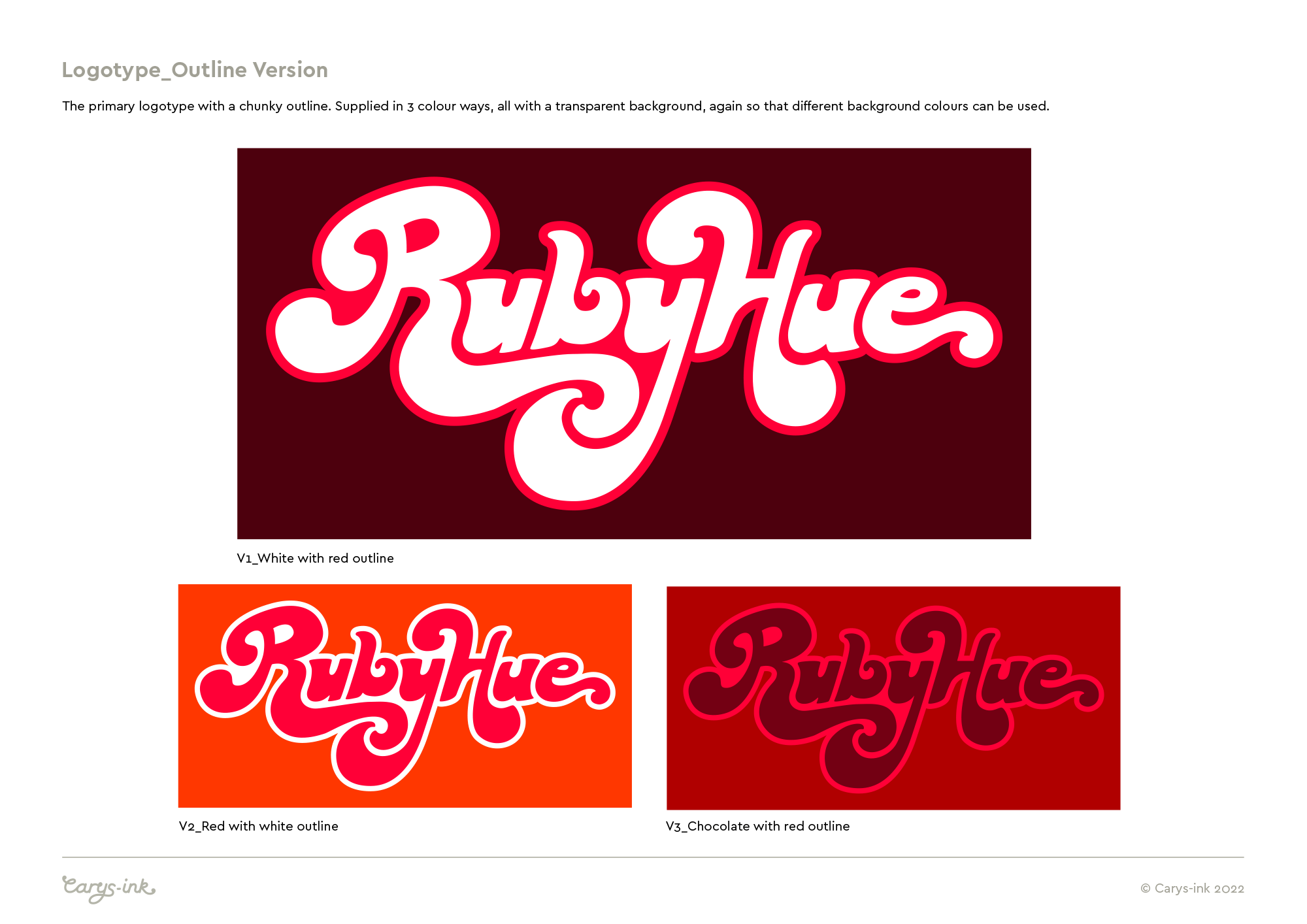
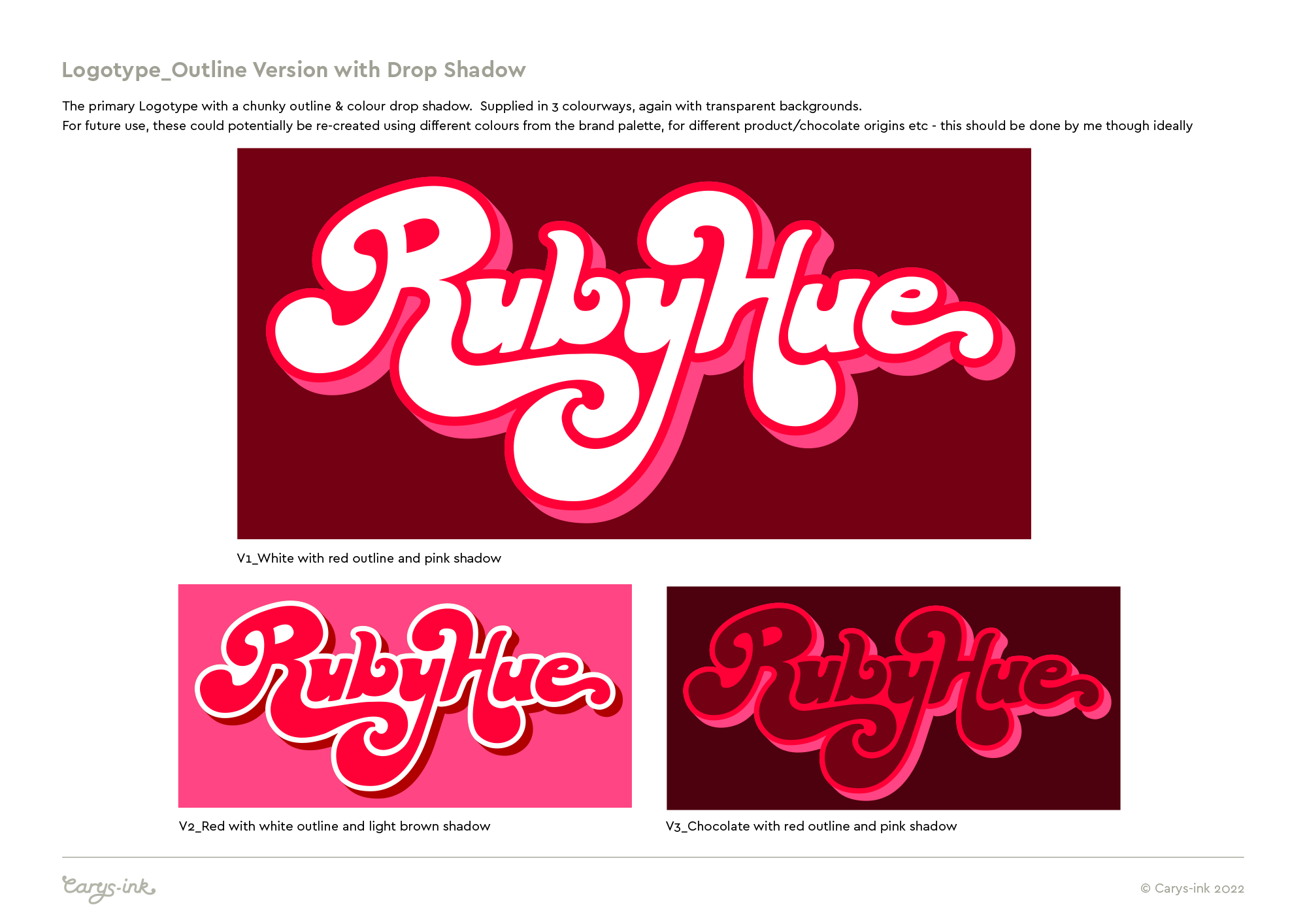
To play further on the fun/retro-inspired theme, versions of the logotype were created with a chunky outline and also a drop shadow. These can be used as required…
Below: Some pages from the Brand Delivery Guide I created - supplied to the client with the final artwork to provide an overview of the new brand and the various elements/options
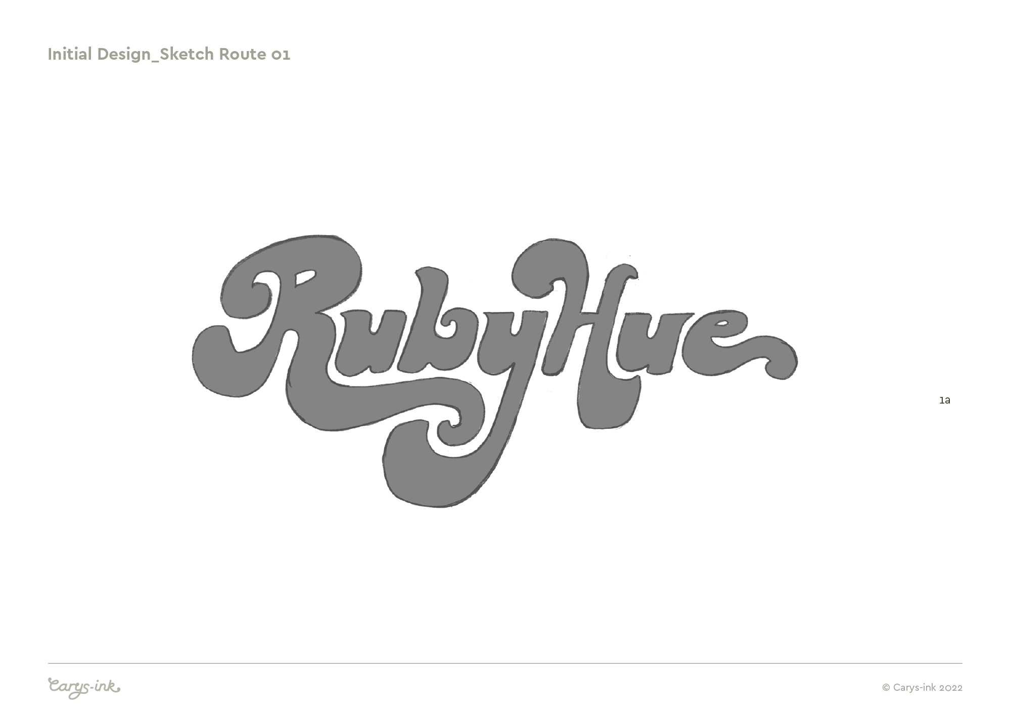
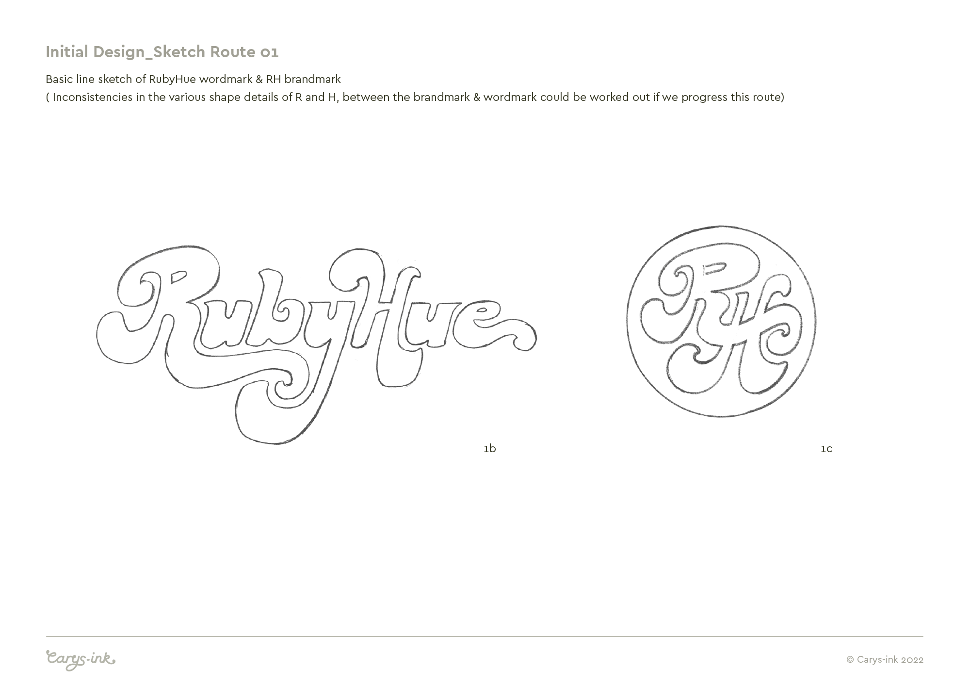
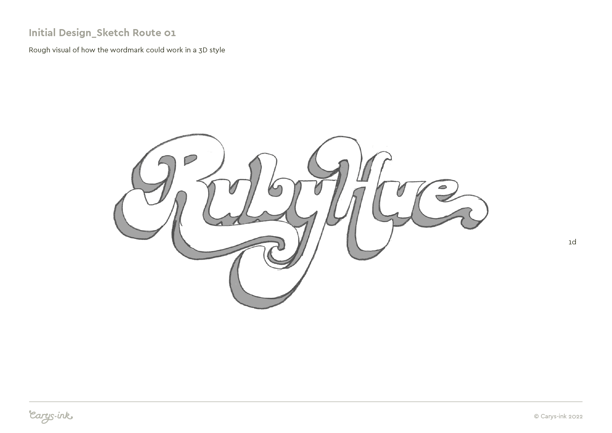
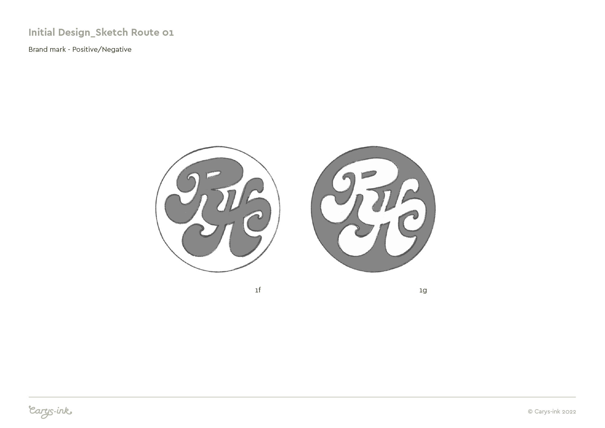
PROCESS
As is usual, the project began with an initial sketch stage - in this instance, I created 2 initial routes for the client to see. Shown below is the preferred route, and what I went on to progress to the finished designs.
A few ‘first looks’ at the new brand in application… ( photos via Ruby Hue’s Instagram )

The logo sign painted on the windows at Ruby Hue. (Hand painted by Tozer Signs )

Ruby Hue chocolate bar
… I will update with more photos in due course!
RELATED PROJECTS

SEA & STREAM | Brand Identity for outdoor swimming shop, with a focus on sustainability

BRAND NEW STORY | Brand identity for a brand storytelling business