PROJECT: VISUAL IDENTITY
CLIENT: SUSTAINABLE THORNBURY
Sustainable Thornbury is a local, environmentally-focused community group of volunteers, working with residents and Thornbury Town Council to create a more sustainable, healthy and pleasant way of life in and around South Gloucestershire town. A primary objective is for Thornbury to be Carbon Neutral by 2030.
The group is involved with numerous initiatives, and there are a number of sub-groups under the Sustainable Thornbury umbrella - Climate Action Thornbury & Surroundings (CATS), Grow your Own Food, the Meadow and Bee Bank Group, and the Orchard Group.
OBJECTIVE
I was initially approached to design a leaflet for Sustainable Thornbury.
Having looked at what they currently had in design terms, and knowing they were keen to engage with new people moving into the town, I suggested it would be worthwhile to create a simple visual identity in the first instance. The identity would help to establish a more recognisable presence in the town and potentially be more appealing, to encourage new people to get involved with the group’s activities. The new identity could then be used as the basis for any future design work - For example, leaflets, updating their website and any other digital/printed materials moving forward.
I was asked to create something simple, and not ‘corporate’, which felt organic and hopeful - as a group they want to give people agency to take action locally, to tackle both the little and big environmental challenges.
I designed the new identity to be flexible, and so that it may be used by the various sub-groups which are run by separate people under the over-arching banner of Sustainable Thornbury.
There are separate icons/’stickers’ for each of the sub-groups, which may be used independently (or in combination with others) by the individual groups or together to describe the various activities/initiatives Sustainable Thornbury is involved with.
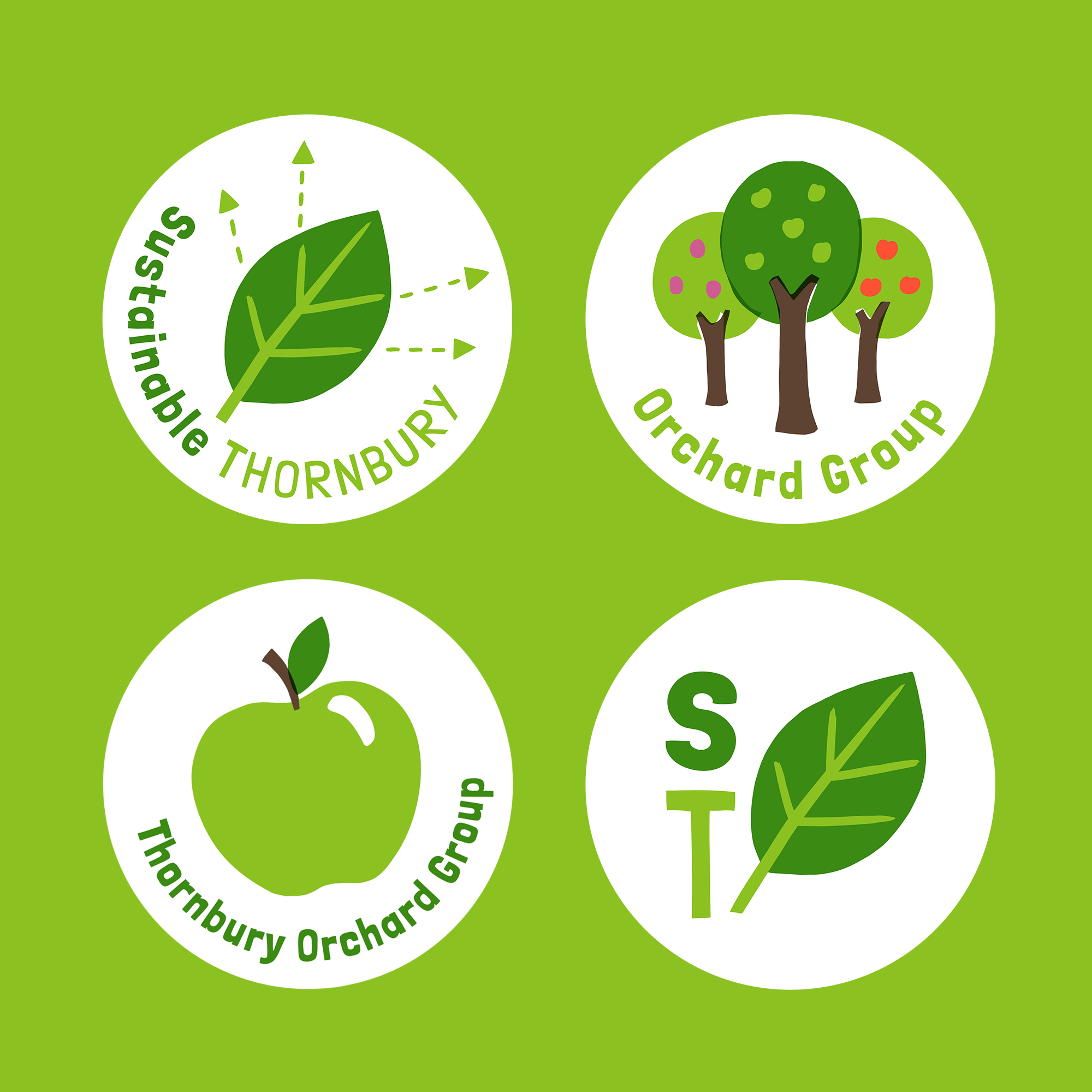
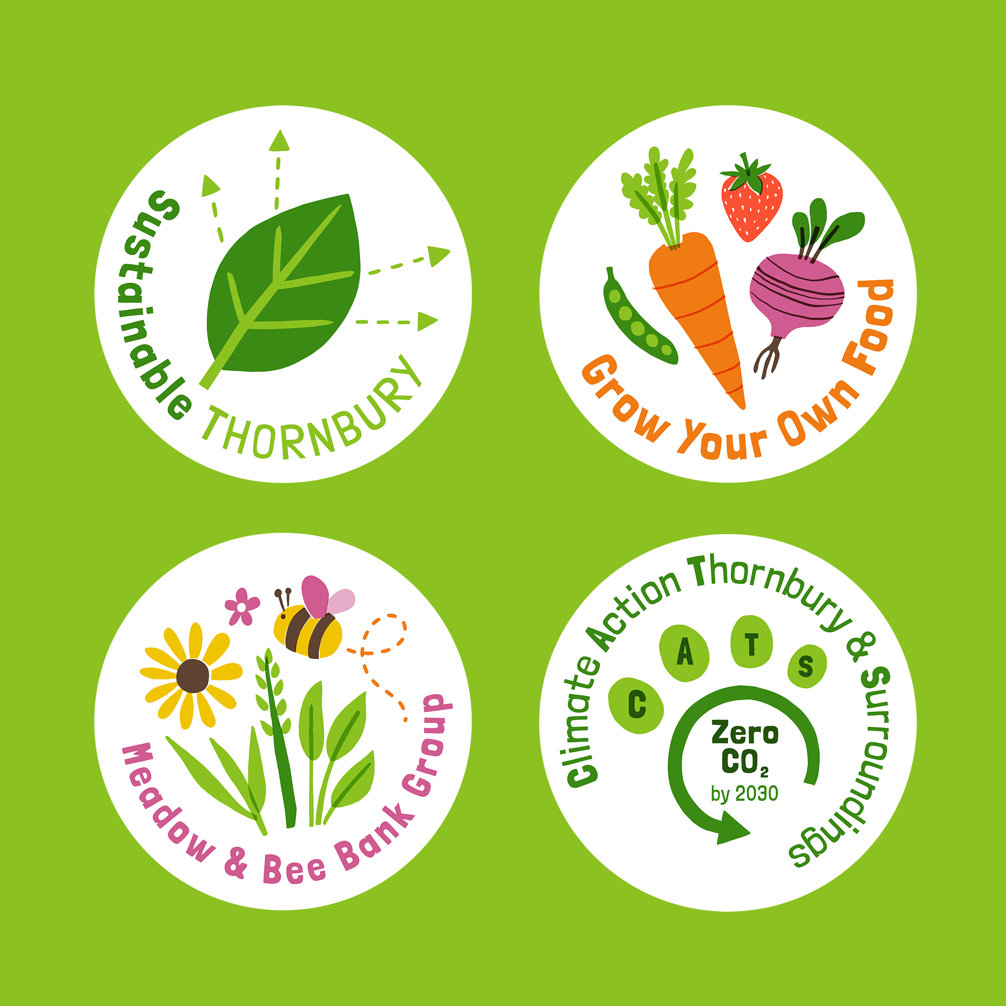

The leaf in the logo is used as a device to pull together the associated groups
The colour palette and typestyle was set, and supplied as reference for the design of any future materials. In selecting the fonts I specifically chose free Google fonts, so they would be freely available for anyone creating designs for the group to use.


RELATED PROJECTS

ORCHARD PROJECT DRINKS | Branding for a community-powered cider and apple juice enterprise

SOUTH KEN GREEN TRAIL | Illustrated map for a London trail, celebrating sustainability with pop-up nature hubs to help inspire a greener future