PROJECT: SEA & STREAM BRAND IDENTITY
CLIENT: SEA & STREAM
Sea & Stream is an outdoor swimming shop, born from a love of swimming and the natural environment. They offer carefully selected, sustainable gifts for people who love swimming outdoors.
OBJECTIVE
Originally launched in 2019, Lou Jones (founder of Sea & Stream) approached me to create a new brand for her outdoor swimming business. The new identity would primarily be used on the Sea & Stream website, social media, packaging and marketing materials.
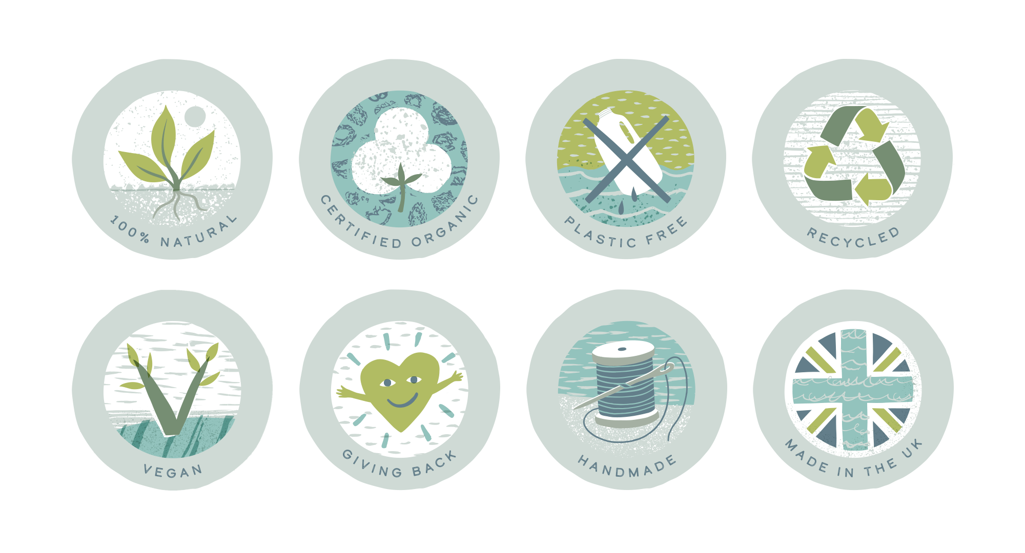
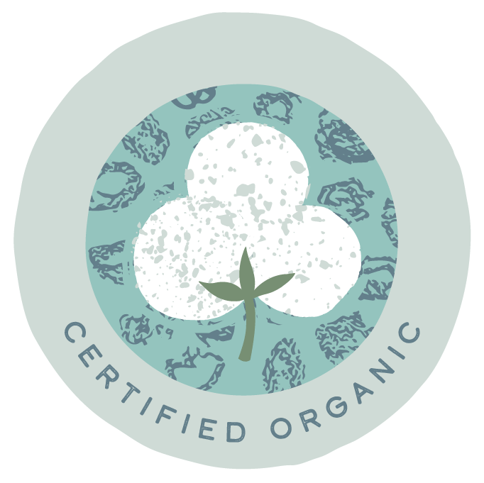
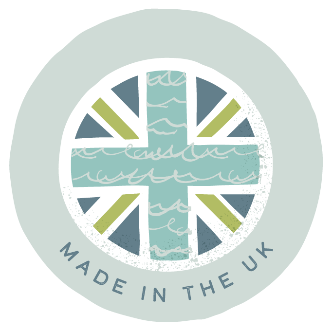
At the forefront of the business is a strong focus on their values - around being sustainable and planet-friendly, so it was important the brand should reflect this. As well as the main brand elements, also included in the brief were a set of values to create icons for.
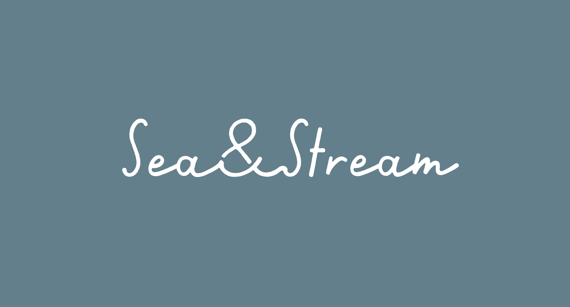
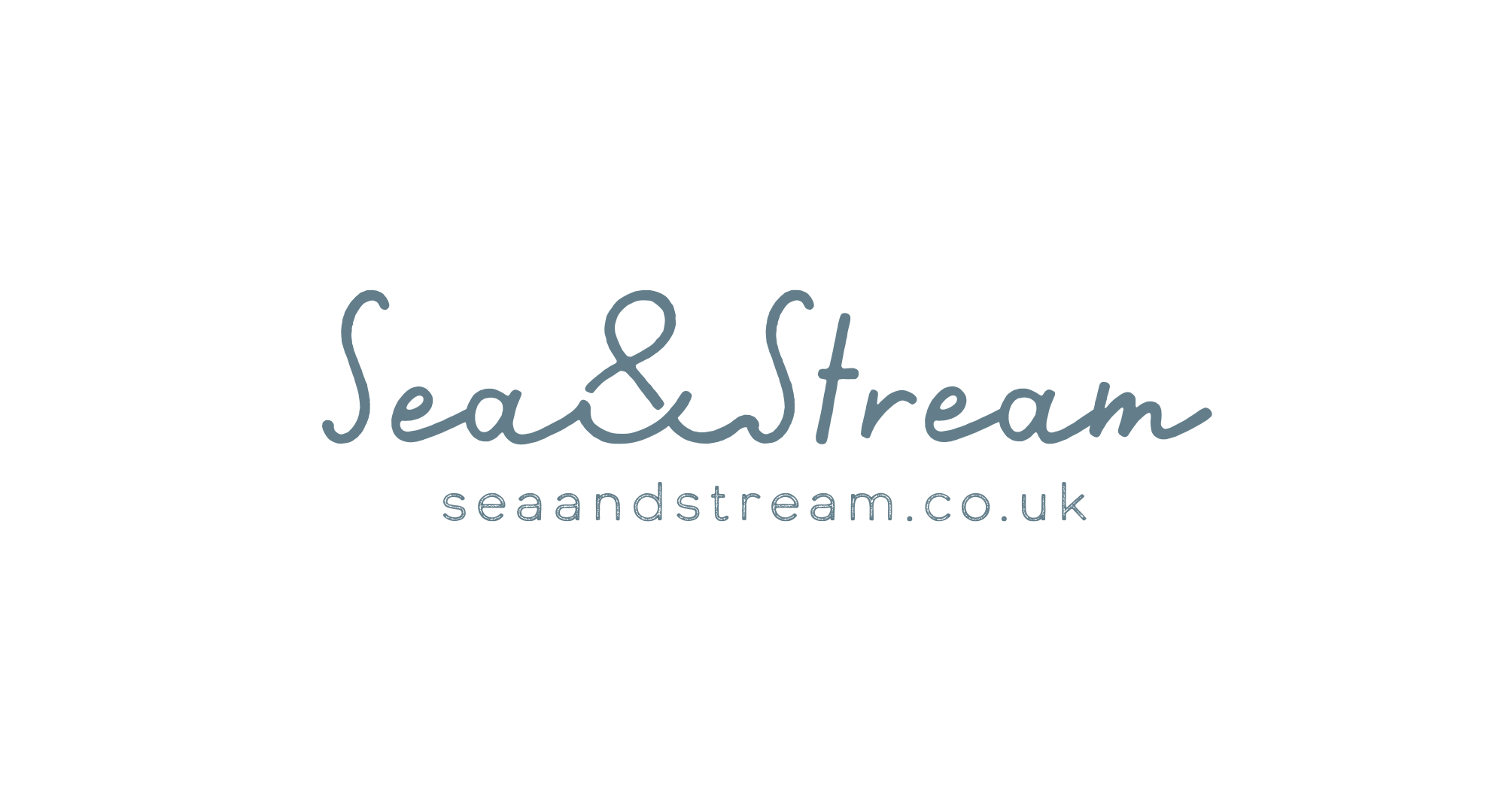
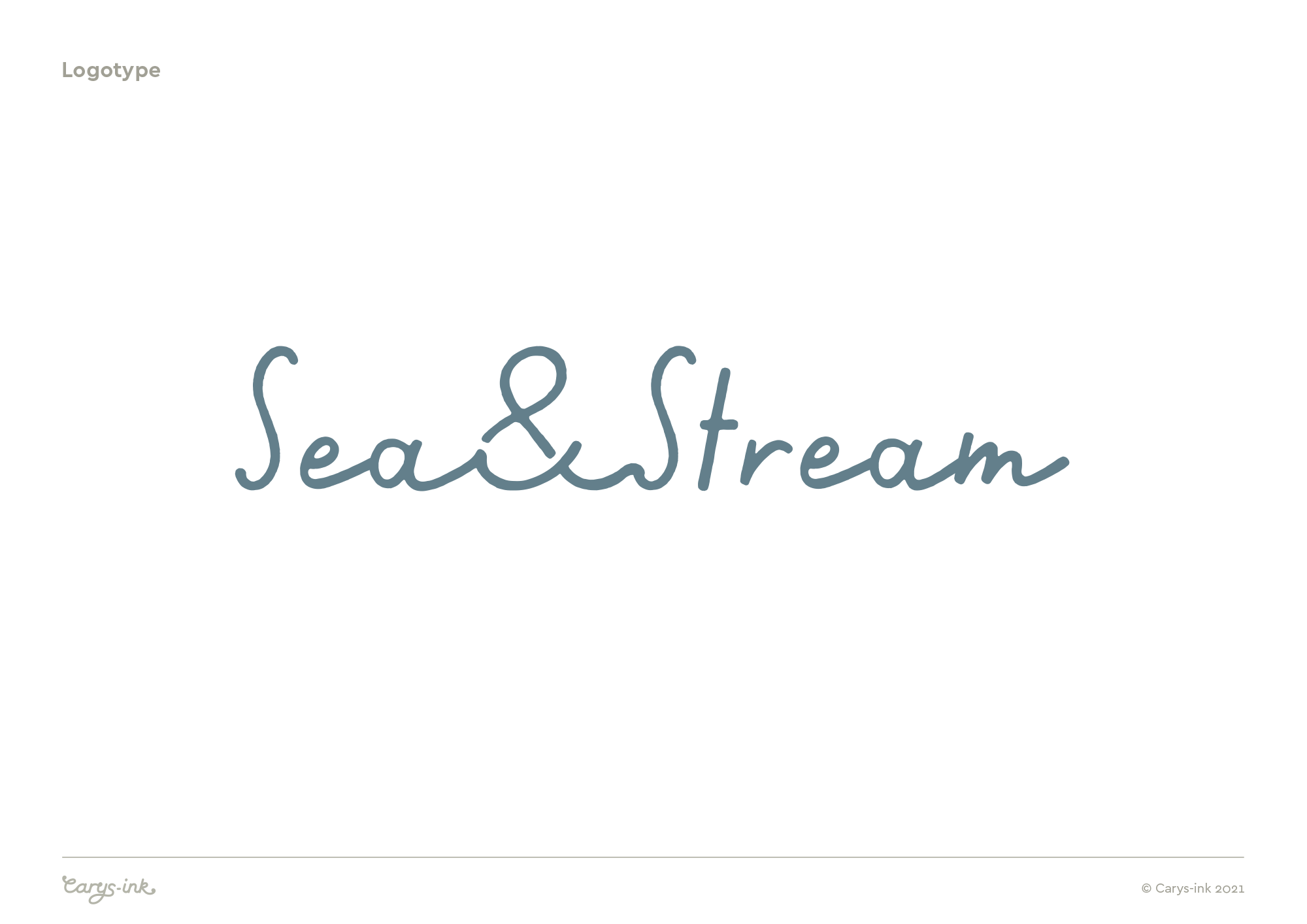
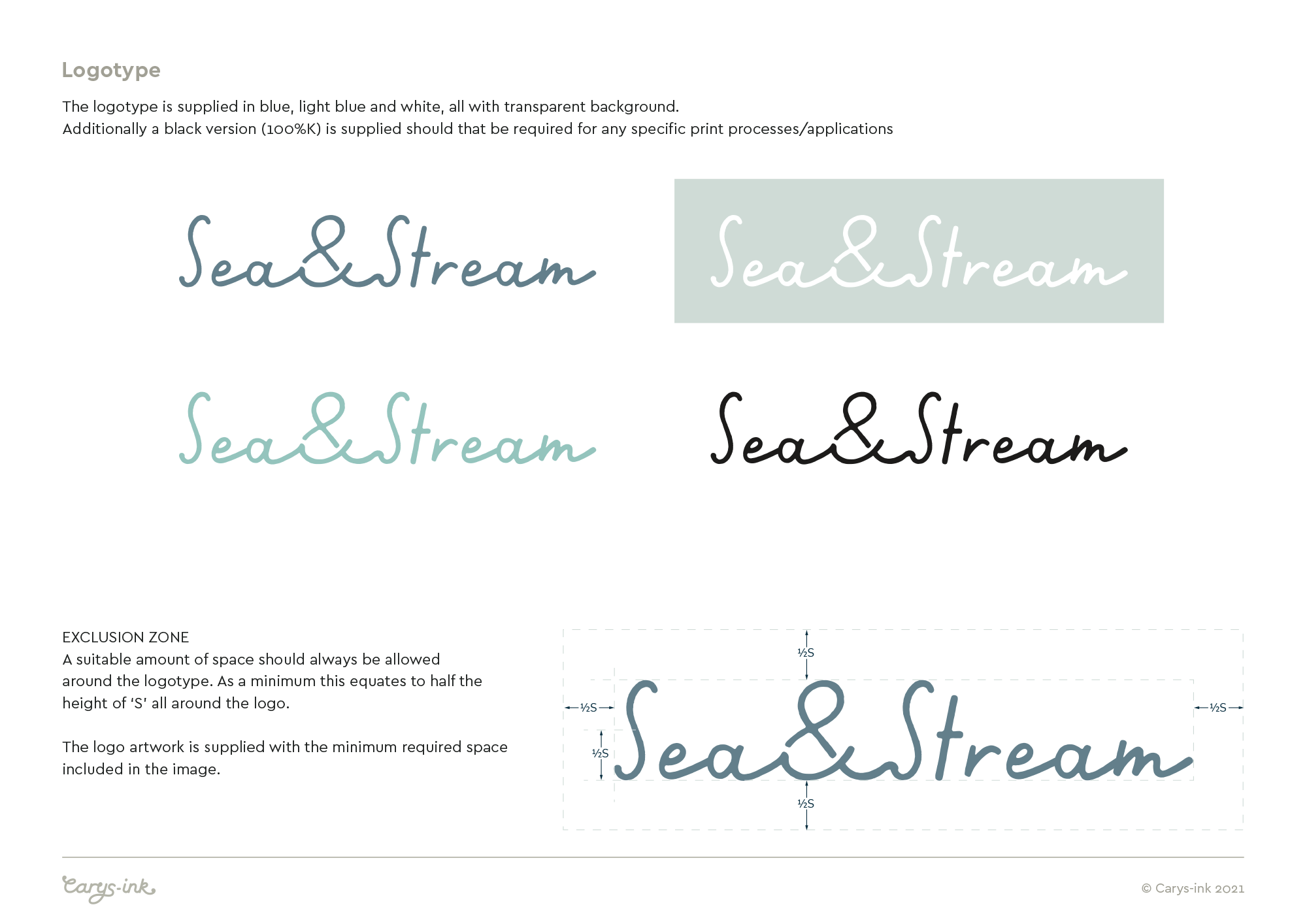
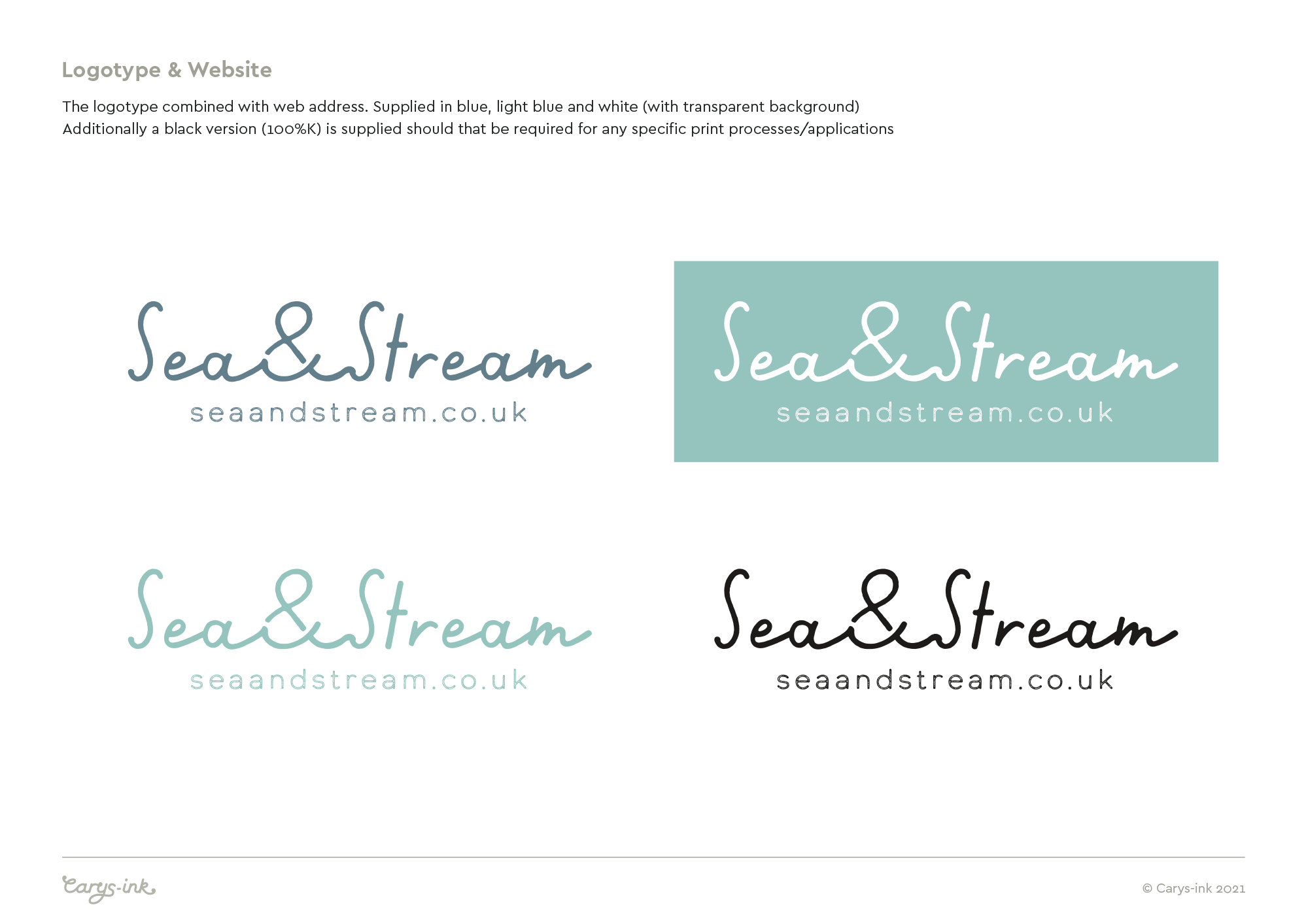
Sea & Stream - Logotype
The logotype was designed to evoke a sense of water, in quite a simple way. My intention was to create something friendly, that flowed nicely, with an understated feel.
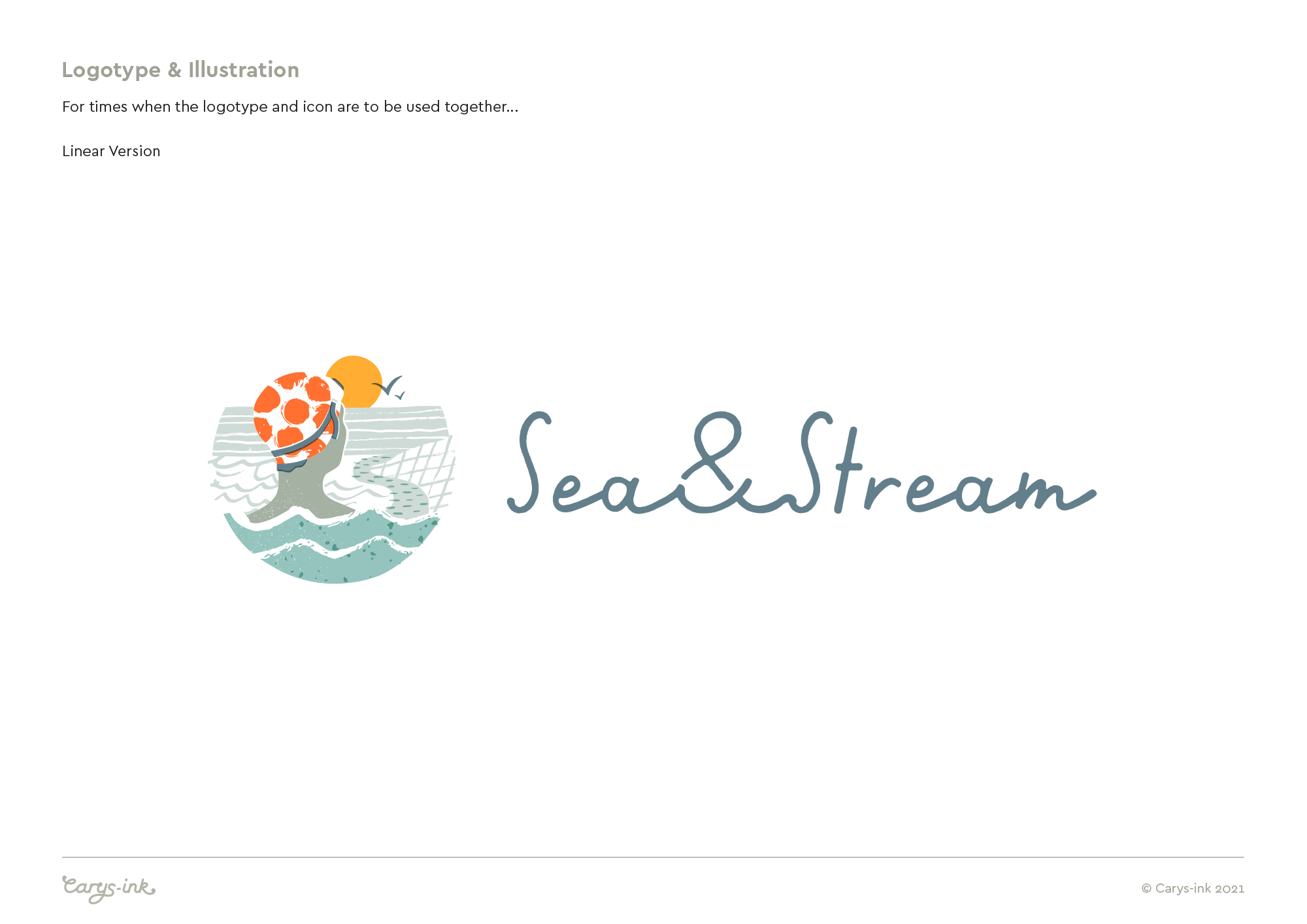
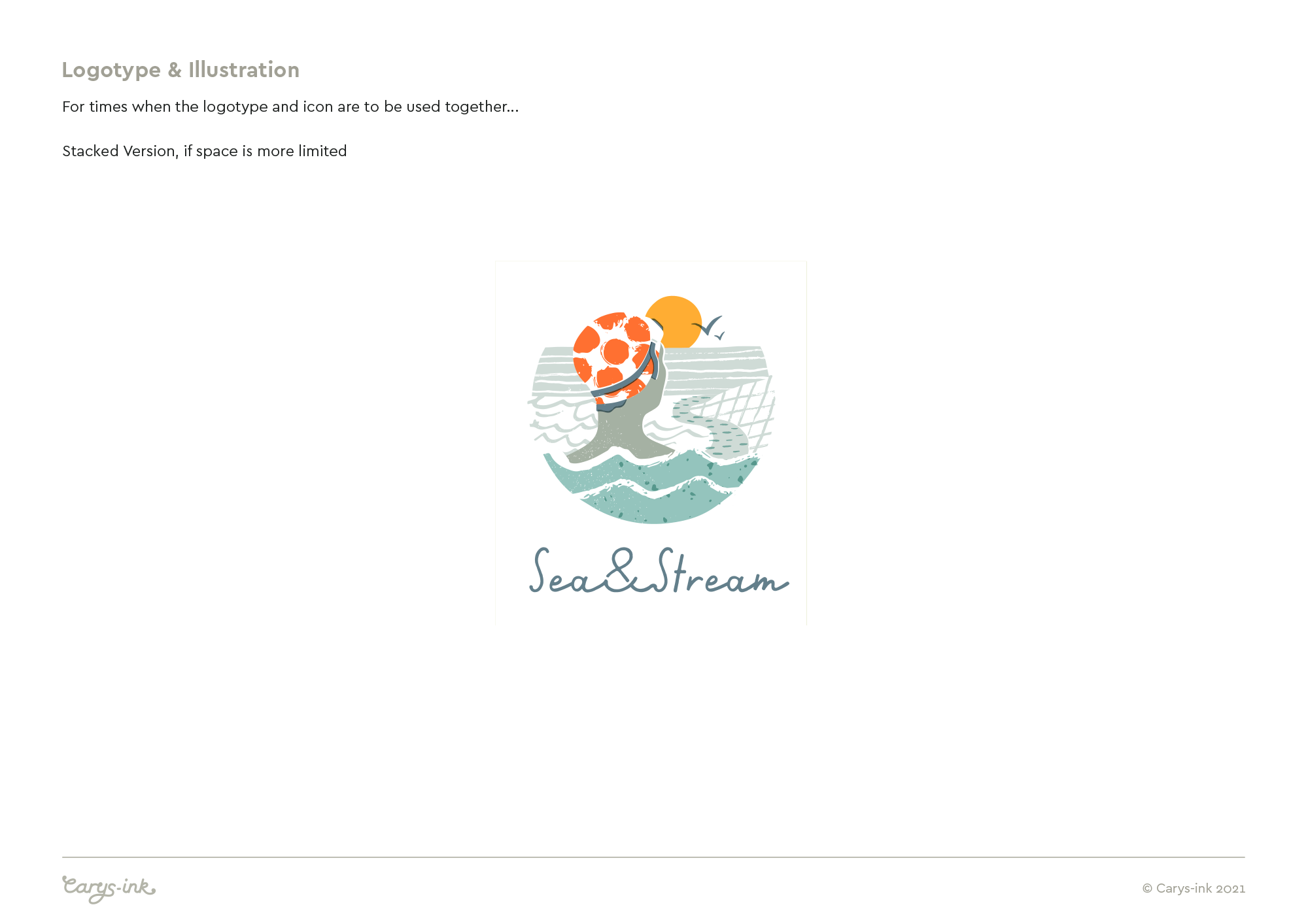
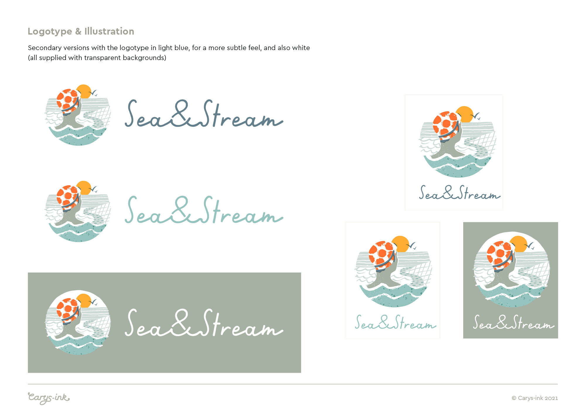
From the outset, the client was keen to include an illustrative approach within the new brand. We discussed how this could work, specifically on the website where there are limitations in terms of the space available for a logo. With this in mind, I wanted to create a stand-alone logotype and a separate illustrative icon, which could be use elsewhere on the page, as an avatar on social media, and across packaging/print materials etc

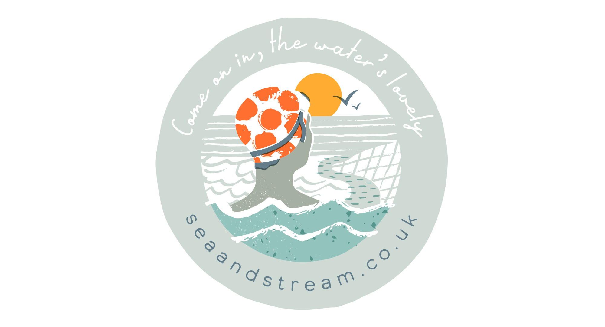
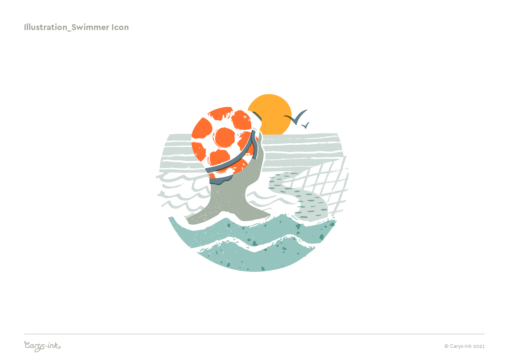
Sea & Stream - Swimmer, Illustrative Icon
One of my main directives for creating the icon was that it should reflect swimming outdoors in all types of water, ie. not just the sea. Outdoor swimming in the UK incorporates rivers, lakes, lidos, as well as the sea, so it was important for the illustration to give a sense of these too.
The ‘illustrative icon’ could potentially be called a brand mark - it’s just terminology, and essentially it is a brand mark in that it symbolises the Sea & Stream brand. However, to me it isn’t really a typical brand mark in that it involves a number of colours, and although easily recognisable it’s not a clearly defined symbol that can easily be applied as a stamp at any size. However, in this instance, the style of the illustration was a good fit for the feel and ethos of the brand, and it offers potential for being used on products in the future - something else that was important to the client.

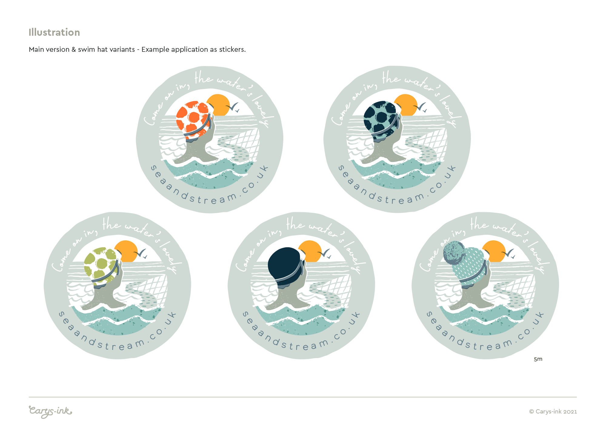
Circular mark, incorporating the web address - Potential use as stickers for packaging

Variants on the swimmer icon - for fun and flexibility! Different colour swim hats offer variation for use of the icon across marketing materials and different product ranges
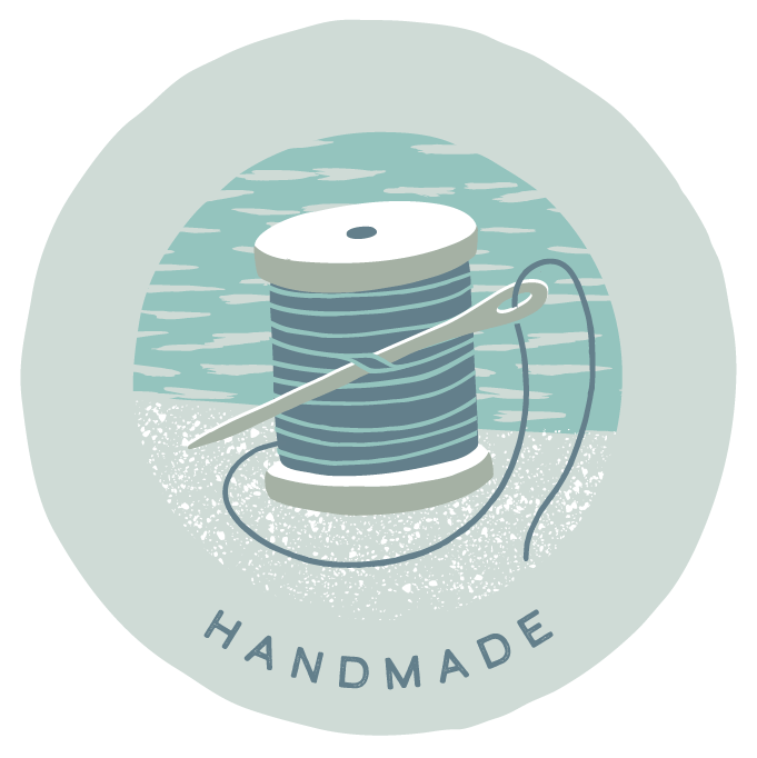
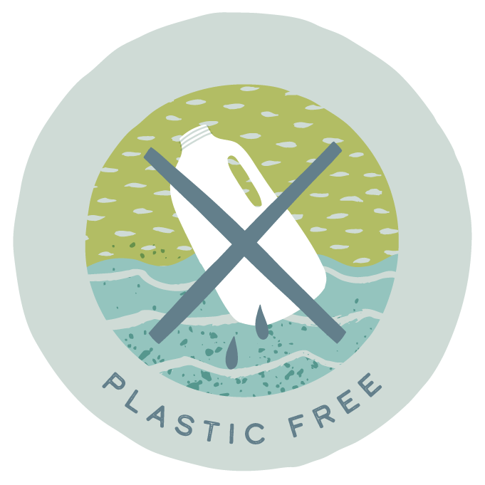
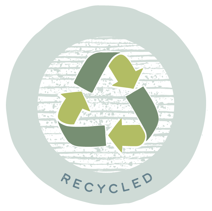
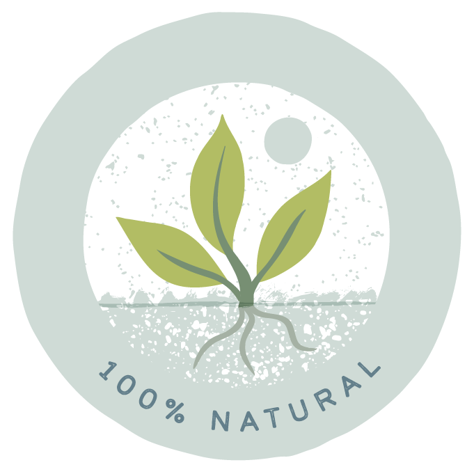
All products available through Sea & Stream, have been carefully created to make swimming joyful, but also to have minimal impact on the environment. All products meet 1 or more of these values, and are categorised as such. To help bring the values front and centre as part of the brand, I created this set of icons, to have a similar feel to the main swimmer illustration.


As part of the project I also defined which fonts should be used across the website and other brand-related materials


In developing the brand, there was an existing colour palette that the client liked and wanted to keep if possible - I was asked to work with that, but with freedom to develop as appropriate. The existing palette included muted tones of blue and green, I added a few brighter accent colours - the orange and yellow - to help the icon stand out, and also an extra green, to fit with the eco credentials - I knew it would be useful when creating the values icons!

Reference for the fonts and colour palette feature in the PDF brand delivery guide, supplied to the client along with final artwork. Pictured below are some of the other pages in the guide created for Sea & Stream, which basically outlines the various artwork versions I have supplied and also some guidance on what should be used where.
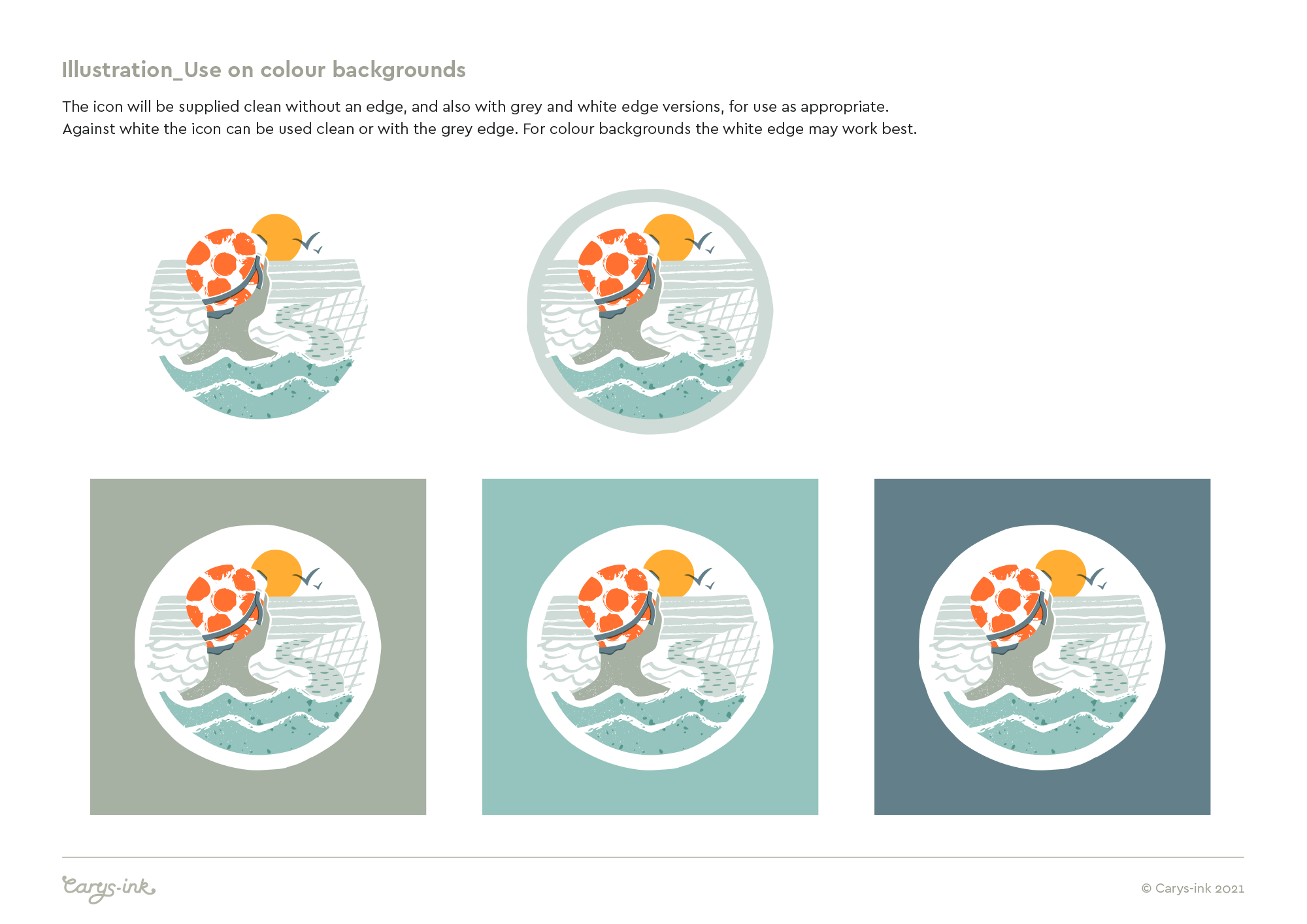
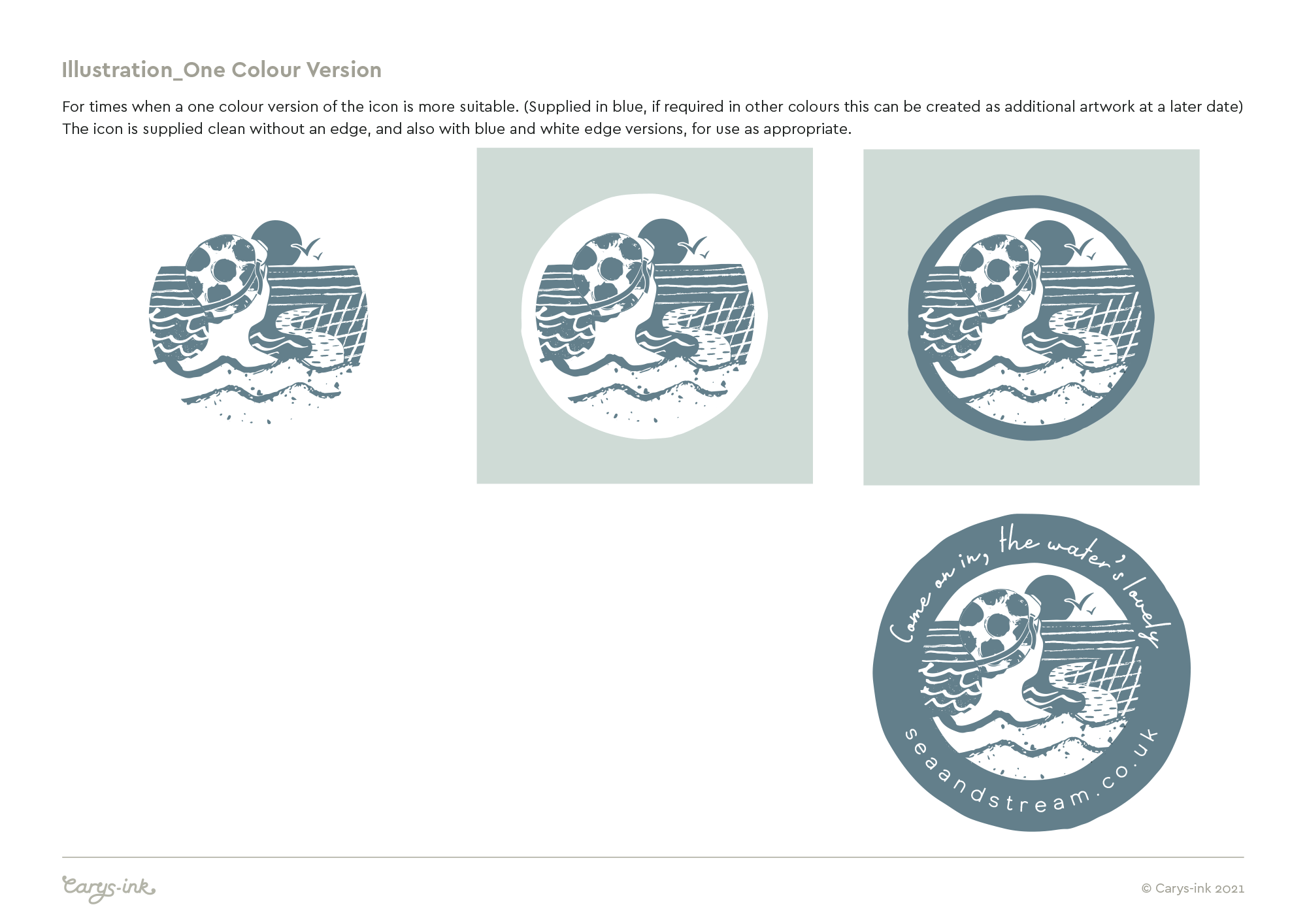
I always tend to supply a PDF along with final artwork created for a brand project. It’s not as extensive as a full ‘Brand Guidelines’ (which I could supply, if required as part of the brief), but I believe useful for clients to have a simple and straight forward reference for their new brand.
CLIENT PERSPECTIVE
Once the new Sea & Stream brand had launched, I got back in touch with Lou, the shop’s founder, to ask for some feedback. I wanted to find out about their experience of working with me and whether the new brand had been well received - I’m really happy to share the following:
I presume you would have considered other designers/illustrators to help you re-brand Sea & Stream, what was it that made you decide to work with Carys?
Carys seemed like the perfect fit for us. We wanted to include illustration in our rebrand, we loved her previous work and the fact that she focused on sustainable businesses was the icing on the cake!
How did Carys’s costs compare to any other quotes you received?
As a small business it has been a big outlay, however we feel it is a good investment. We didn't approach any other illustrators so a cost comparison was not possible. We feel we got excellent value for money with what Carys achieved with the brand.
How did you find the overall process, from the initial briefing through to the completion of your project - Were there any areas that could be improved?
Carys was really clear throughout the process and took on board what we wanted to achieve. Can't think of any areas to improve.
Are you happy with the final identity, and have you had any feedback from others who have seen it so far?
We are absolutely delighted with our final identity and have had so much positive feedback from customers and the outdoor swimming community. It has allowed us to launch a new website which looks so much more professional. The branding really captures the joy of swimming outdoors and stands us apart from other businesses in the market.
And finally, if you were to describe Carys to someone else looking to commission a new brand identity, what would you say?
We would definitely recommend Carys. She understood what we were about from the beginning. The process was smooth and her talent for illustration will really help you to stand out from the crowd!
- Lou Jones, Founder, Sea & Stream
RELATED PROJECTS

Debi Holland Gardening | Illustrative identity for a North Somerset Gardening Business
RAVENSPOINT MARKETING | Identity for a Website Design and Marketing business