PROJECT: WEBSITE ILLUSTRATIONS
CLIENT: ADMP UK
The Association For Dance Movement Psychotherapy UK, ADMP UK is the professional body for Dance Movement Psychotherapists in the UK. They accredit training programmes within the UK, and set the professional standards for practice for their qualified members.
Dance Movement Psychotherapists work with a range of clients with different mental health needs, and their therapy modality utilises creative expression, alongside talking, to support clients throughout the therapy process. DMPs can be found working in the NHS, within charities and organisations, in schools, and also in private practice.
OBJECTIVE
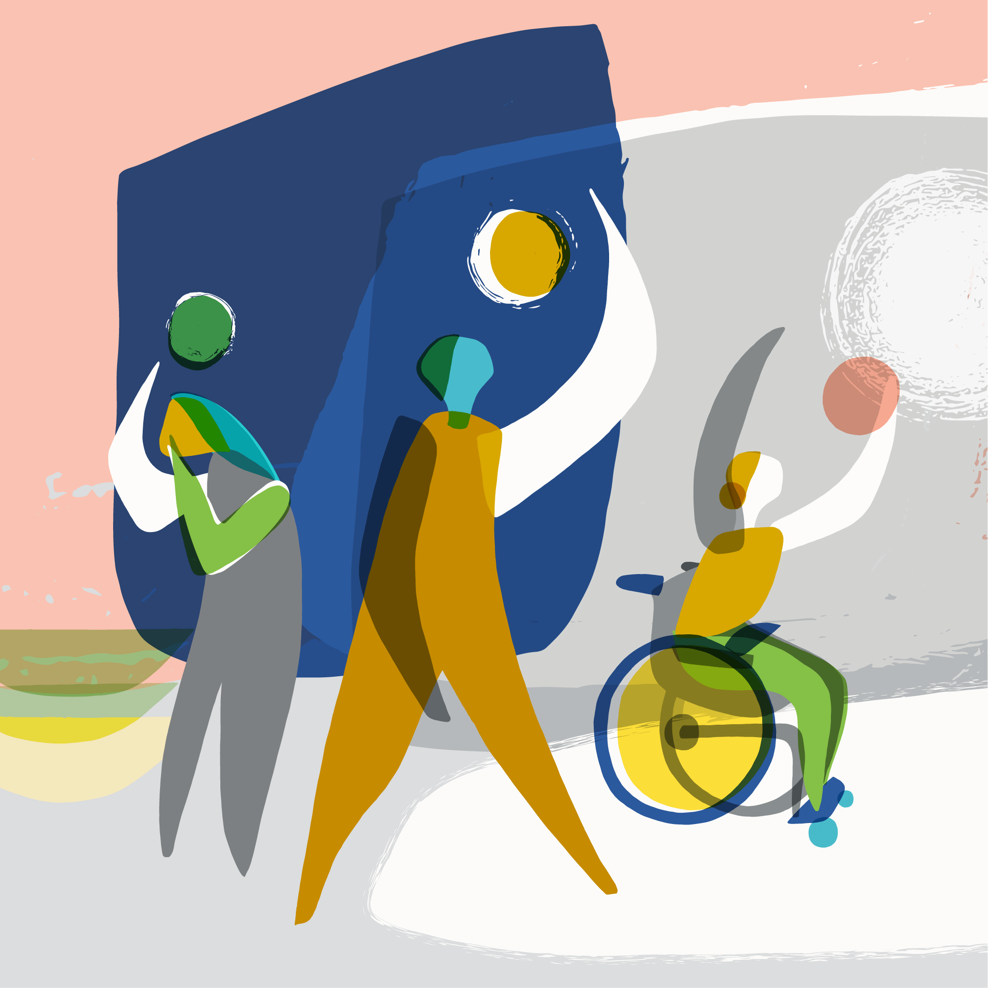
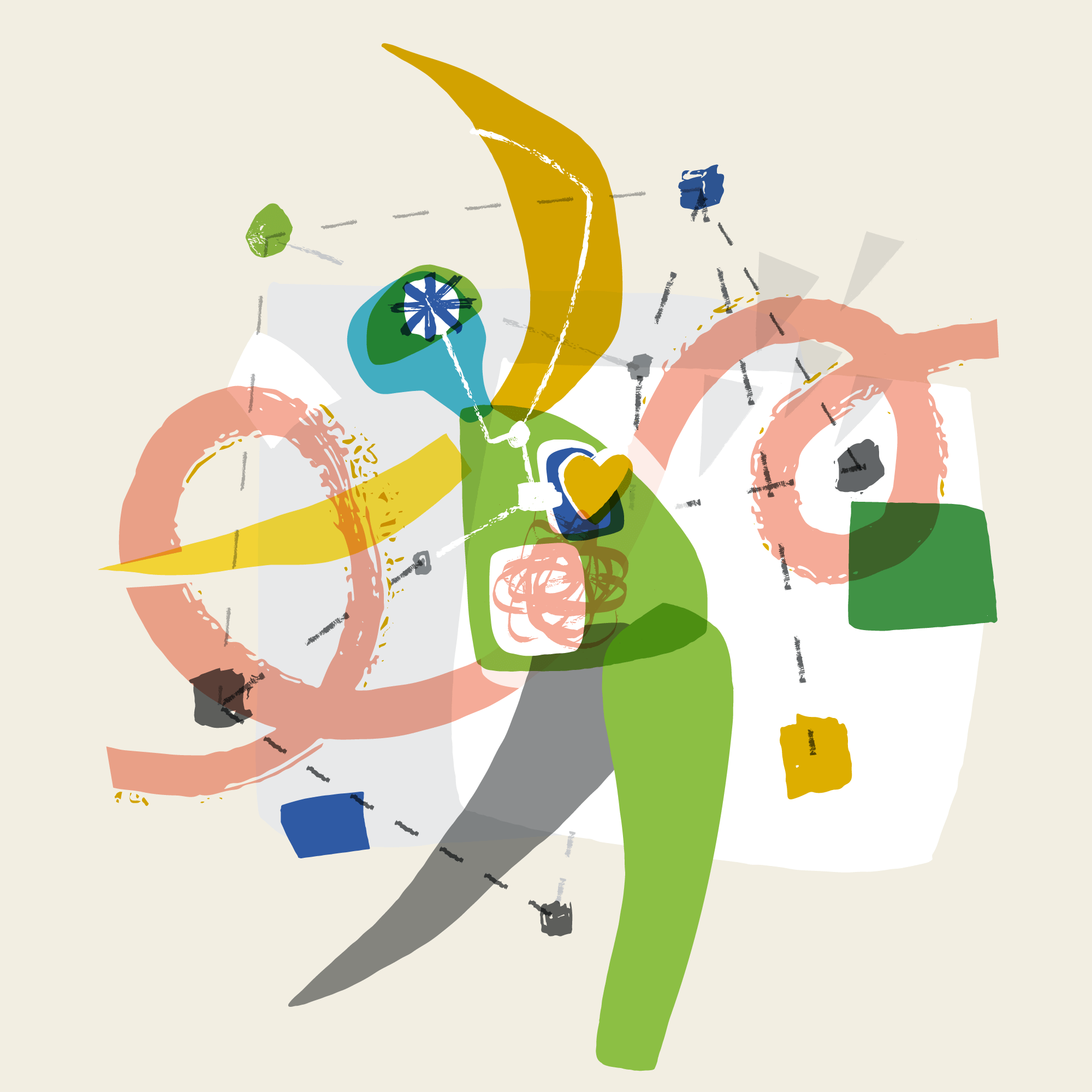
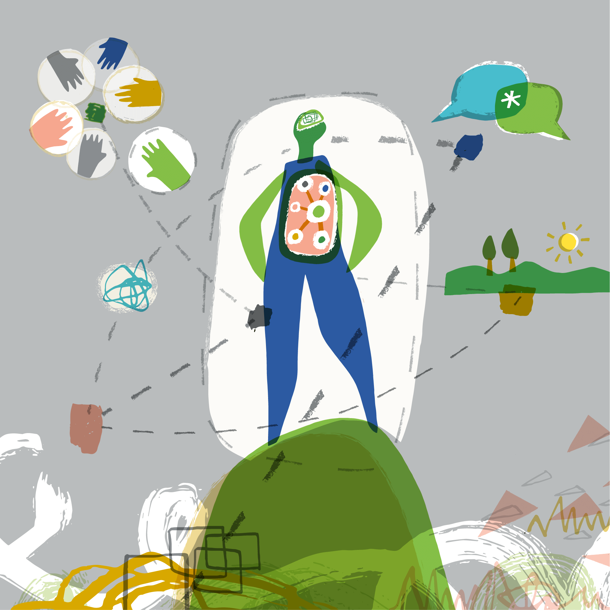
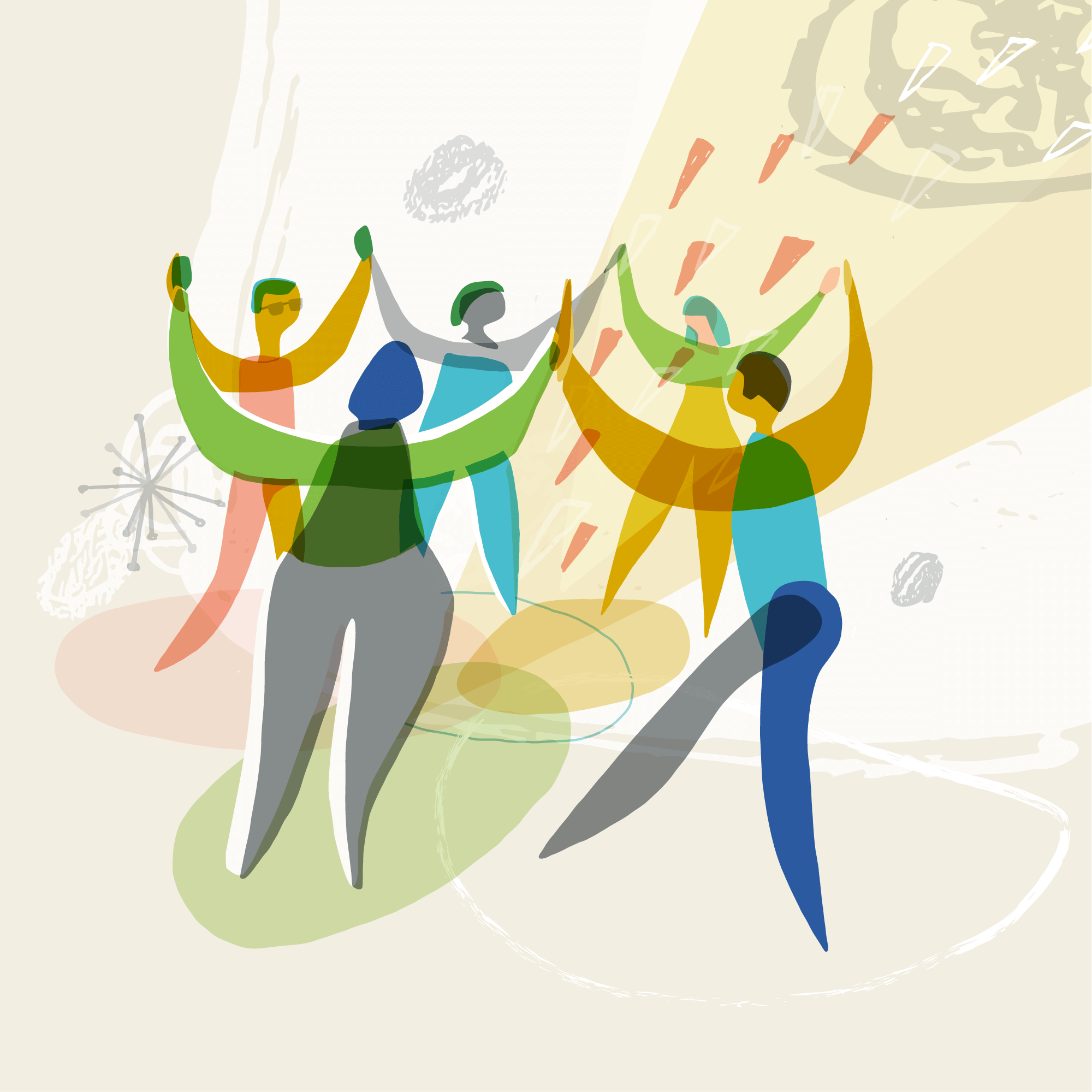
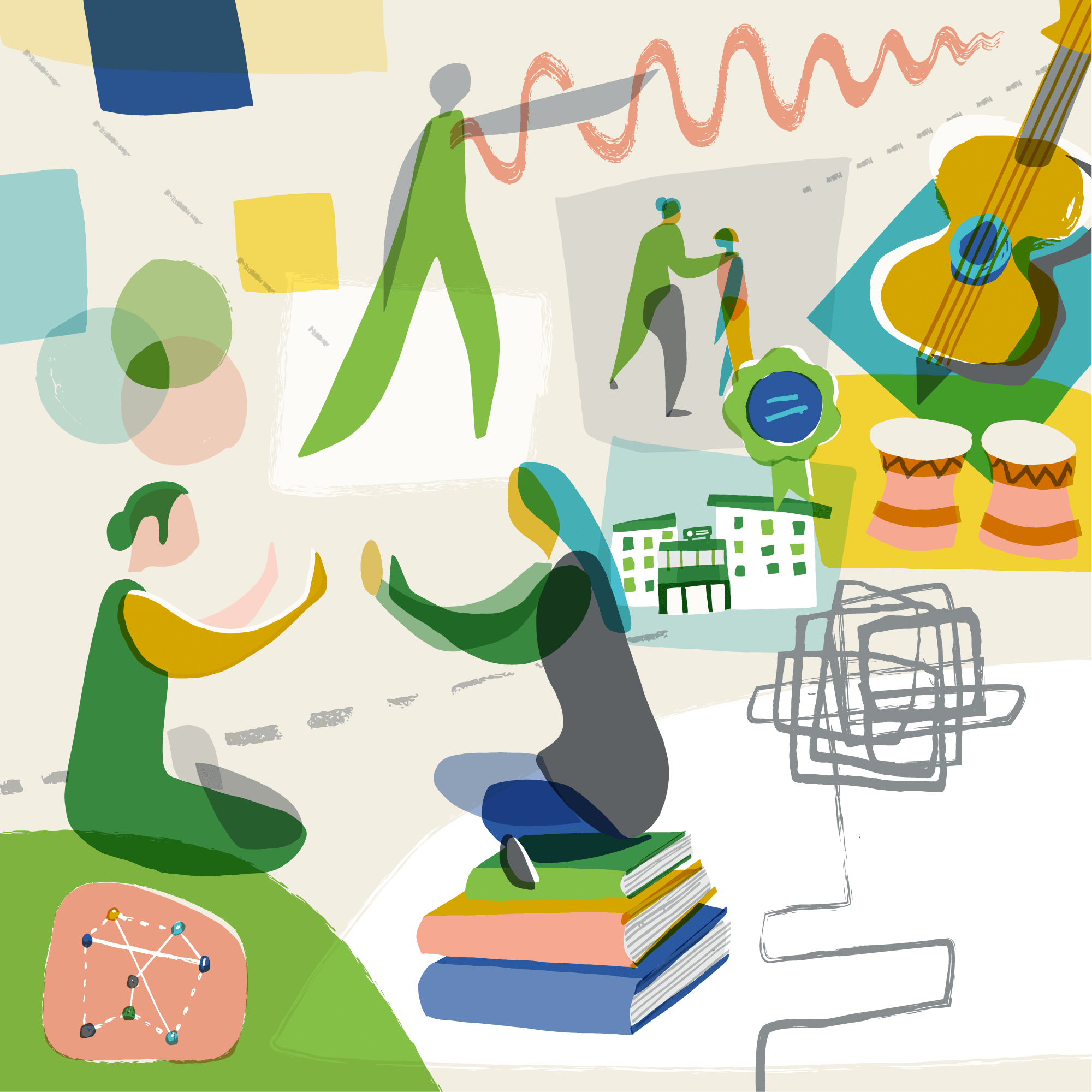
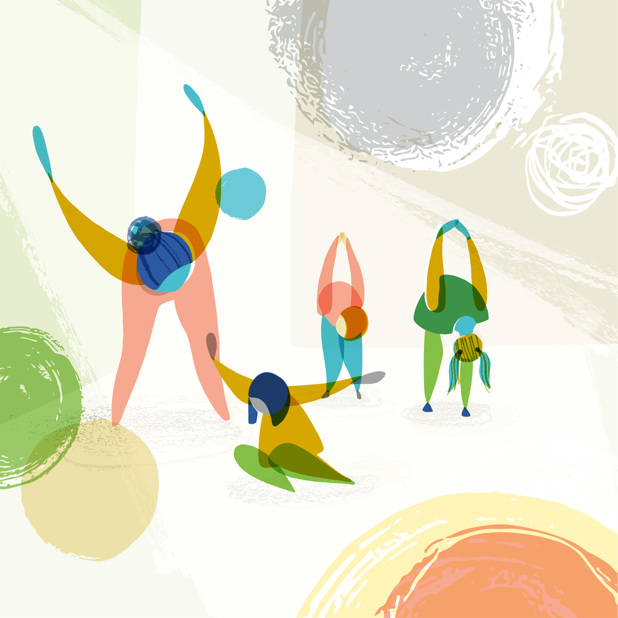
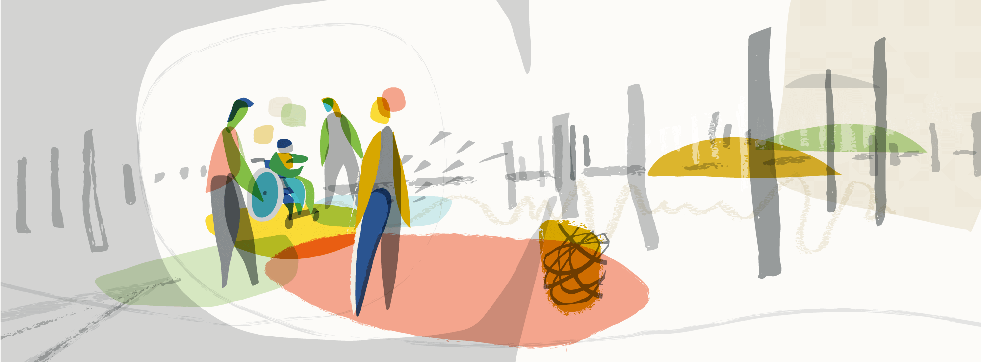
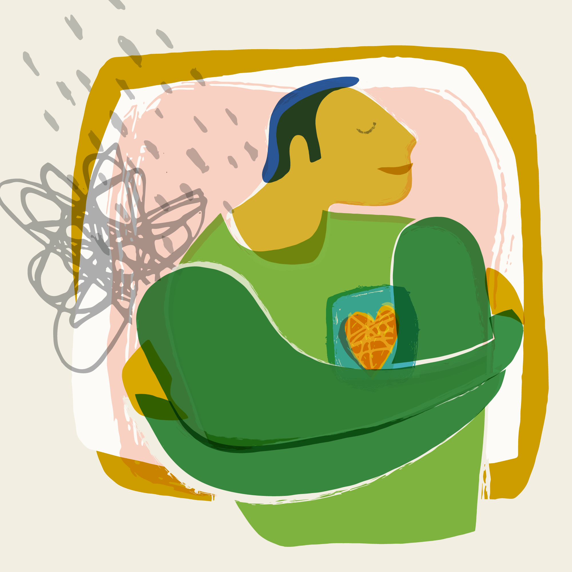
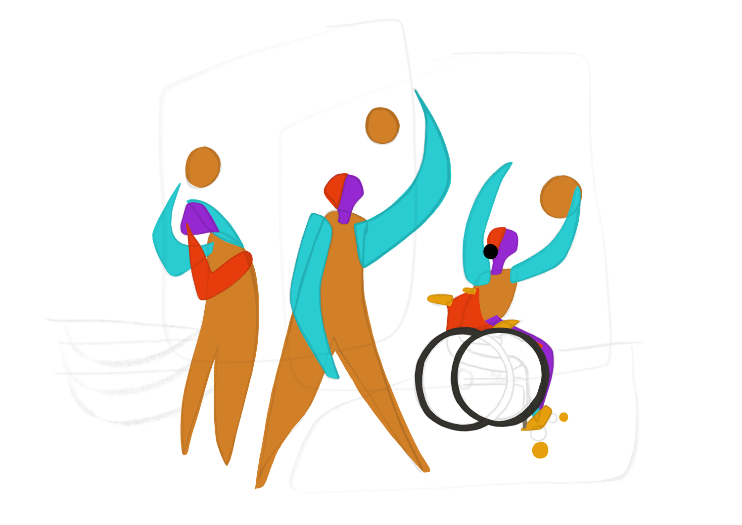
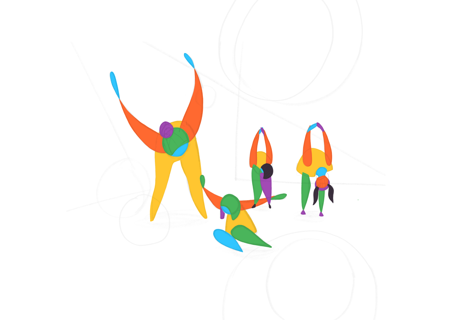
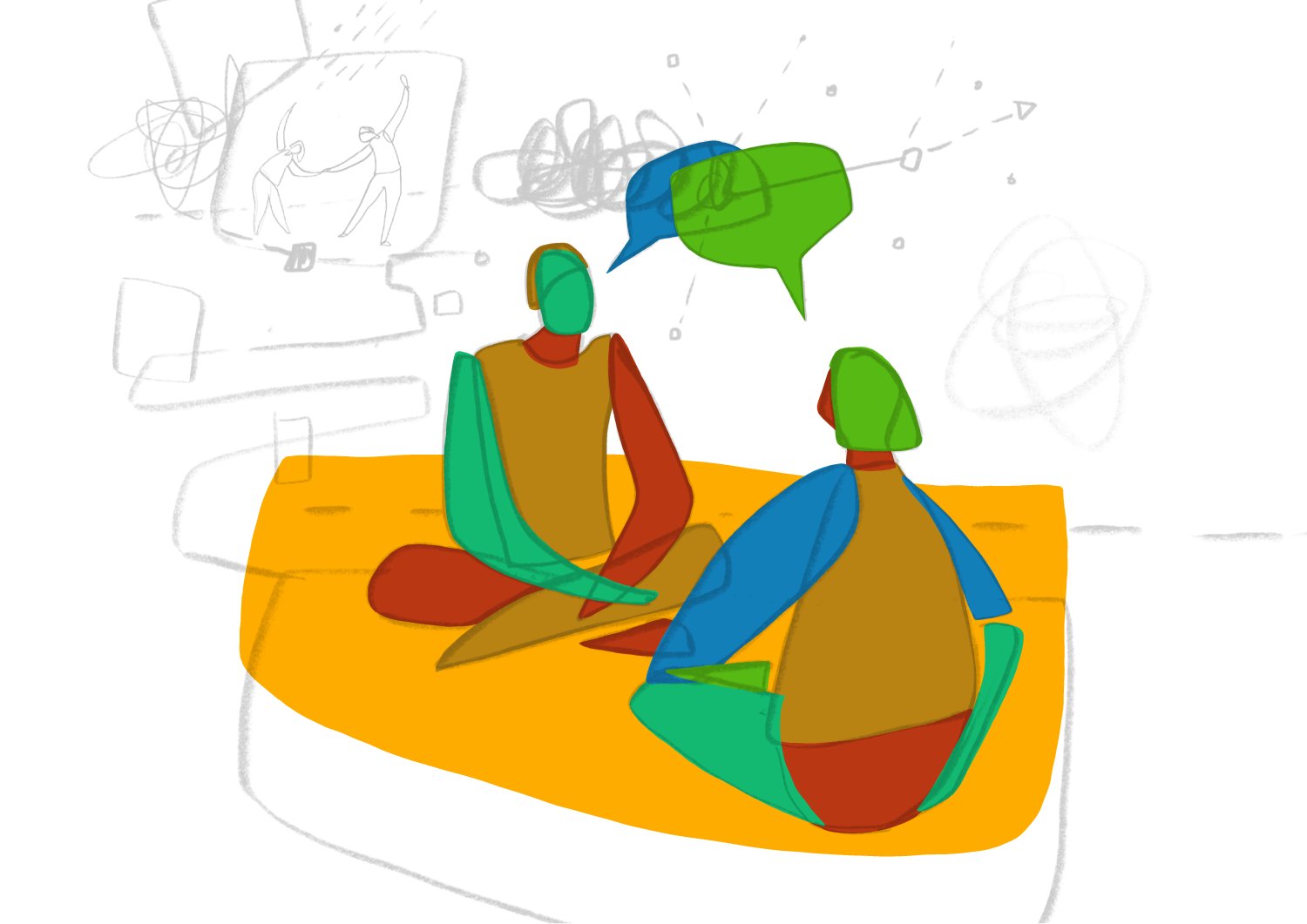
I was approached to create a set of 22 illustrations for use on the ADMP website which was in the process of being re-designed. The illustrations were to work alongside quite lengthy text content & help to convey a sense of how dance movement therapists work using embodiment and movement, and with a range of age groups, individuals and groups in different types of settings.
Some of the illustrations were briefed to show specific ‘scenes’ whilst others were more open to interpretation and to be much more abstract. It was important the illustrations showed a diversity in the ways DMP’s work and who they work with, and also that dance movement psychotherapy is definitely not like a ‘dance class’.
The existing ADMP logo features an abstract figure, with a ‘Matisse/cut out’ feel, so the main directive I was given was that the illustrations should work alongside that. Apart from the green and grey of the logo, there were no other brand colours so I was asked to develop a suitable colour palette for my illustrations.
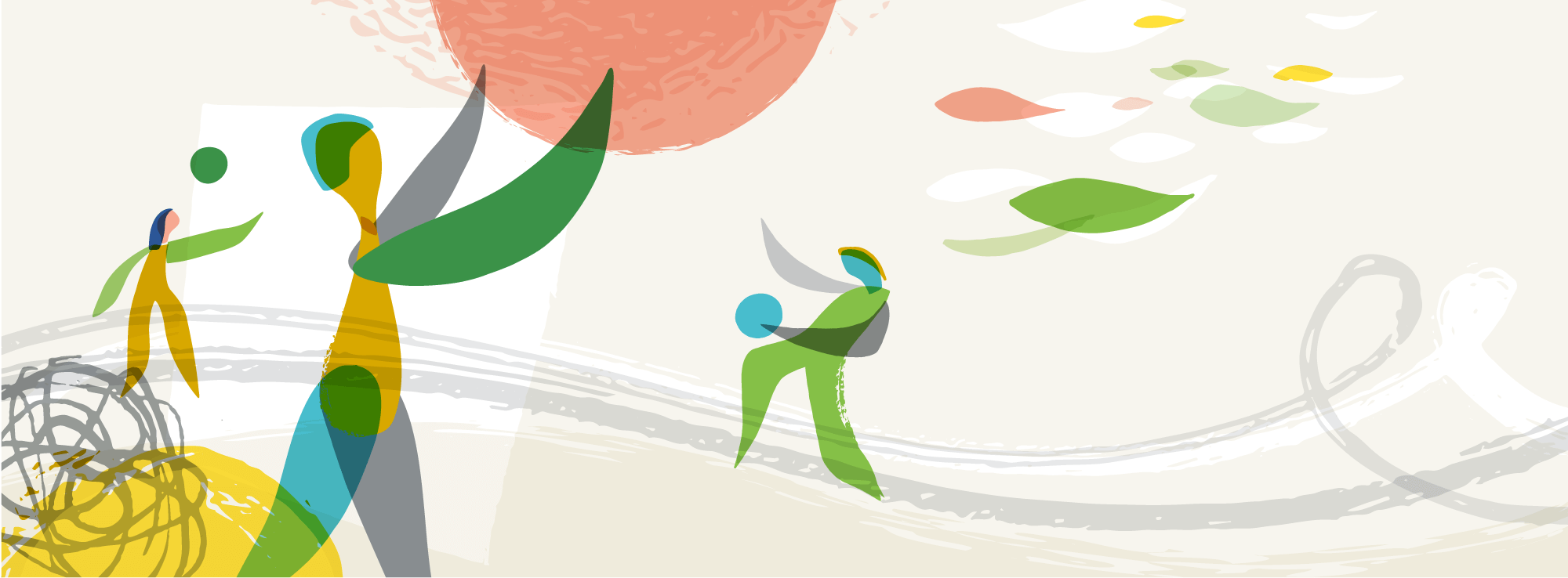
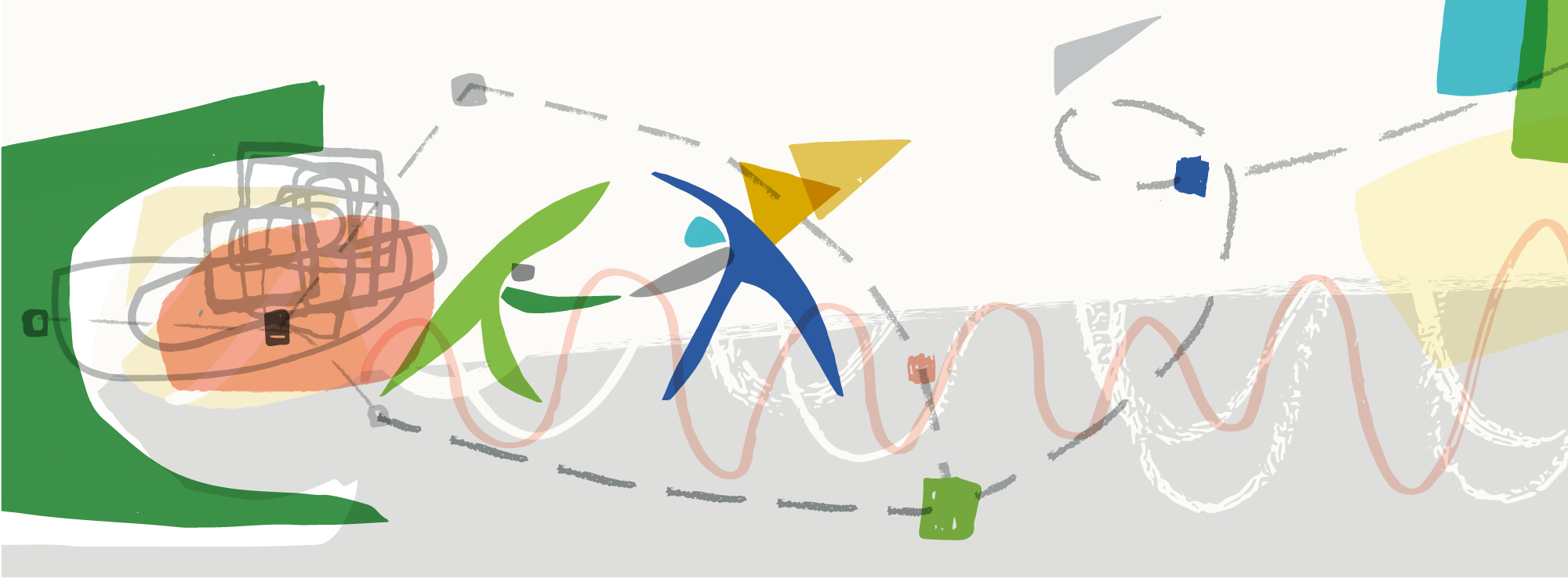
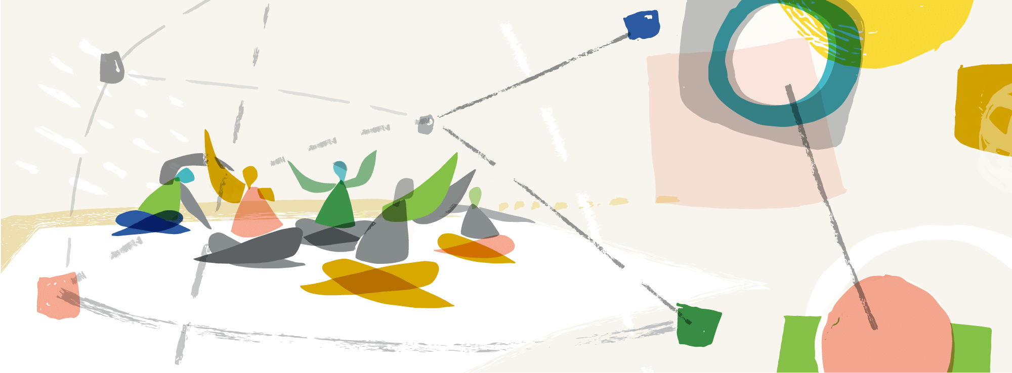
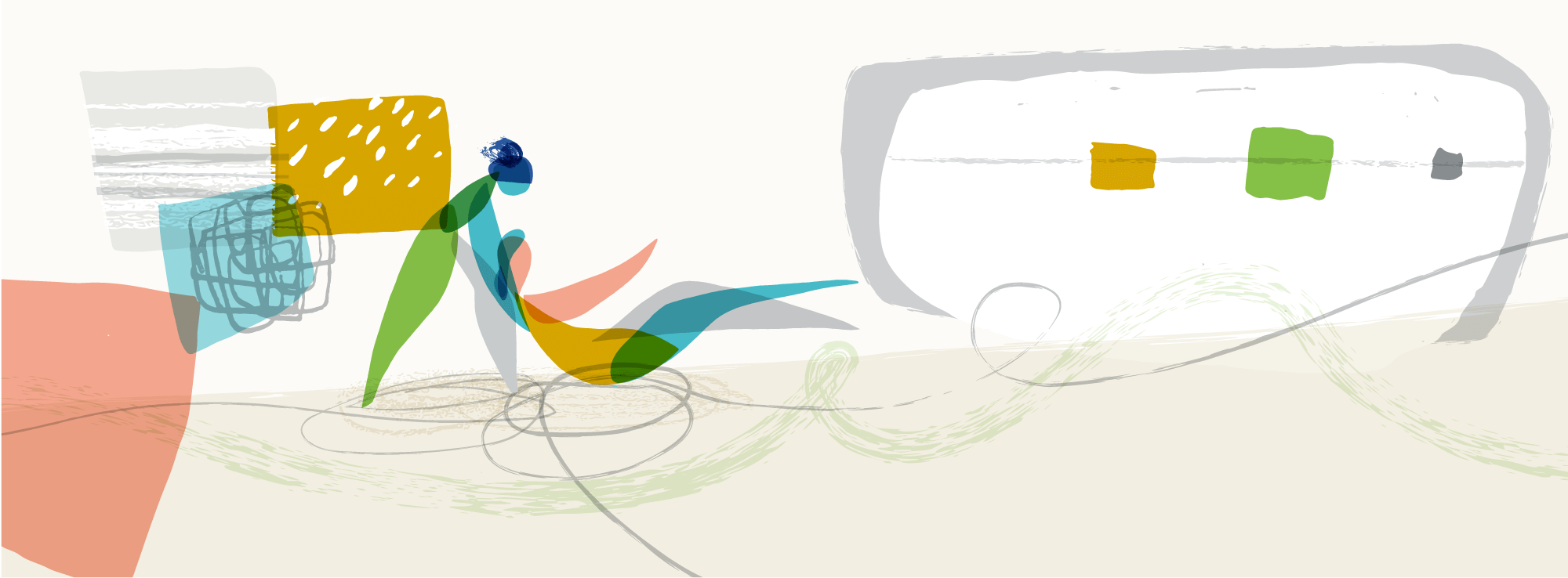
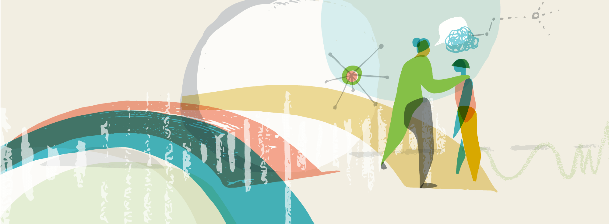
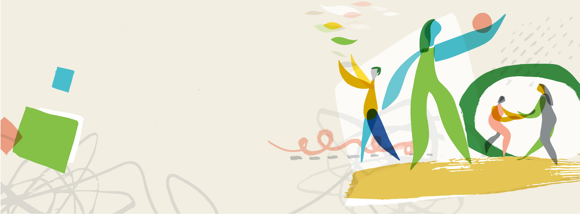
Above: I created 7 wide format ‘hero’ images for use as headers on the homepage and other main category pages. These were generally quite abstract and allowed for flexibility of use by not being overly specific in terms of content, whilst as a set also covering a range of different types of movement and individuals/groups.
We agreed that all the other illustrations would have a standard square format, as this would potentially work well on instagram too.
(Click an image below to enlarge, and step through the set…)


Existing ADMP logo
PROCESS
Pictured below is a page of initial stage sketches, along with an example of my proposed style. There was obviously a sketch for each individual illustration, and these were shown to the client for approval before proceeding to work them up. As the content of the illustrations was quite abstract it was particularly important to give a sense of how the pencil sketches would translate into the finished illustrations.
The illustrations are created digitally, but I always like to combine an analogue approach where suitable - with the subject based around dance and movement this seemed particularly appropriate for this project. Working through each approved sketch I created lots of individual elements to piece together later: a mix of cut paper shapes, general mark making and various inky squiggles!


I photographed all these elements and made them into vectors, to effectively create a library of assets. I like to work this way as it allows for an amount of flexibility and means I have a large kit of parts to use as needed across the set of illustrations.
The people within each illustration were drawn on the iPad Pro using Adobe Fresco with an Apple Pencil. My focus at this stage was simply to draw the shapes, and not worry about the colours or overlapping of shapes - see example images below.
I then pulled everything together on my Mac, using Adobe Illustrator, combining the various textures and shapes I had created, with the stylised figures, and applying colour
The final artwork was created as vectors, not because it particularly needed to be for this project, more that it is the way I tend to like working. I like that the illustrations are crisp and I can easily move things around and tweak the colours etc. There is also the benefit that if the illustrations are ever needed large scale or for print in the future, they’re good to go!

The colour palette I developed for the illustrations, to work with the existing grey and green of the logo

ADMP ‘40th Anniversary’
Following on from the website illustrations, I was later asked to create a celebratory image for ADMP UK’s 40th year. The image is being used on the client’s website and social media to publicise ADMP’s 40th Anniversary Conference and for some special edition printed merchandise.
CLIENT FEEDBACK
As an organisation, ADMP has a council of individuals overseeing and collaborating on everything it does, and the process of me developing this set of illustrations was no different. Throughout this project, my main point of contact was council member Katherine Rothman, who took the lead in discussing the project with me and also collating together any comments/feedback from other council members.We agreed set feedback stages throughout the process to allow for all members of the council to have opportunity for input, and communication generally worked really well.
Once the project was complete, and now the website has gone live I asked Katherine for some feedback on how the project had cone from the client perspective. Here’s what she had to say…
What was it that led you to contact Carys… Was there something specific that made you think she would be a good fit for your project?
We looked at a couple of illustrators and narrowed it down, with Carys being a really strong contender from the start. We were drawn to how dynamic her illustrations were - particularly some of the work with shapes and characters displayed in the sketchbook section of her website. We also thought it could be a good fit based on some of the other organisations Carys has worked with previously. After making initial contact and talking things through with Carys, it seemed she had a really good sense of what we were after and trying to communicate. We trusted her to translate our words and example photographs into beautiful illustrations that could help deliver a message.
How did you find the process… from the initial briefing through to the completion of your project? Are there any areas that could be improved?
The entire process was really clear and organised - it felt like we were in good hands. Carys' blog post about what it's like to work with her [see that here] meant I could approach her for an initial inquiry already feeling quite confident with what to expect. Her briefing documents helped us think about what we were asking for and what was important to us. Carys was flexible and thoughtful throughout the process - and was great about clarifying elements of our brief that needed a bit more information from us. It was clear she put a lot of consideration into the work she created, and it was always exciting at each stage to see how the sketches had developed. Carys was open to feedback and made the small adjustments we asked for - though we really didn't want much changed.
Are you happy with the final illustrations, and has there been any feedback yet from others who have seen the illustrations?
We are so happy with the final illustrations. We commissioned them because we were updating our website, and they have added much needed colour and movement to our public face.
And finally, if you were to describe Carys to someone else looking to commission a set of illustrations, what would you say?
Easy to work with, conscientious, and creative.
- Katherine Rothman, ADMP Council Member & Treasurer
RELATED PROJECTS

BIBLE MONTH | Set of illustrations for a learning resource, featuring stories from the Gospel of Mark. I used a similar analogue/digital approach in creating the illustrations for this project

MATERNAL MENTAL HEALTH ALLIANCE | Perinatal Peer Support Principles, Illustrations & poster design