PROJECT: EVENT PROGRAMME/MAGAZINE COVER ILLUSTRATION
CLIENT: BRITISH ANIMATION AWARDS
Every two years the animation community rally together for a night of celebration and fun as the British Animation Awards (The BAAs) hosts an awards ceremony for all that is great about animation in the UK. This year the event was held on March 12th at the BFI, South Bank, London.
The BAAs has always had strong emphasis on celebrating art, with the award for each individual category being an original artwork, specially commissioned from some of the finest artists and animators working in the creative industries.
OBJECTIVE
I was commissioned by Helen Brunsdon, Director of the BAA to create an illustration primarily for use on the cover of the event programme/magazine, but also for poster and screen use at the venue on the event night.
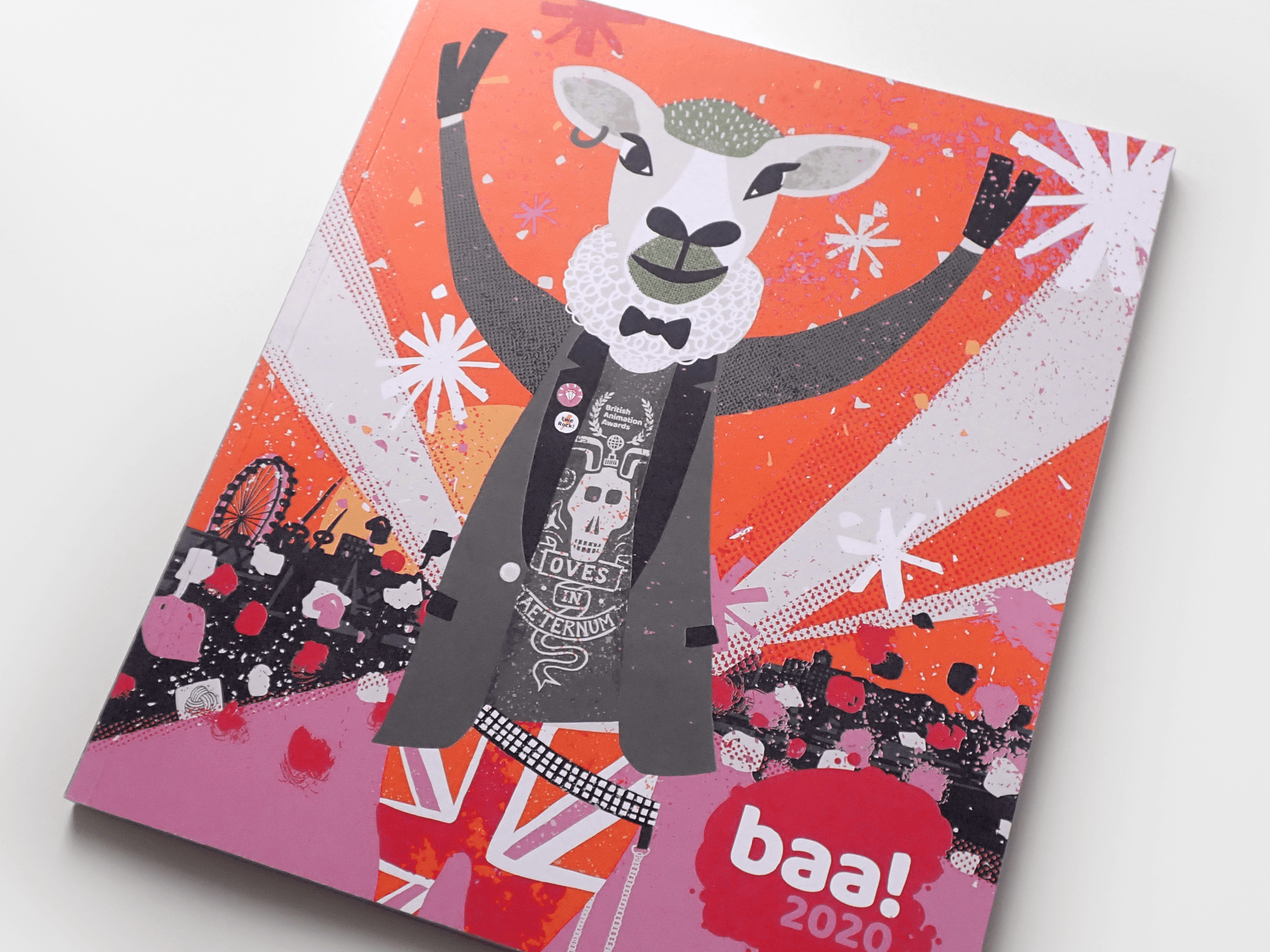
My brief was to develop an illustration which related to sheep - which is the basis of the British Animation Awards brand (BAA, geddit??) - and for the overall image to have a fun/edgy feel, with the vibe of something that could sit comfortably on the front of a cool, contemporary magazine.
The BAAs have an existing brand colour palette, with pink being the primary colour used for the logo & website.
CONCEPT
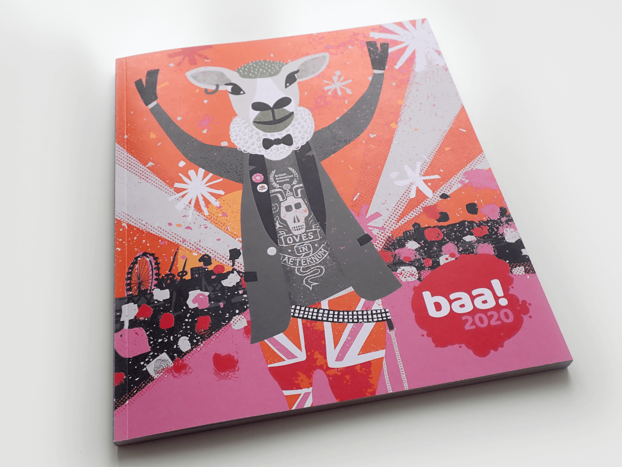
My overall concept was based on the idea of the glitz and glitterati of the animation world descending onto the BAA pink carpet (obviously a pure British wool carpet!) for a spectacular event. I developed a flamboyant sheep character, perhaps a chief judge or rock-star animator, and tried to evoke the atmosphere and excitement of arriving at such a celebratory event.


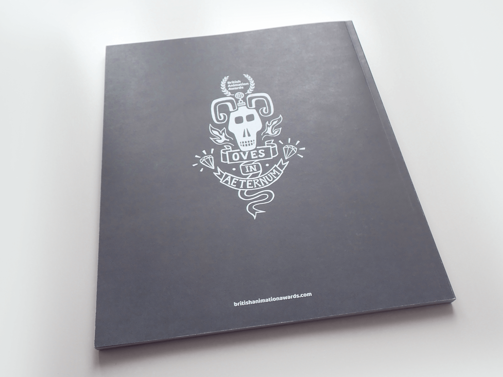
The programme cover, front & back.
Thanks to Christian Tait for the photos - Christian @ Creative Cadence designed the full programme and all the inside pages - see his case study here.
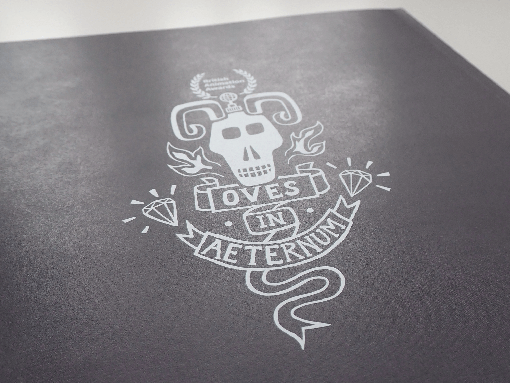
(& if you were wondering… the latin ‘Oves in Aeternum’ means ‘Sheep Forever!’)
Pictured below some photos of the design in situ on the event night (before the guests arrived!) at the British Film Institute - BFI in London. ‘Quad’ size posters, the programme and on the auditorium screen.
Photos by Matt Whiteley @ Black and Whiteley Photography
The illustration adapted to a wider format to work on the auditorium screen
Initial concept sketch
CLIENT FEEDBACK
“I had looked at a few other designers but was immediately drawn to 3 of Carys’s illustrations and prints on her website. I was looking for something impactful, cool, textural, punky, with clean lines and that tells a story. I also wanted on-brand design that would be memorable for my first incarnation of the awards.
Once we had an initial briefing Carys came back with a few options on the illustration front cover which we talked through. She was great at taking on board my feedback, and we discussed what worked and what could be tweaked to be more in keeping with the existing brand. This process also focused my thinking about summing up the animation industry and the awards - what was/wasn’t going to work, and using keywords to help Carys. I was aware Carys worked with me on the budget for this and delivered different formats for us to use on the awards night itself, including posters at the venue and screen images to use for award categories - These were fantastic, we received all positive comments and feedback from attendees and admiration for the design and look.
I was delighted that the image we ended up with possesses the ingredients for a ‘wow’ image whilst containing some key elements from the original image that brought me to Carys in the first instance. I would willingly work with Carys again and highly recommend her design and illustration experience and skills- they were perfect for me and the British Animation Awards.“
- Helen Brunsdon | Director, British Animation Awards
As testament to how happy the client was with the illustration… For the next event 2 years later, they requested to re-use the image in a different colourway! I re-worked the image in alternative colours, again from the existing brand palette.


