PROJECT: BRAND IDENTITY
CLIENT: LITTLE BRIGHTS
Little Brights is a soon-to-launch new venture from Bath based yoga teacher Jacinta Powell, offering fun yoga classes for kids aged between 5 and 12. Classes are themed around fun animal postures, and created specifically with children in mind, rather than being simply tailored versions of adult’s yoga.
OBJECTIVE
Jacinta approached me to create a new logo for her business, to be used on her website, social media channels, and in print on items such as posters and flyers. Words used in her brief included: Bold, bright, joyful, fun, love, clean and happy.


I created 2 main versions of the logo - a landscape format with the type to the side, which would work best as a website header for example, and a portrait format for flexibility and as an alternative for print use. Each version was supplied with and without the strapline included.
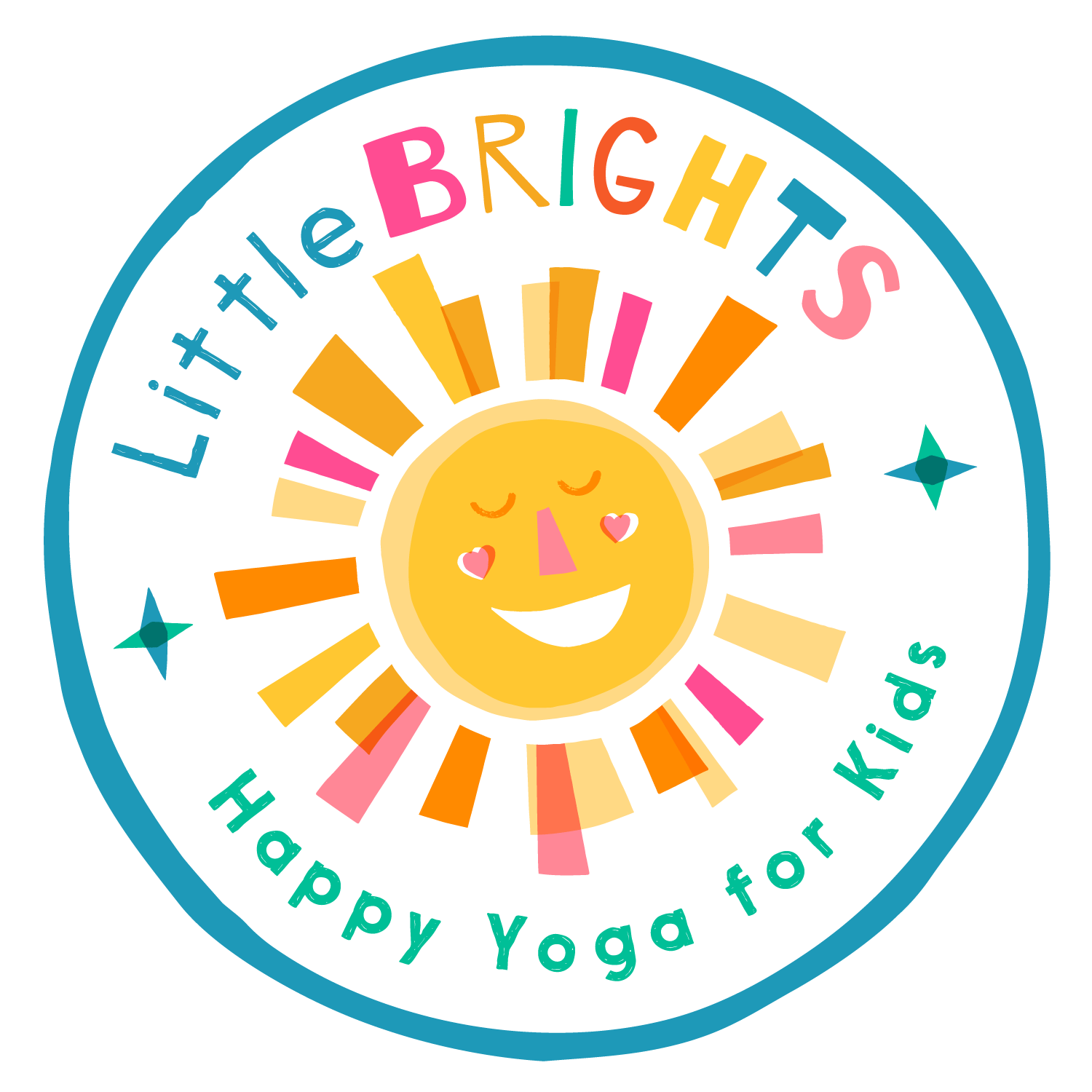
Additional to that, the design was adapted to work in a circular form, to be used as a stamp/sticker.
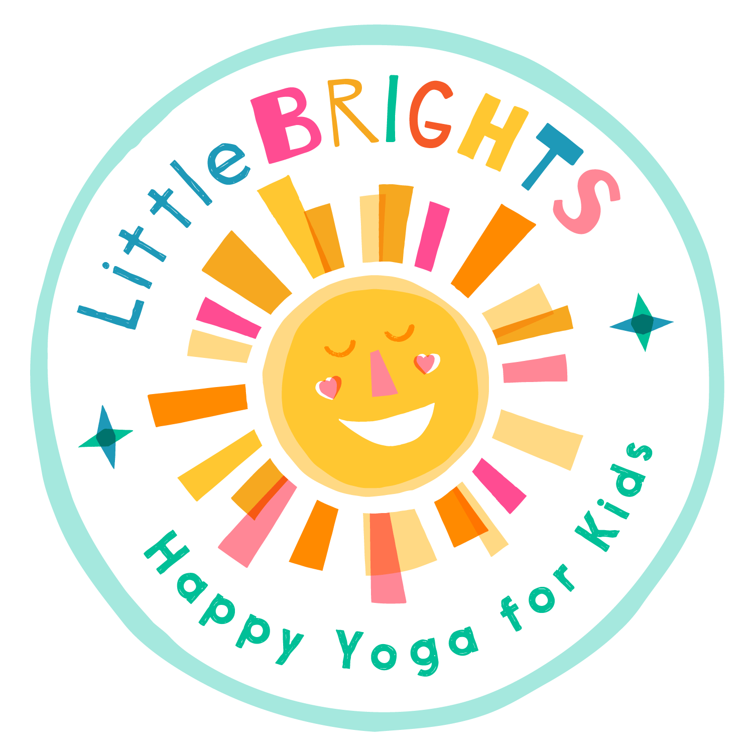


A little bit about the process of creating the sun icon… I wanted there to be a sense of fun and playfulness within the logo, and although I work digitally most of the time I love there to be a handcrafted/organic feel where possible and appropriate. Here I made some hand cut paper shapes, which I photographed and used as the raw materials to make the sun on my computer. By creating everything as separate shapes which don’t overlap, I have complete control and flexibility on how the various elements can be moved around, combined and coloured until I’m happy with the finished design. I really like the slight imperfection and subtleties that come naturally from working this way.

CLIENT FEEDBACK
Soon after the project was completed, Jacinta kindly agreed to answer some feedback questions for me. This is what she had to say…
What was it that made you think Carys would be a good fit for creating your new branding?
I approached Carys because I loved her bold, colourful, playful and creative style. I thought she would be a perfect fit for a kids brand and I also like the chic and clean fonts she uses.
How did you find working with Carys and are you pleased with the results?
I’m over the moon with the final designs! The whole process was really smooth, we spoke on the phone and communicated well. Carys did an excellent job and is highly professional.
If you had to describe Carys to someone else starting up a new business what would you say?
Carys has a lot of experience and vision and is very adaptable for different styles and needs. I would highly recommend talking to her and sharing examples of what you might want because I feel she is very good at navigating this well and bringing forward your dream graphics and branding.
- Jacinta Powell | Founder, Little Brights
RELATED PROJECTS
Orchard Project Drinks - Another project using a similar style, where the final designs were originated from cut paper shapes, but with an animal based character as the main focus, ‘Local Fox’
And 2 more branding projects for start-up businesses, each with a different feel but equally strong use of colour… Healthy People Nutrition & Ravenspoint Marketing