PROJECT: SOUTH KEN GREEN TRAIL - ILLUSTRATED MAP & LOGO
CLIENT: DISCOVER SOUTH KENSINGTON
Discover South Kensington brings together the leading cultural and educational organisations in South Kensington – London’s home of science, arts and inspiration.
South Kensington is one of the world’s most popular cultural destinations, with an extraordinary cluster of world-leading organisations pioneering innovation and learning in science and the arts. Together they generate and share knowledge and inspire the engineers, designers, scientists, musicians and artists of the future, welcoming over 20 million visitors each year.
OBJECTIVE
I was commissioned to create a logo and illustrated trail map for South Ken Green Trail (running from July - mid October 2021).
The trail brings South Kensington to life with exciting new installations and pop-up nature hubs created by architects, artists and garden designers, all intended to make visitors leave ‘buzzing’ with new ideas and inspiring visions for a greener future.
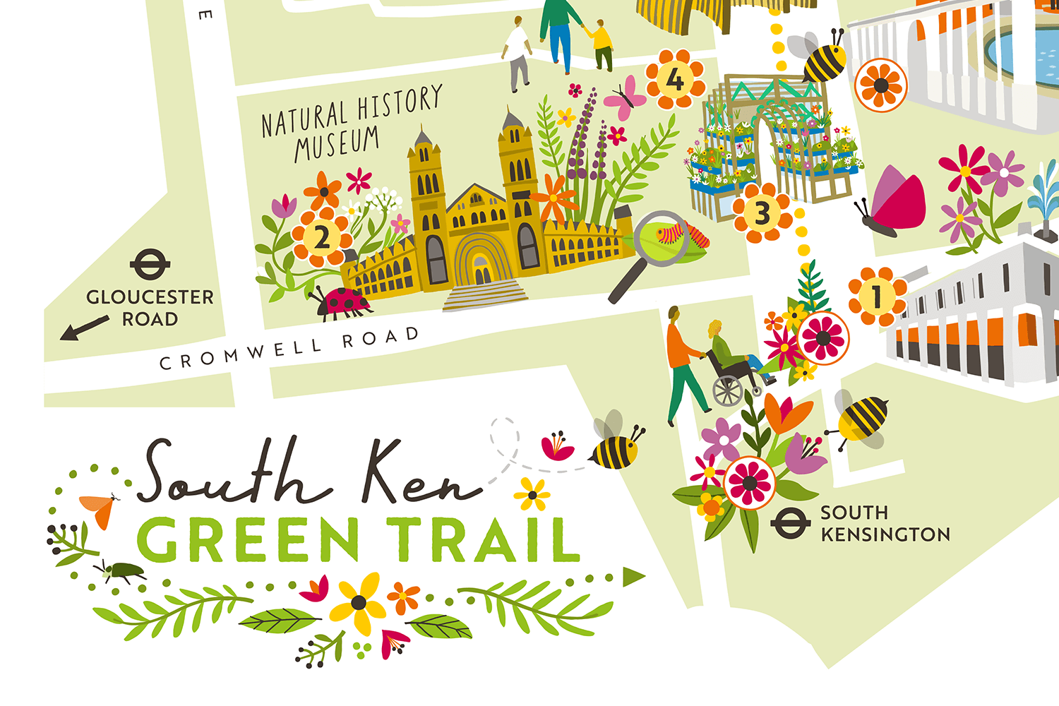
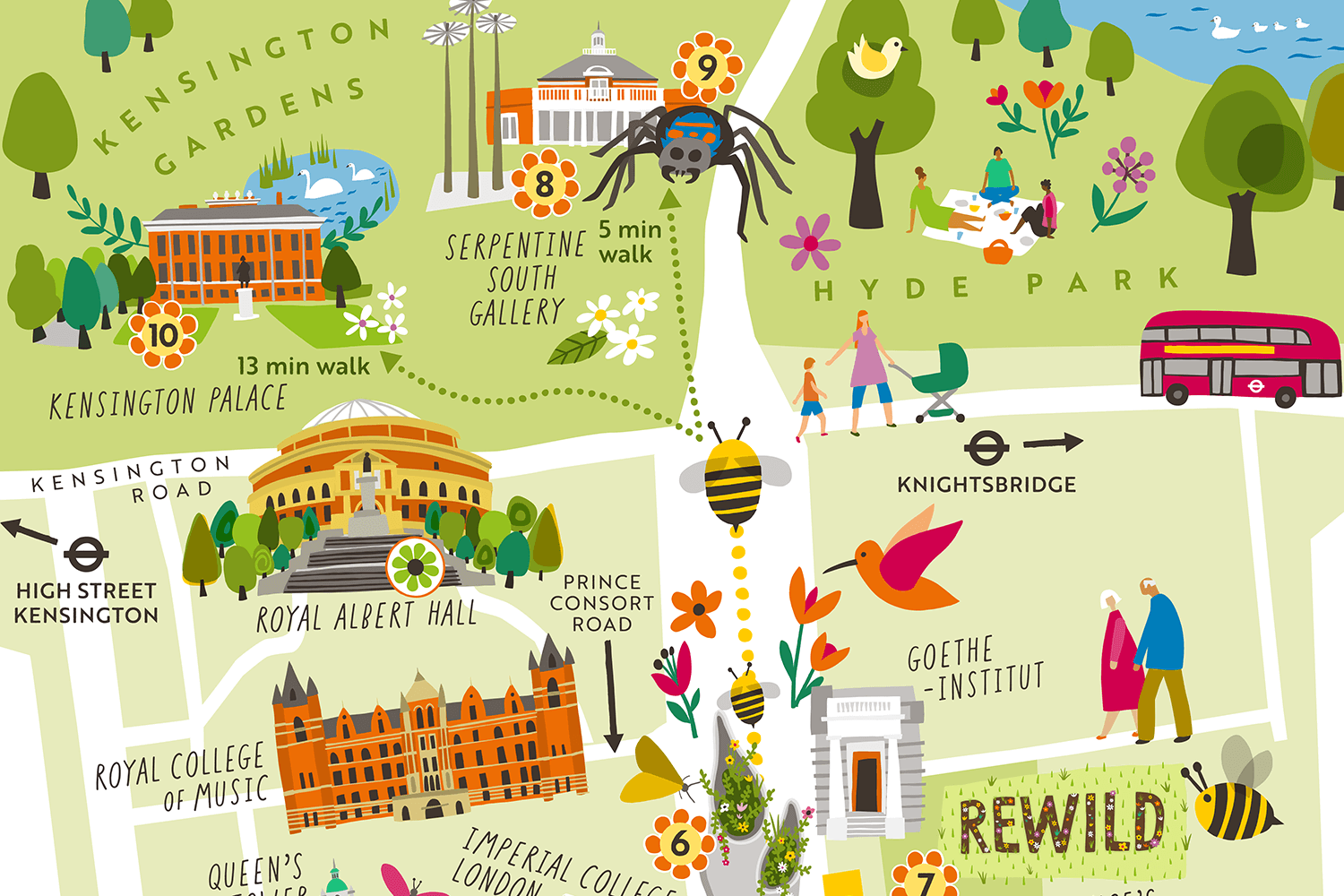
Illustrated Trail Map - Front
The trail map is available for visitors to download, and print at home if they wish.
Download the map from Discover South Ken here
With home-printing in mind, I factored ‘print margins’ into the design… Home printers don’t generally print to the edge of the page, and the margins aren’t always the same for all printers. Working with the need for a white edge to the design, instead of a standard straight edge crop, I opted for a more playful, angular shape for the map, which also ties in with the Discover South Kensington brand.
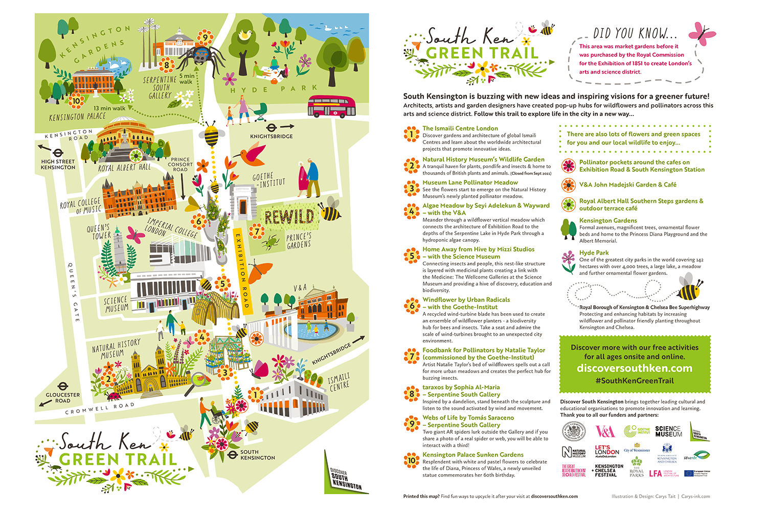
Illustrated Trail Map - Back
Illustrated Trail Map - Front & back combined into 1 image
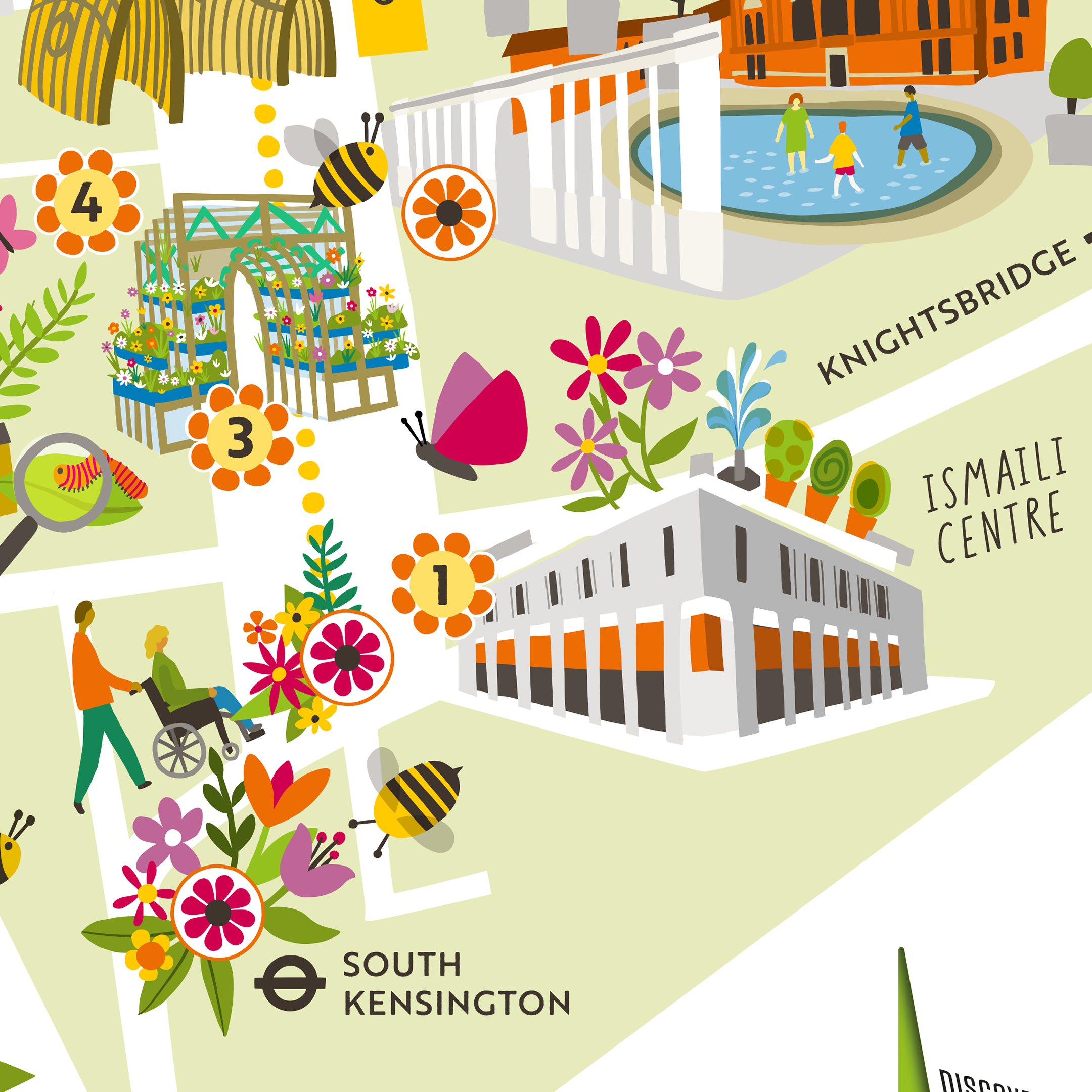
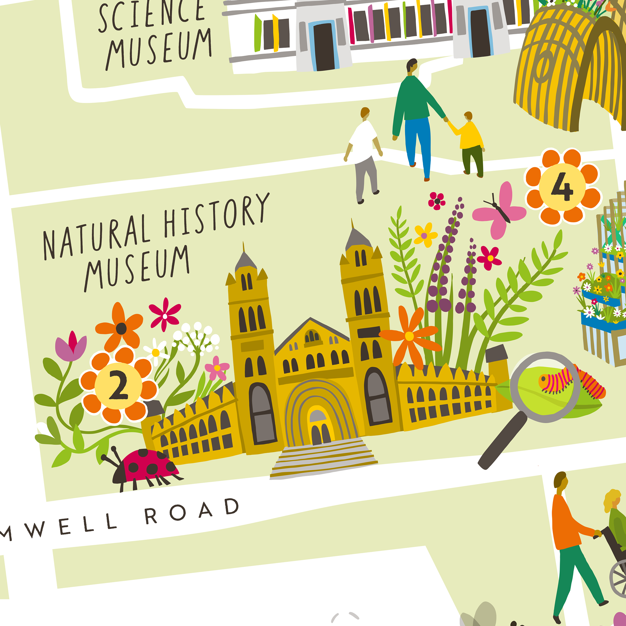
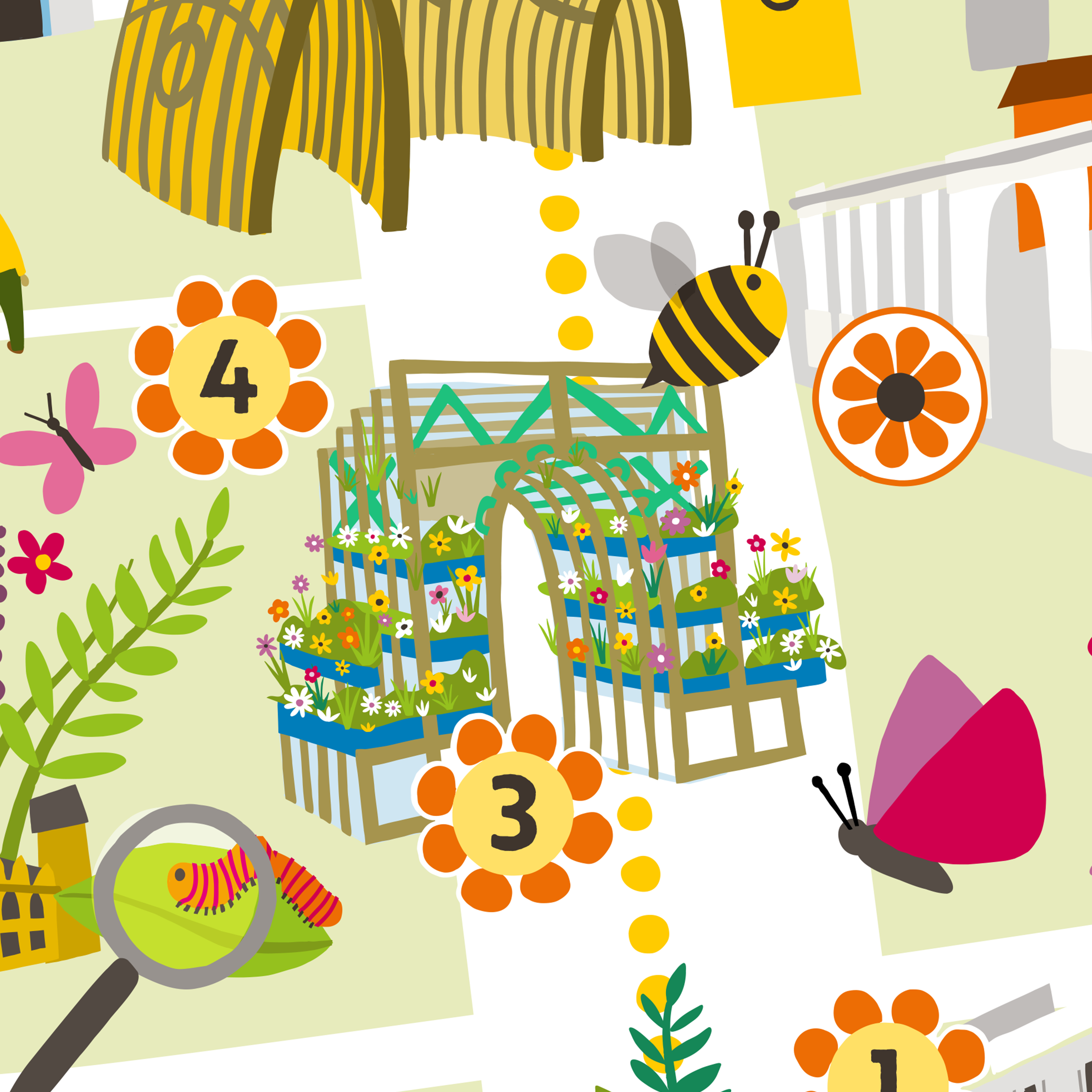
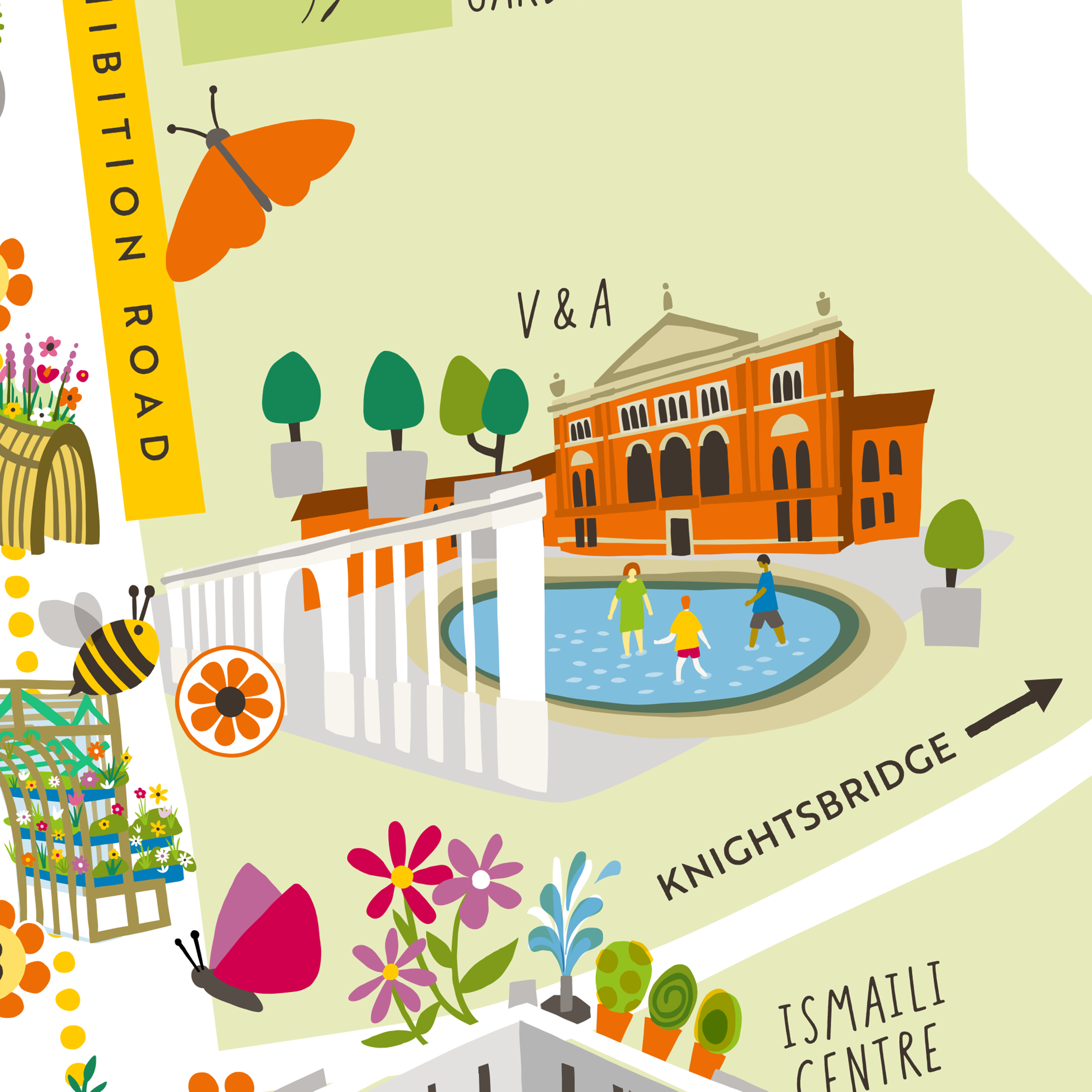
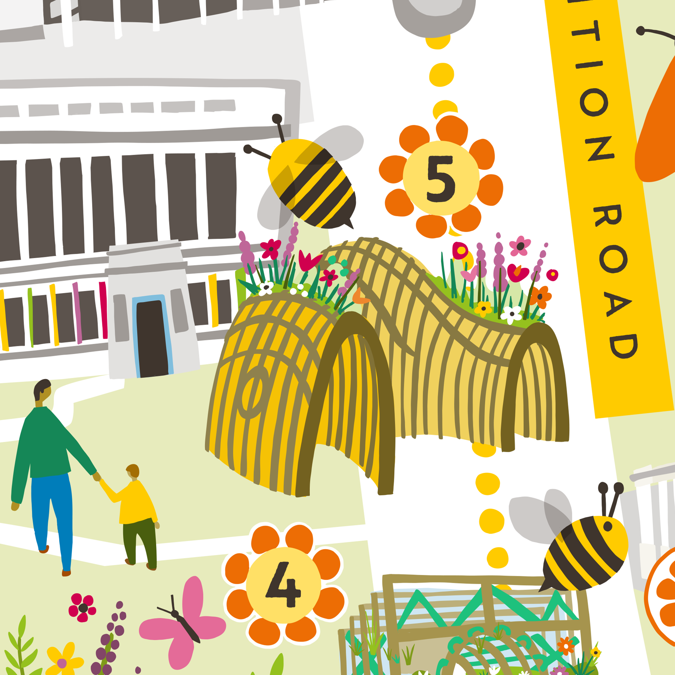
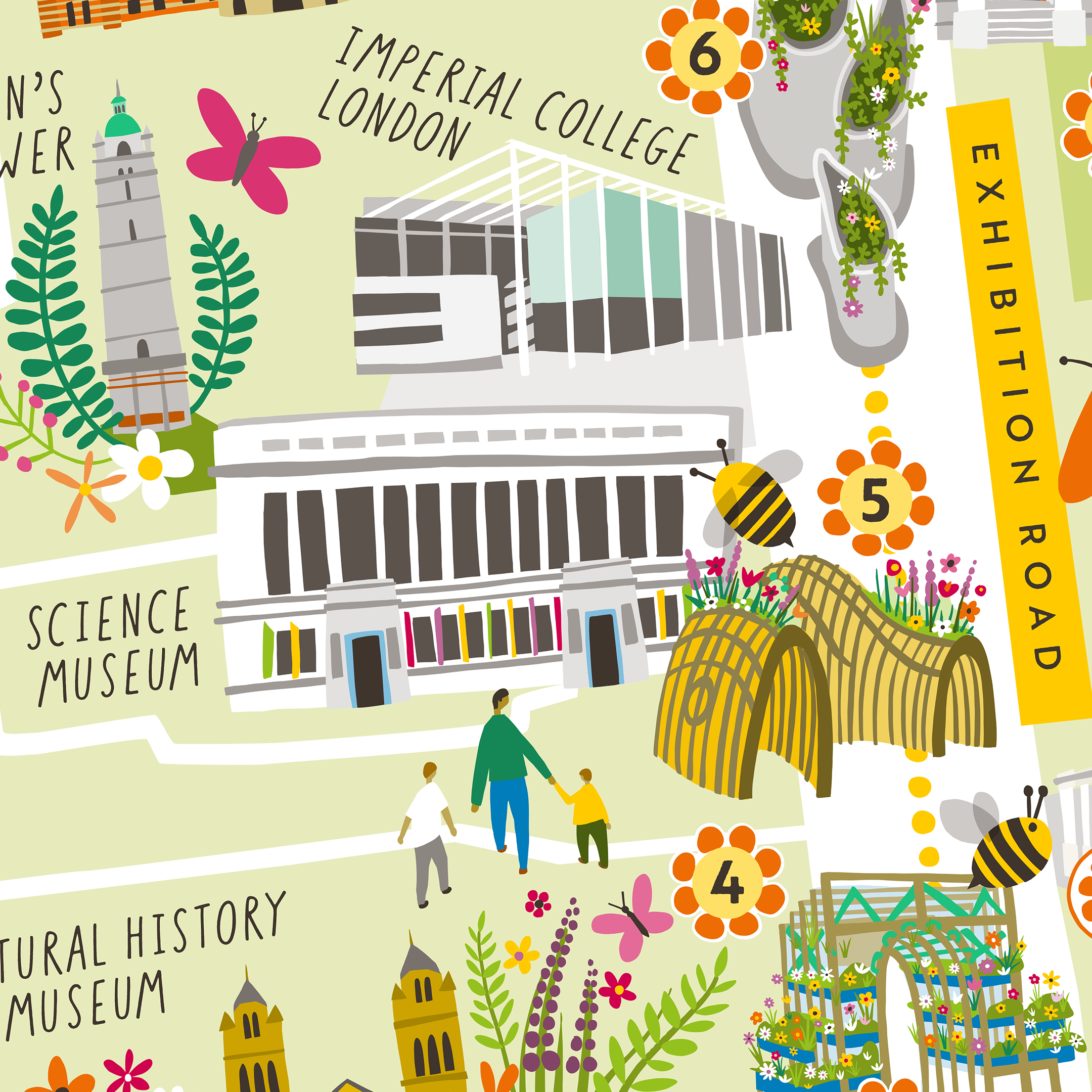
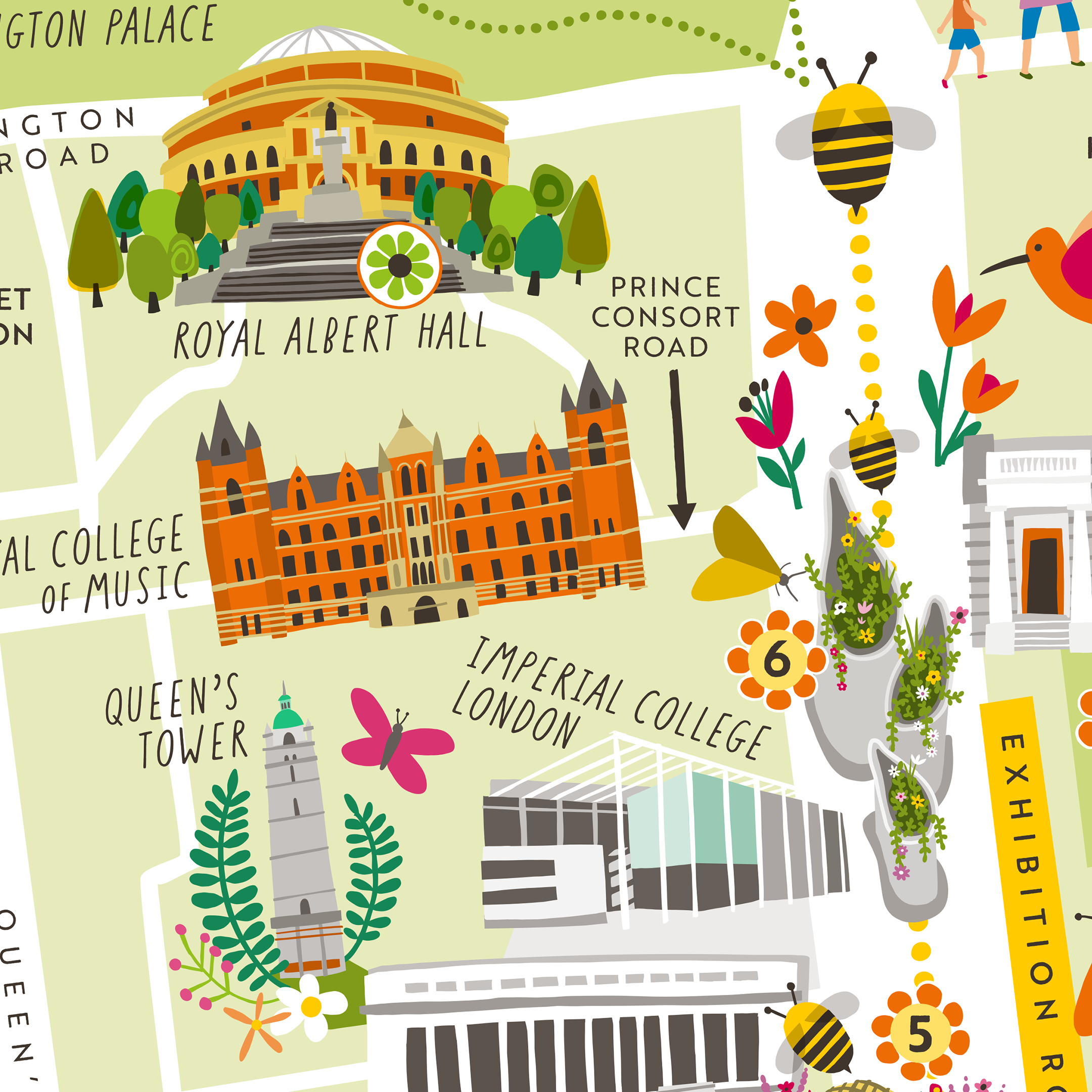
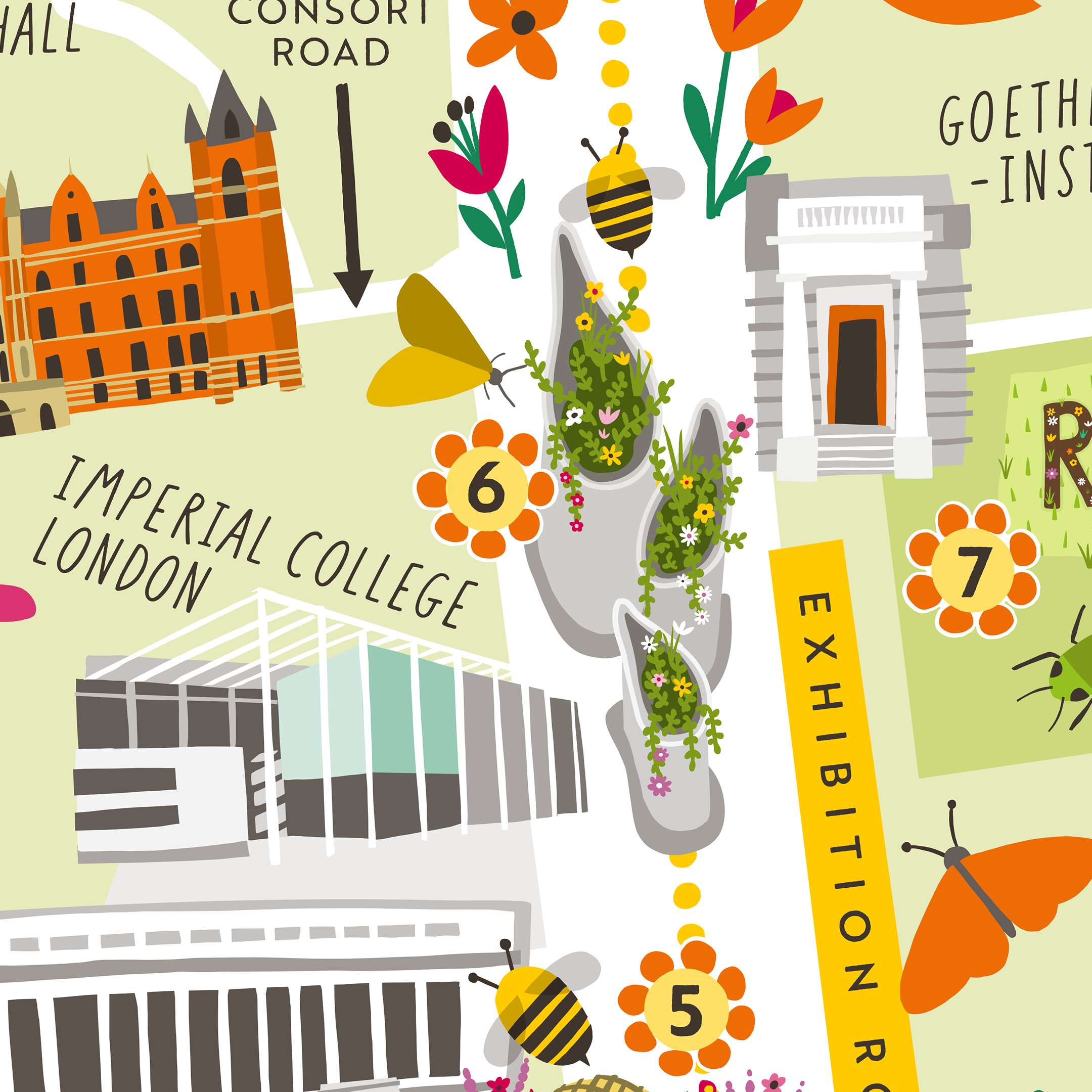
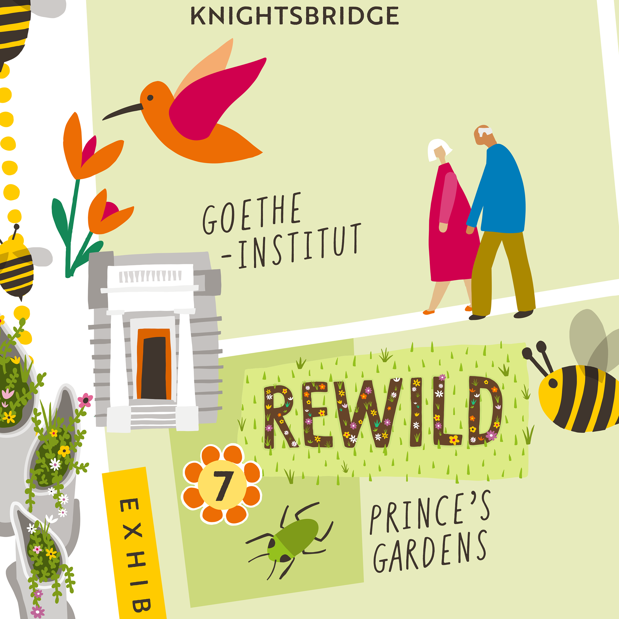
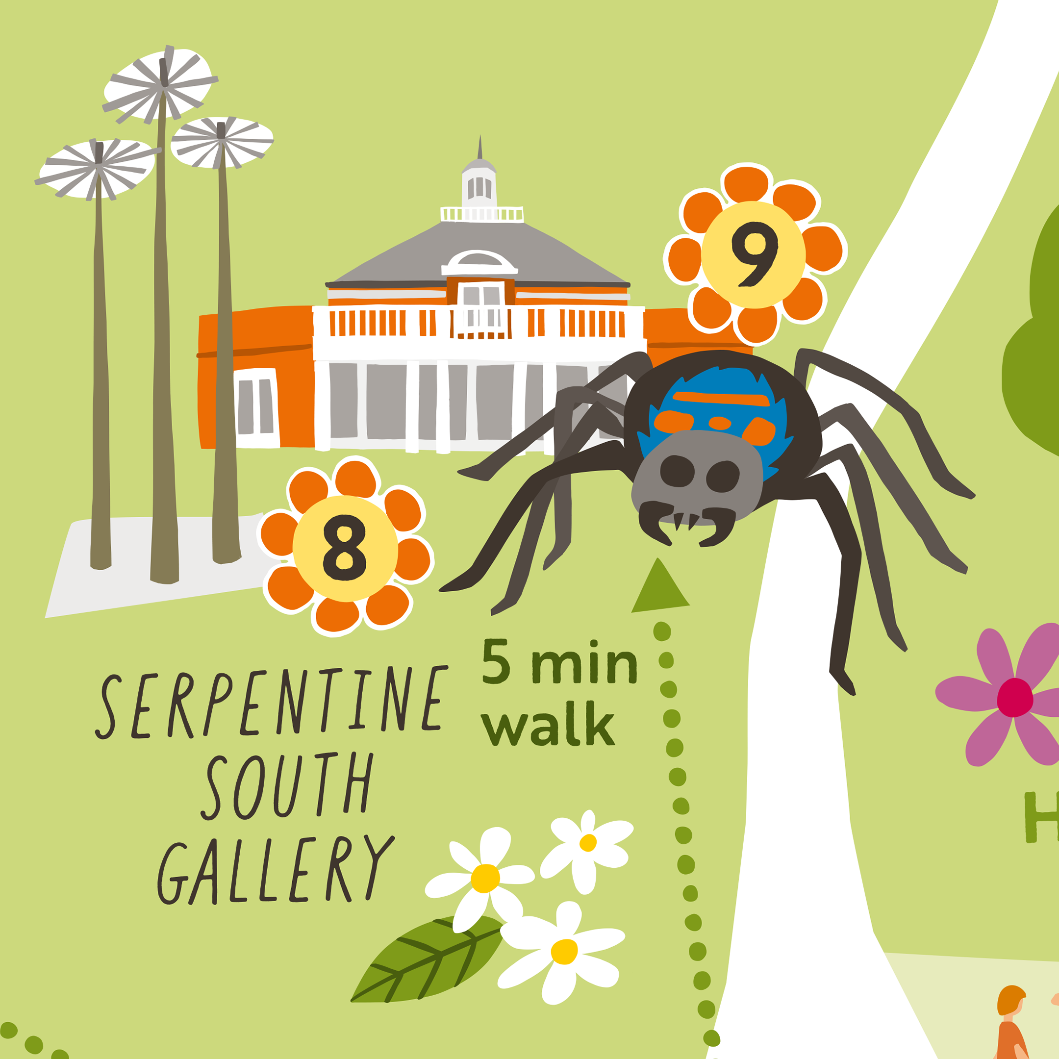
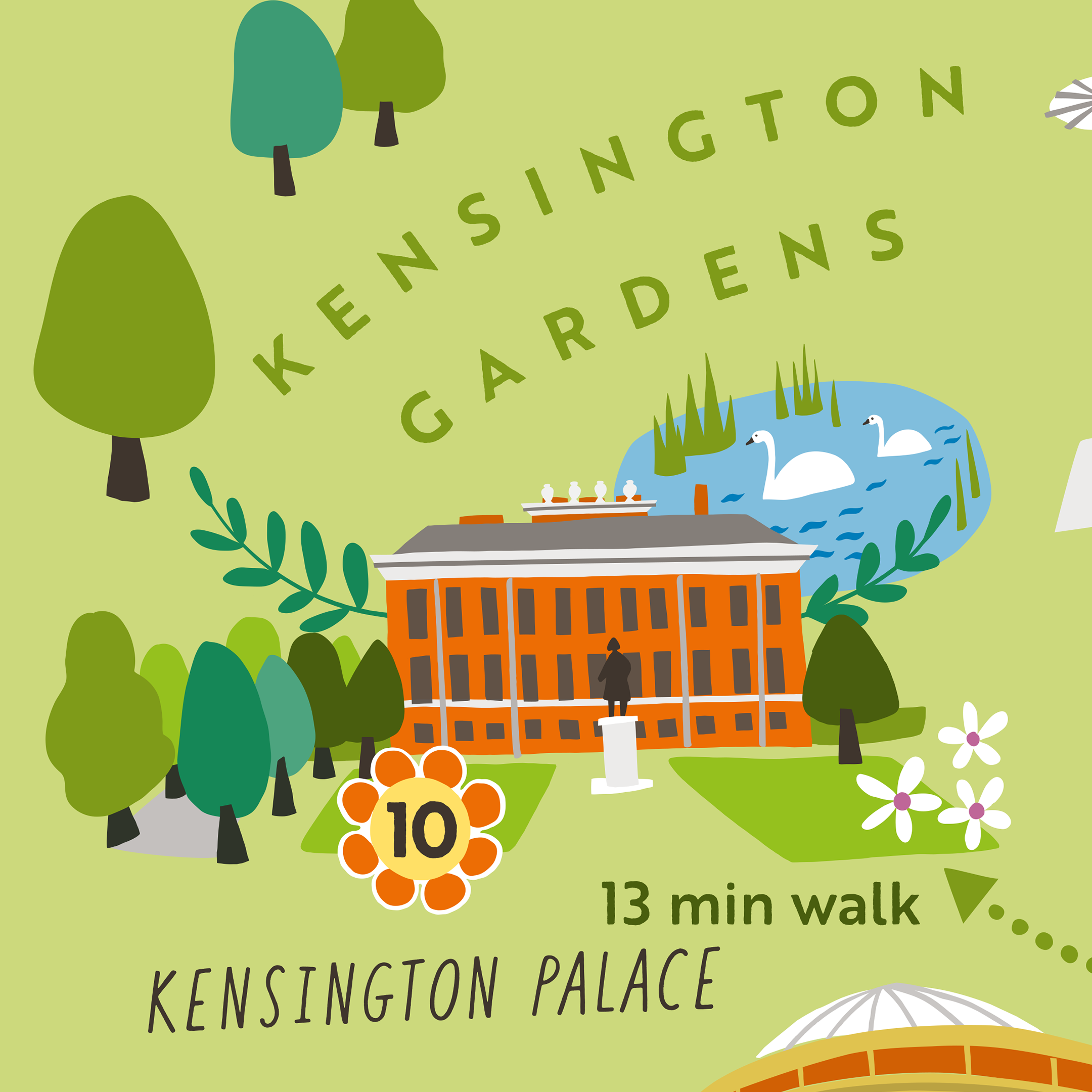
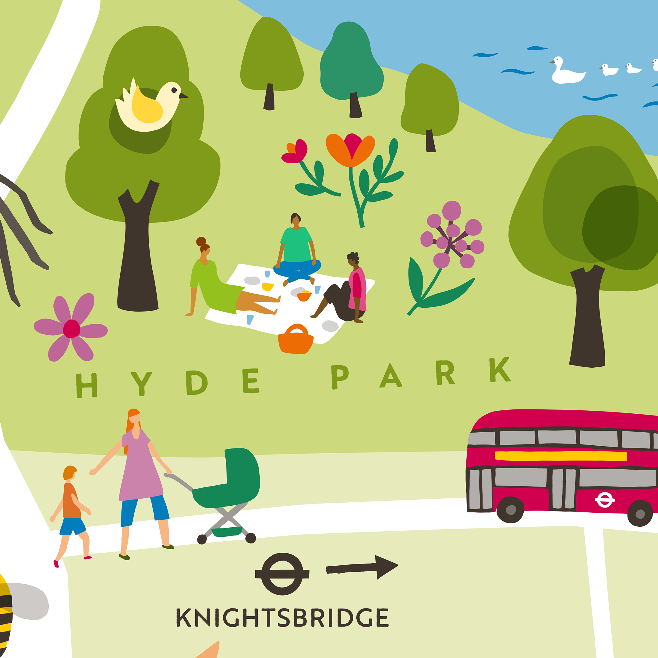
Pictured below are some close-ups of the various installations and locations along the trail - it was an absolute joy to illustrate all the iconic London buildings along with other more nature based elements…

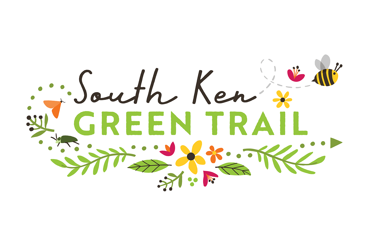
The primary version of the logo, as utilised on the map has a white background. An alternative green version was also created for variation on social media and for print applications where a colour was preferable.

The client wanted an animated version of the logo to share on social media… We worked with animator Toby Gutman of Maby Media who did a great job in bringing my logo design to life.

Process stages of creating the illustrated map
For anyone interested in the general stages I go through in creating an illustrated map, the above shows a quick visual walk through and here’s an outline:
1. Create a simple colour version of the relevant road layout, using Google Maps as reference and plot the various locations. This is essentially a master map and not necessarily focussed on the final crop.
2. Sketch the main buildings to be included as illustrations, and position them on the map as a guide. At this stage I didn’t have reference for the installations so not all the featured locations are included.
3. Work up a sample building and a couple of marker elements to show the client my proposed style.
I developed the style which included firming up the colour palette and fonts. The main colours originated from the client’s existing brand palette, but I had the freedom to add extra colours as needed. I chose fonts to suit the project.
4. Complete everything! This looks like a big jump in the process, and essentially shows how the map evolved for various reasons.
I worked up all the buildings and the other features/installations that I now had reference for, and arranged them on the map. Some of the numbers on the trail were changed/removed in line with how the trail was to be organised.
The locations in Kensington Gardens and Hyde Park are more spread out than the others, so in order for the composition to work I needed to condense these areas into a smaller space. Also the client wanted to accentuate the area around Exhibition Road as this is the main geographical focus of the trail.
The final illustration stage was populating the map with some extra nature and wildlife elements and also some people!.
The final crop was dictated by the geography of the map, and also to allow space to include the trail logo on an A4 page.
Once the map was complete, I laid out the text and information on the back.

Logo sketch
For the logo I had selected fonts I thought suitable and sketched some nature based elements to work with the type - I showed this to the client for approval, before finalising. It was requested that I add in a few more pollinators, which you can see in the final logo.
CLIENT FEEDBACK
I worked with Sarah Berresford, Marketing & Communications Manager for Discover South Kensington throughout the project. It’s always interesting for me (and hopefully for you too…?) to find out why clients choose to work with me and how they find the process. Once the trail was up and running, Sarah was kind enough to answer some feedback questions for me, here are her thoughts, which I’m really happy to share… Thanks Sarah!
How many possible illustrators did you consider initially for this project, and what was it that made you think Carys would be the best fit for you?
I considered 5 illustrators. We felt that Carys’s style matched our brief the best – modern and fun with the right balance of detail. Our tone of voice includes ‘serious fun’ – her style certainly reflects this. I liked Carys’s approach and the work examples she supplied gave us a clear idea of how our illustrated map might look. We really loved her portfolio
How did Carys’s costs compare to other quotes you received?
Very comparable to all the quotes although she offered more flexibility with copyright compared to one other illustrator
Had you worked with an illustrator before, and how did you feel about commissioning the work - were you clear about the process and what to expect or was there anything you were nervous about ?
Yes we have – we have illustrated a number of postcards. We were fairly confident about commissioning the work although the project was moving so fast, we were aware the brief might change – and it did! We were clear about the process and Carys made it very clear in terms of her process
Are you happy with the completed work Carys delivered? Is there anything you would change if doing the project again?
We are 100% happy with the completed work and really thrilled with how much content Carys has been able to include and how quickly she understood what we needed.
Have you received any feedback from the organisations you work with or members of the public relating to the trail map and logo specifically ?
We have had a lot of very positive feedback about the trail map and the illustrated logo which has been reflected in the way our members have used the assets. We have had nothing but positive feedback about our ‘beautifully illustrated trail map’
Finally, if you were to describe Carys to someone else looking to commission illustrations for a similar project what would you say?
Your project is in safe hands with Carys – she has an excellent ability to interpret the brief resulting in minimal changes and an illustration which we are all so proud of. Carys has also been incredibly fair in terms of budgets which were constrained at the start. Having changed the brief and content considerably, Carys was always incredibly accommodating and unfazed – how she managed to include everything on our illustrated map is pure magic!
- Sarah Berresford, Marketing & Communications Manager, Discover South Kensington
RELATED PROJECTS

CHERISH PROJECT | Project Graphics for an EU Funded study Investigating the impacts of climate change on coastal heritage

VALUABLE CONTENT | The Content Marketing Journey Route Map