PROJECT: ILLUSTRATED PARK MAP
CLIENT: CATTLE COUNTRY FARM PARK
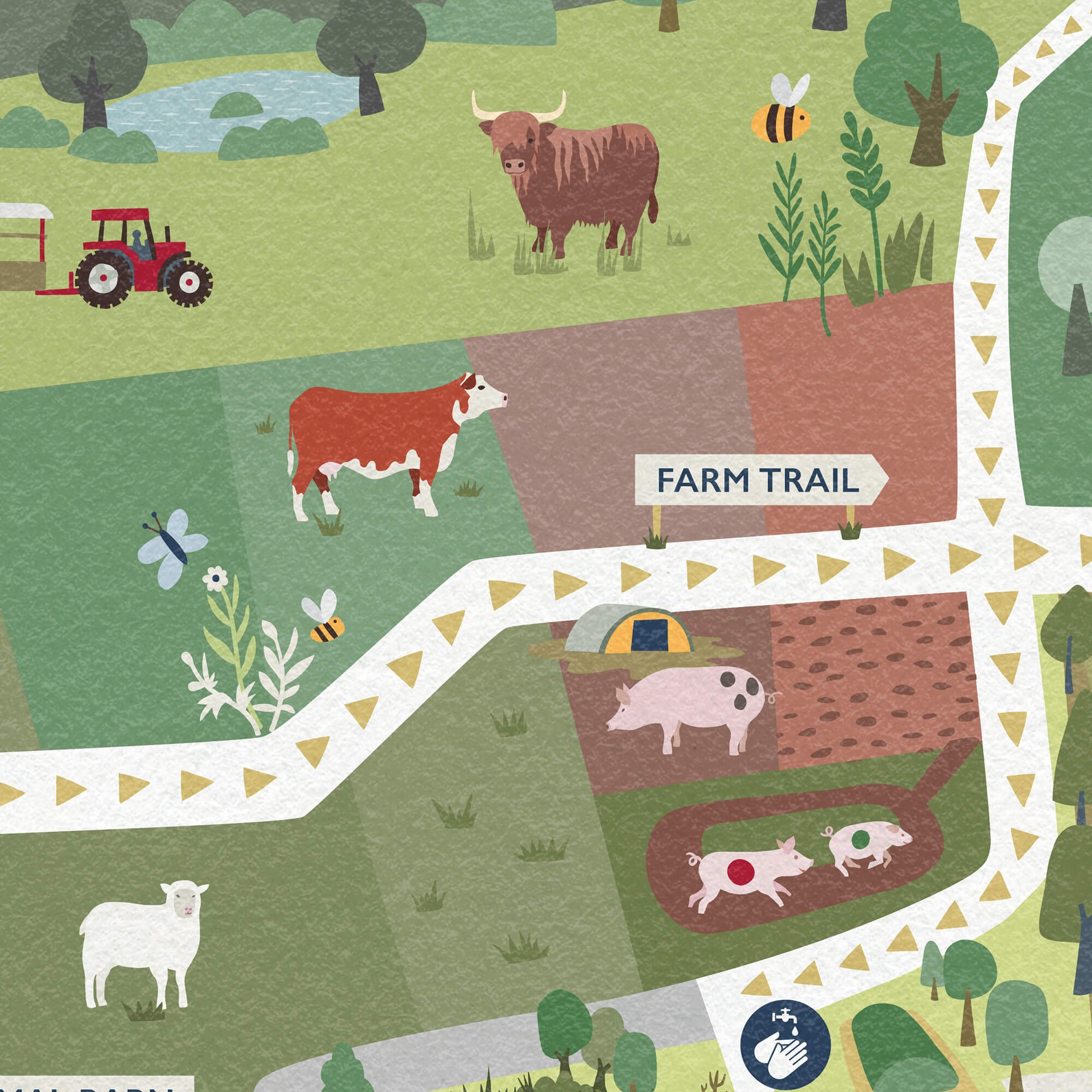
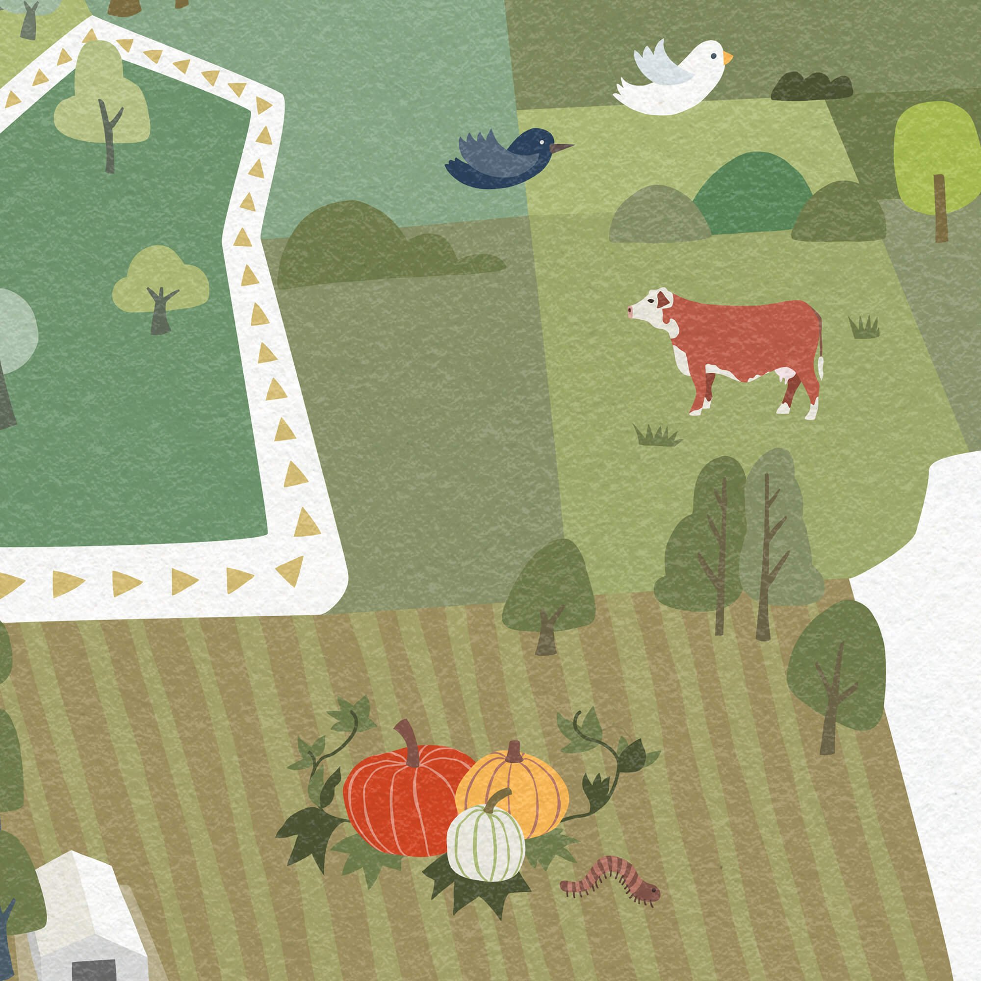
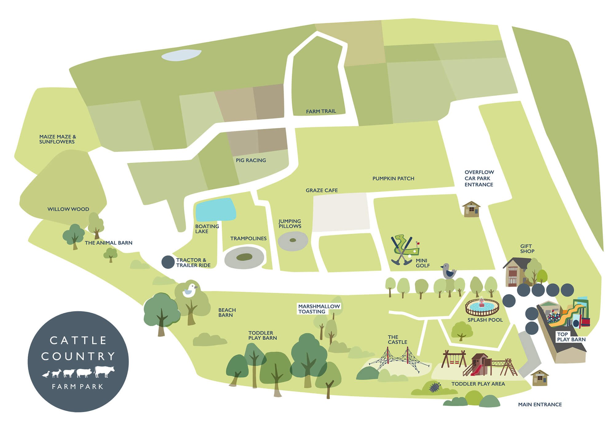
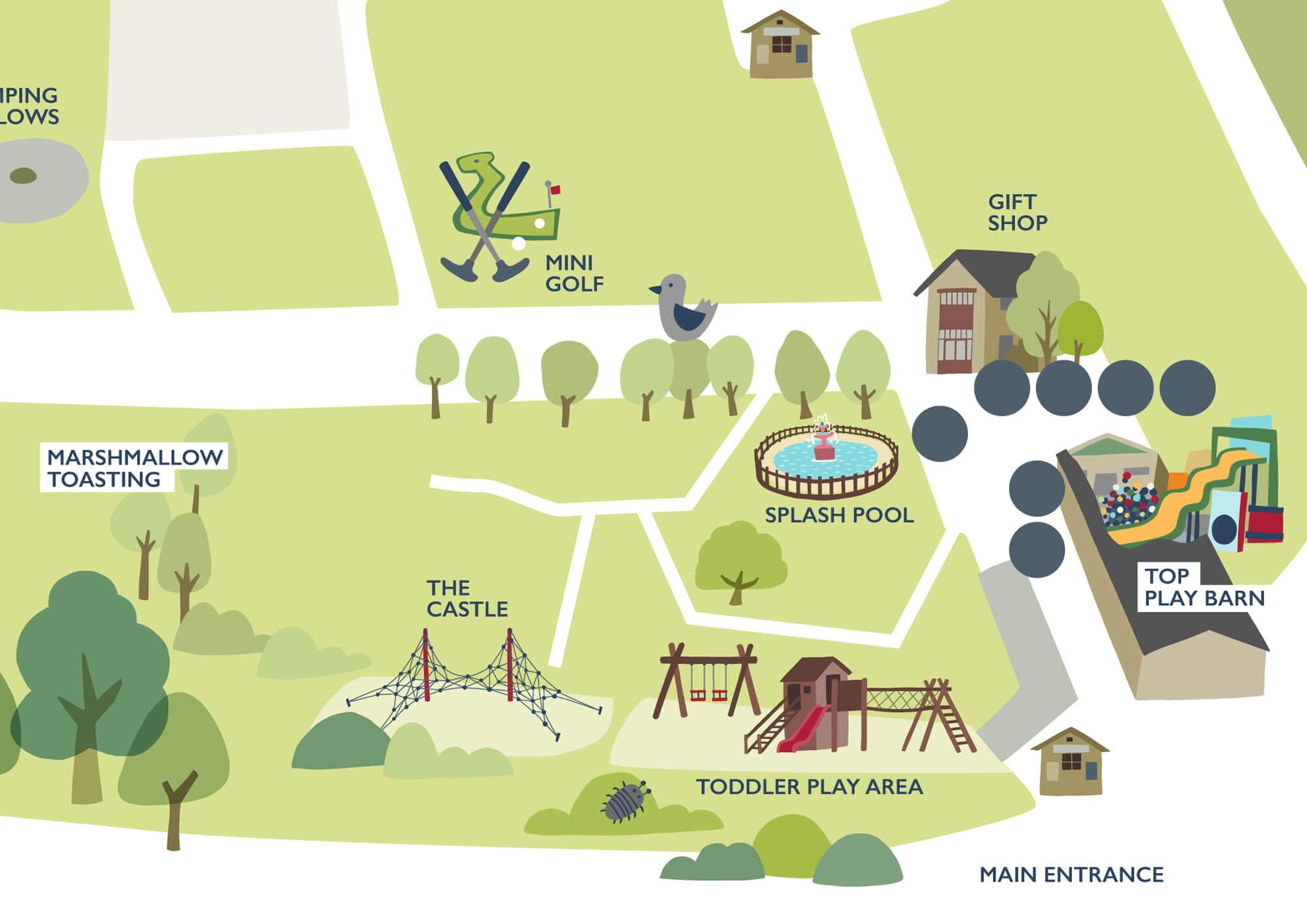
Cattle Country is a fun, farm-based family attraction based in Berkeley, Gloucestershire. It is a large site which includes a farm trail featuring rare breeds of cattle (and other animals), along with a range of indoor and outdoor play/activities.
OBJECTIVE
To create an illustrated park map which will help people navigate around Cattle Country Farm Park and plan their visit before arriving, as well as to showcase the wide range of attractions available.
The park is run with a strong focus on conservation and sustainability, so the maps won’t be printed as handout leaflets for visitors. Instead, the map will appear as large-scale signage and prints around the park, and on the Cattle Country website
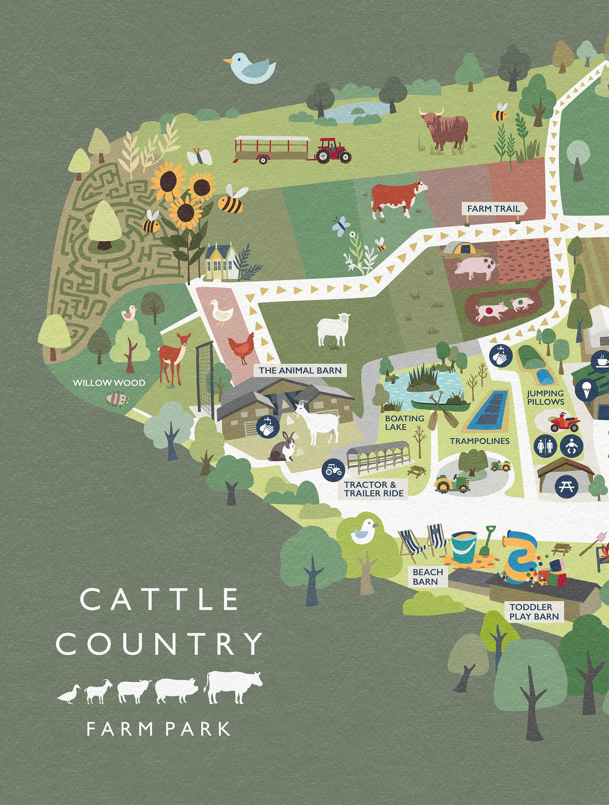
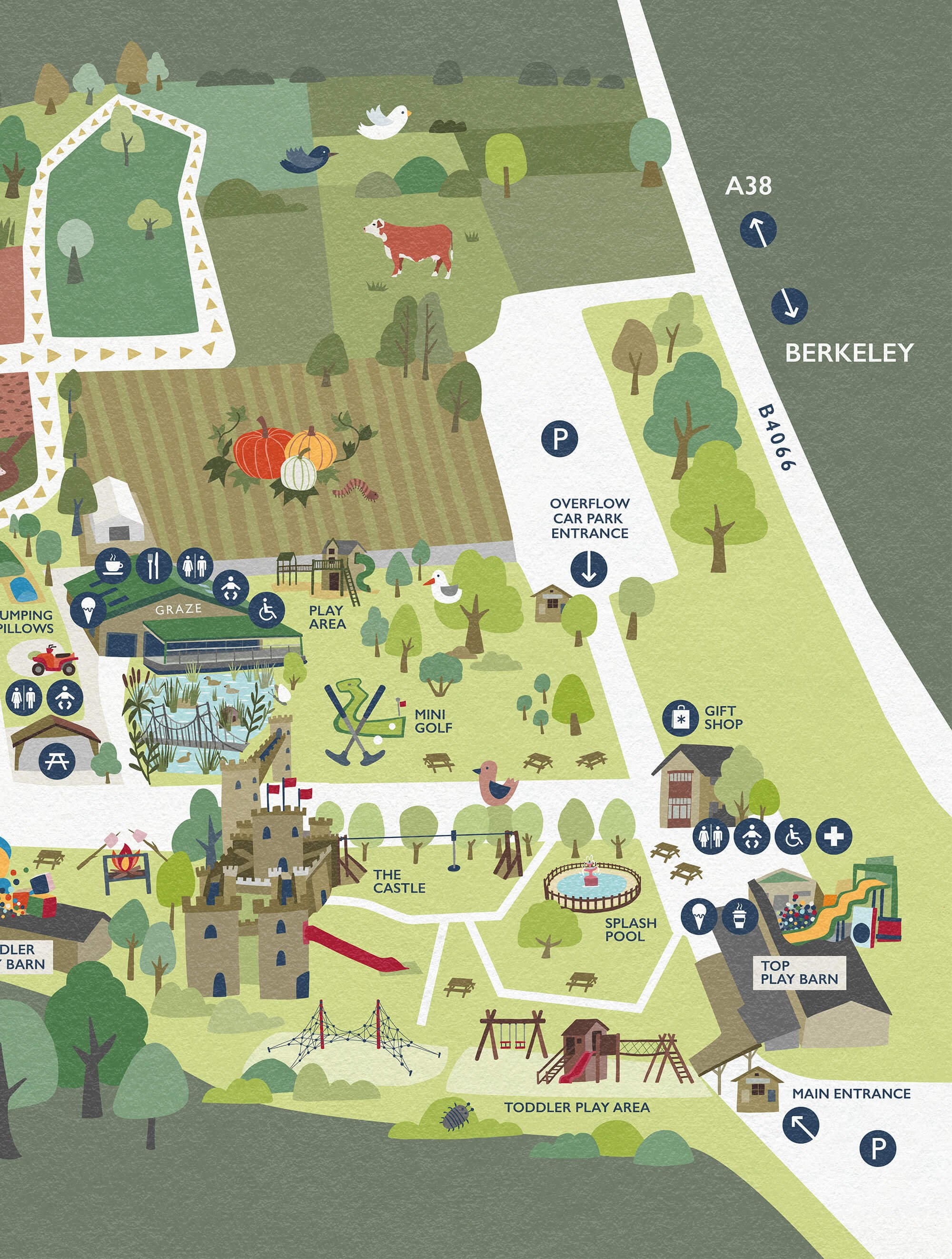
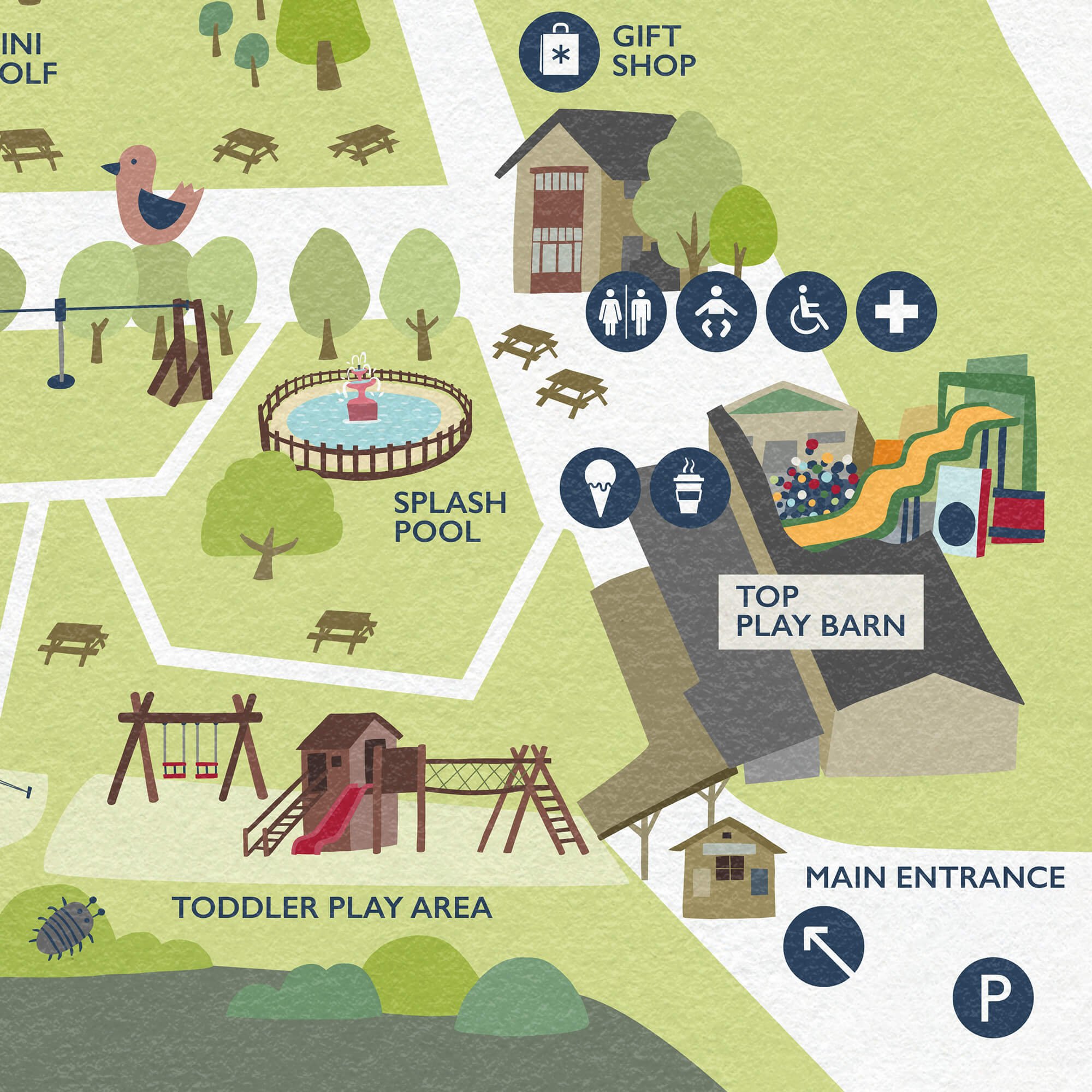
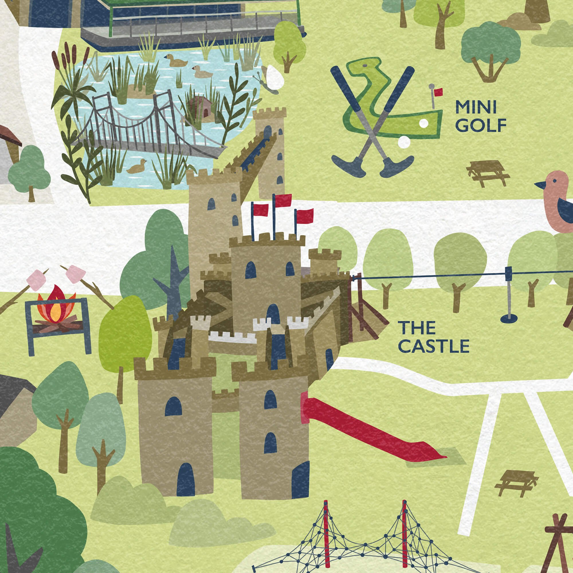
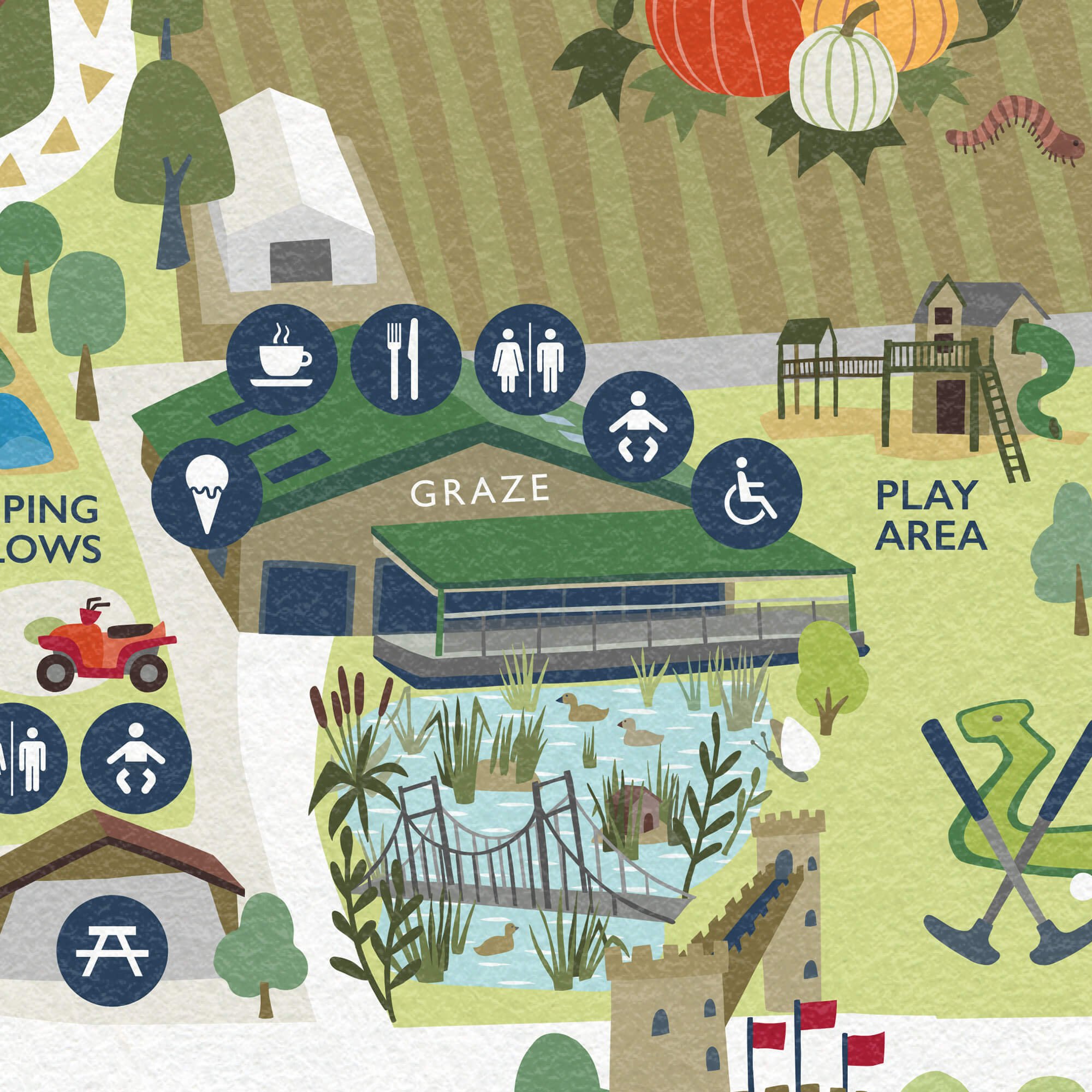
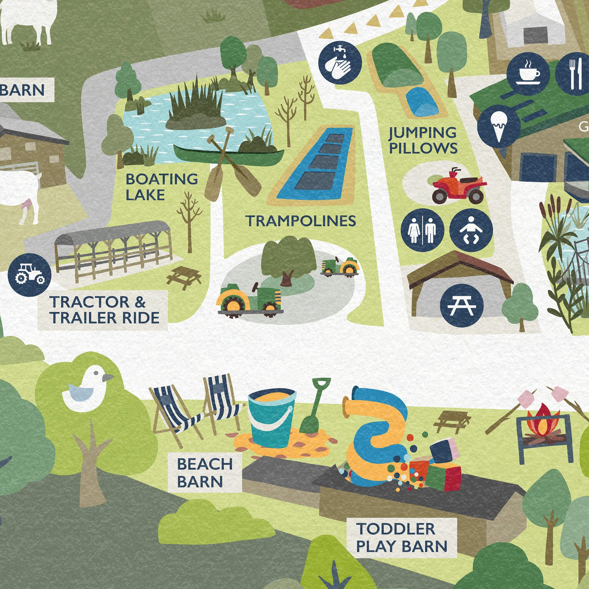
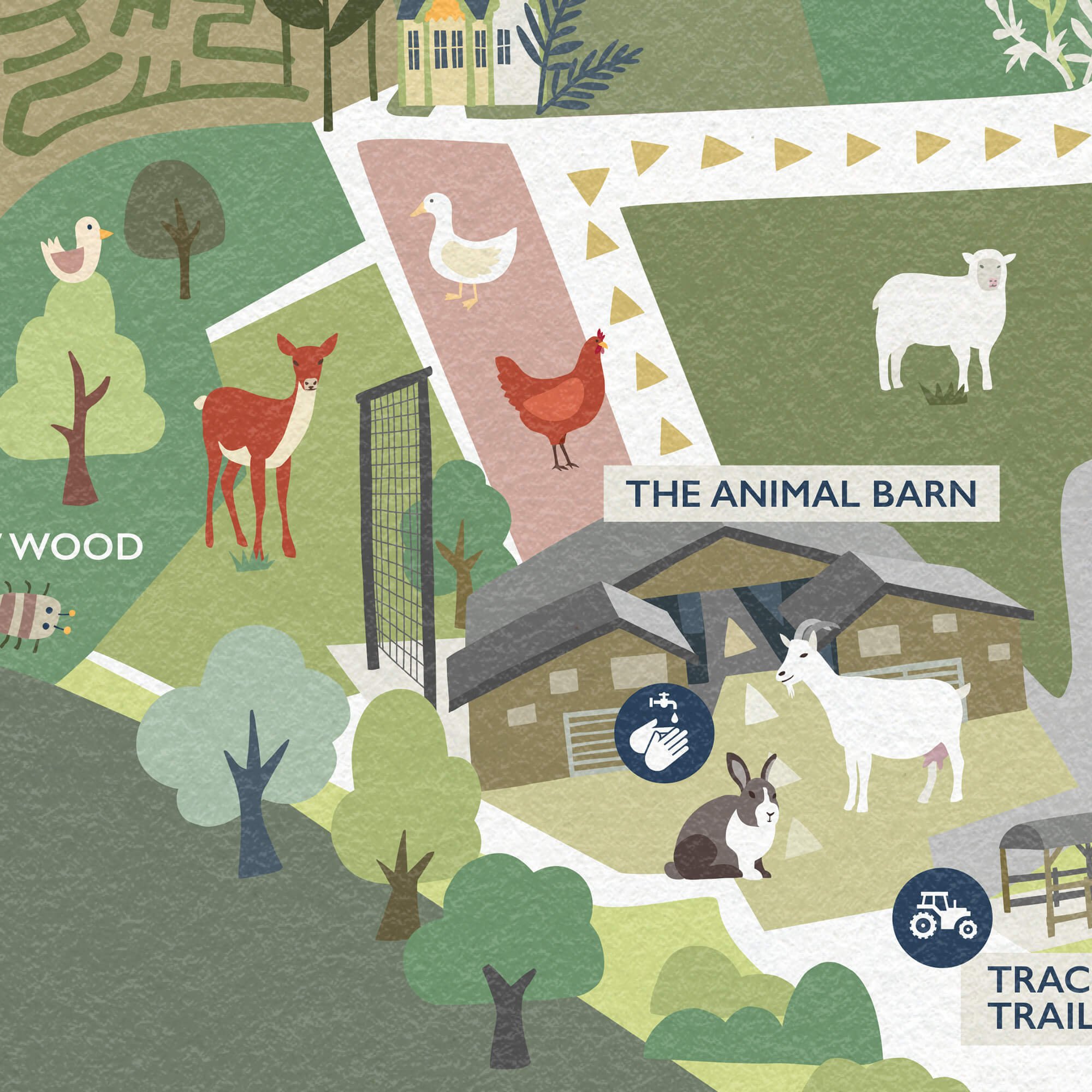
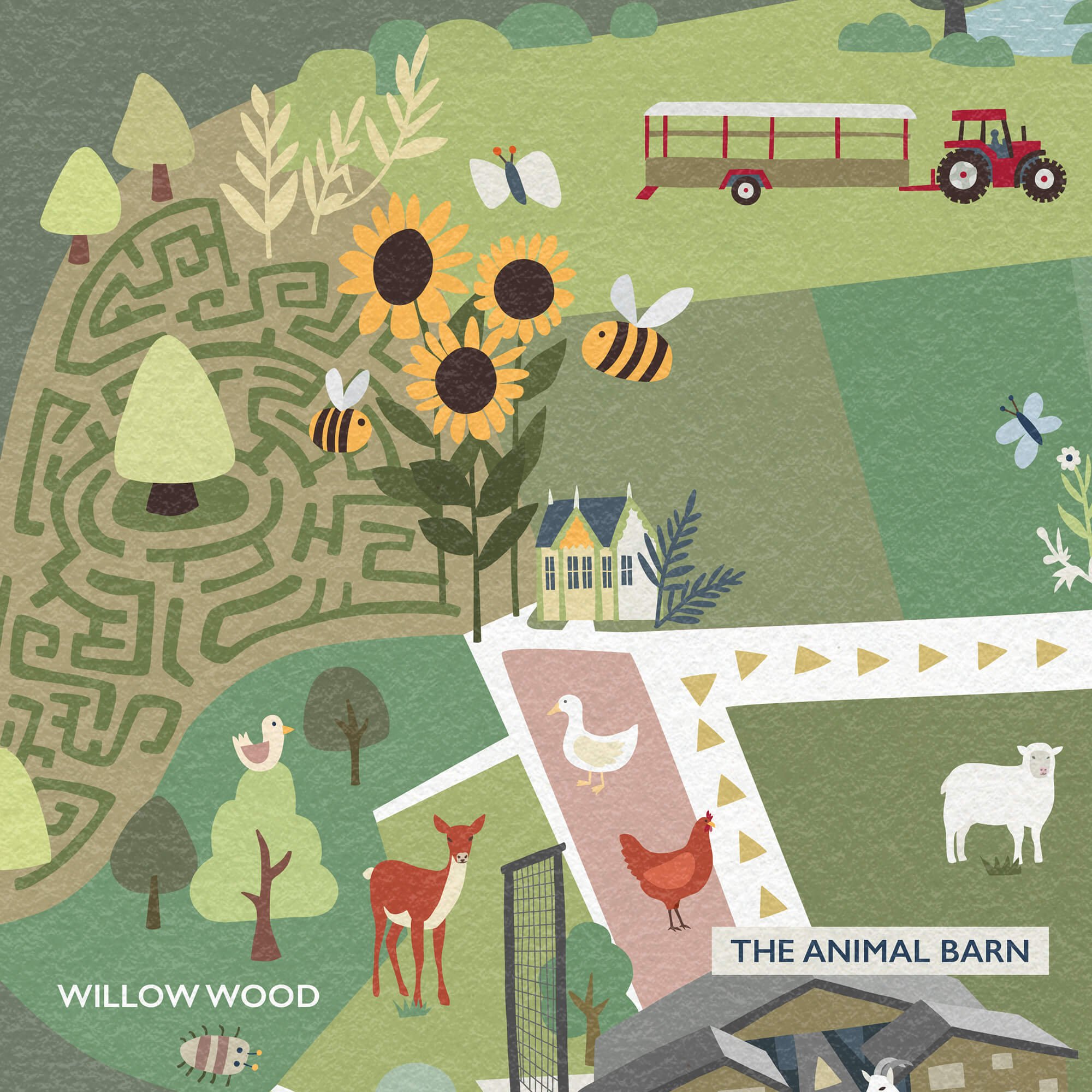
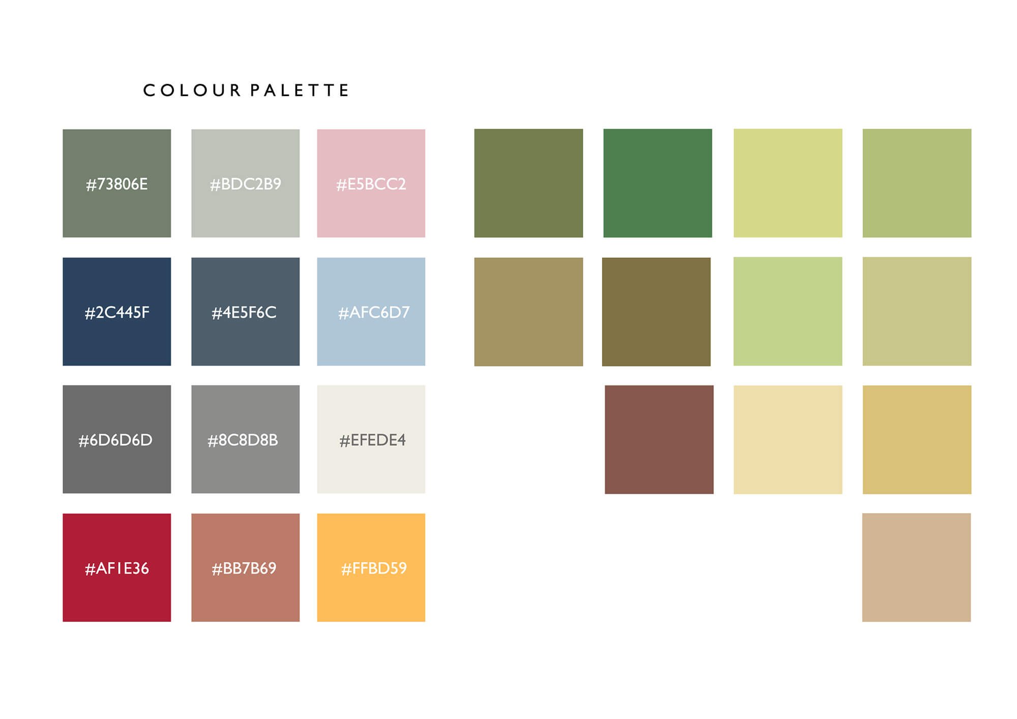
The existing Cattle Country brand included a colour palette - the colours on the left of the image below. I utilised these colours in creating the map, along with some additional colours (mainly greens) I selected to complement the brand. The park is in a rural location, surrounded by fields, so it was important to convey a sense of the outdoors and natural landscape.
PROCESS
Pictured below are the various stages I showed the client in the developing the map.
1. An initial sketch showing the proposed layout to fit with in an A-size format (location signage/prints will be A0 & A1), and placement of the various features and facility icons.
Although I had in mind the paths in the final map would be white and the areas predominantly green, at this stage I find it easier to draw the paths in as a way of helping to define the areas.
The site is quite big and geographically it doesn’t naturally sit in a horizontal format, so there was an amount of artistic licence to make the layout fit the required size and to make sure the attractions and amenities had equal prominence to the farm trail and paddock areas. And, of course, that it would make sense from a navigational point of view!
2. Work in Progress - Once the sketch had been approved, I worked up the basic map background with the areas defined and created a few of the illustrated features, to give the client more of a sense of my proposed style for the finished map. With approval on this, I continued to work on the rest of the map.
3. Subtle texture. The map has been created as vector artwork to achieve a crisp feel which is in-keeping with the existing brand and also so there would be no issues with scaling the artwork up for large scale signage. However, once complete, I wanted to give the map a more natural feel and so applied a subtle paper texture over the top, which serves to soften the map a little and take the edge off…
The image below shows what I mean - a comparison between the same image with and without the texture added… (if you can see the image closely enough on your screen/device!)
Click on the image to enlarge and see the difference more clearly!
If you wondered why some features on the map aren’t labelled… It’s because there are different seasonal versions with the relevant features labelled. For example, the Pumpkin Patch and Maize Maze aren’t year-round features - These are labelled on the appropriate seasonal map version, and will appear on the website and around the park at the relevant time.
CLIENT FEEDBACK
“ We recently rebranded Cattle Country and needed a new Park Map that reflected this, to show off all the great attractions within the park and help people to plan their visit. Carys has brought Cattle Country Farm Park to life with her illustrations - the map is exactly what I was hoping for and more! ”
- Katy Cullimore, Operations & Marketing Director
Cattle Country / Berkeley Heath Enterprises Ltd
RELATED PROJECTS

SOUTH KEN GREEN TRAIL | Logo & Illustrated trail map for Discover South Kensington

CHERISH PROJECT | Project Graphics for an EU Funded study Investigating the impacts of climate change on coastal heritage