PROJECT: VARIOUS COMMISSIONS, since 2016
CLIENT: PLANNING VENTURES
Planning Ventures are a Bristol based planning consultancy, run by Julie Laming and Lyn Jones. I have had the pleasure of working with them fairly regularly since 2016, to create a series of individual bespoke illustrations for use as printed direct mail pieces.
I always relish the opportunity for building an ongoing working relationship with my clients, and I admire Julie & Lyn for taking what I think is quite a brave and individual approach to their marketing materials. They have opted to do things differently and value commissioning custom artworks which aren’t in a prescriptive/set style - a move that sets them apart and I believe helps them stand out in their industry, which can generally be quite straight & conventional.
OBJECTIVE
Planning Ventures send out printed mailers to their clients typically twice a year - a Christmas card, and a postcard-sized invite to a summer drinks event. There is always an agreed theme - often quite open and up to me to develop - and a general directive to include colours from the existing brand palette (not necessarily in isolation).
Pictured below are the designs I have created for Planning Ventures to date. Essentially each one is a stand alone piece, but it’s interesting to see that although they have been created at different times, with different briefs, they sit together pretty well as a set because of their brand colour palette being used throughout.
The most recent design is at the top, and then working back as you scroll down…
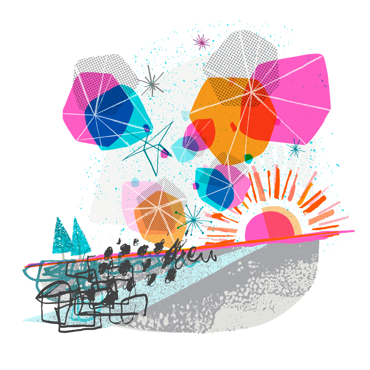
‘Hope’ - A New Year’s Card, 2024. Printed with fluorescent pink, silver and CMYK inks by WithPrint
The brief for ‘Hope’ stemmed from an initial Winter Solstice theme, developing into something that celebrated the turning of the year, and returning light. We agreed that instead of a Christmas card, the card would be sent out in early January to bring a bit of colour and joy… who doesn’t like getting something nice in the post on a grey, dismal day in January?

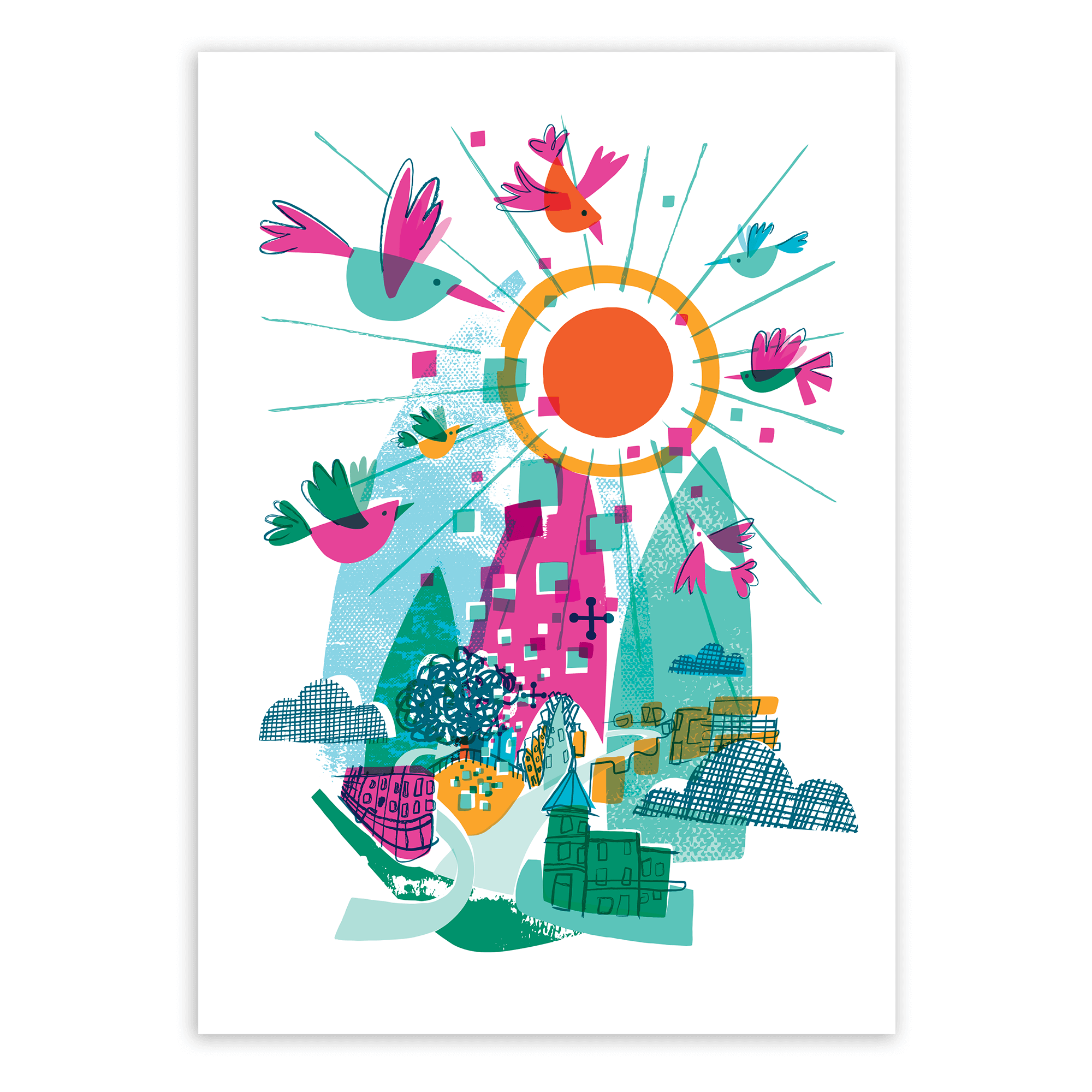
‘Reunited” - Drinks Invite, 2022. A return to the annual drinks event, after missing a few through the Covid pandemic
In 2022, the event was held at The Mount Without (@themountwithout_events) which is a newly converted grade II listed church - now a creative/event space - situated at the bottom of St Michael’s Hill in Bristol city centre.
Although pretty central, the location is quite tucked away and so the church can be easily missed! My illustration makes reference to the roads and buildings around the church at the bottom of St Michael’s Hill, with abstract shapes derived from the stained glass windows and other architectural details… all combined with a joyous set of colourful birds, flocking back together!

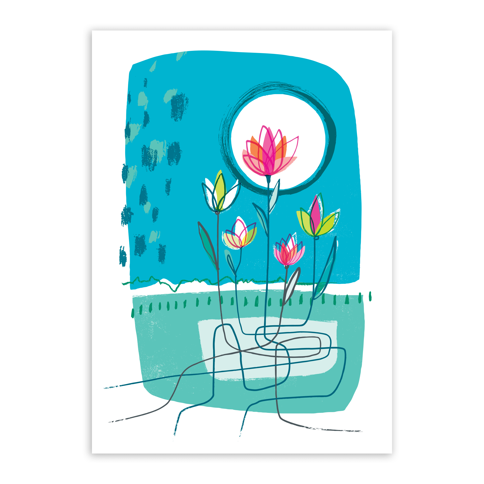
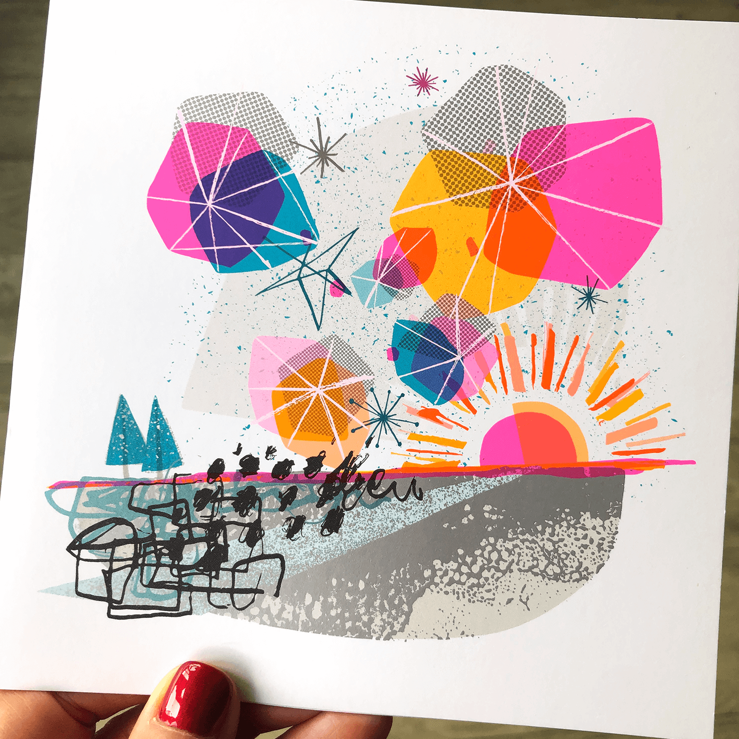
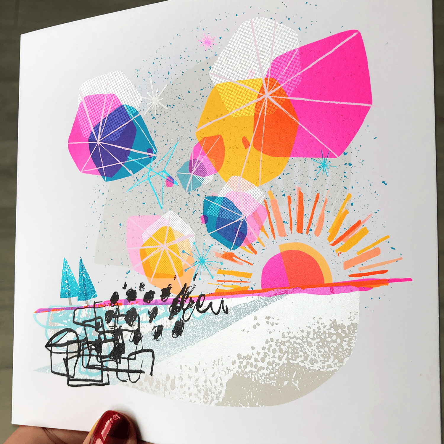
‘Futures Entwined’ - Postcard mailer, 2020. Sent to clients in the absence of annual end-of-summer drinks, due to COVID-19

Postcard mailer, front & back
The latest illustration ‘Futures Entwined’ was created for a postcard mailer to be sent out, instead of what would’ve been an end-of summer drinks invite. (It’s September 2020, and the COVID situation means drinks events aren’t really possible!)
The idea was to create something that felt more like a little, personal note - just to say hi, and keep in touch with clients/friends who hadn’t been able to meet as usual. The illustration concept originated from the idea of individual paths crossing, and that when they do, good things can flourish - A suitably positive and bright image, with an an abstract, but forward looking vision to beyond COVID…
To make this illustration, I created various elements by hand, using ink, general mark-making and cut paper shapes, which I then utilised digitally to work up the final piece. I enjoy working this way as it allows for flexibility, but it also means the work intrinsically has an organic and handcrafted feel.


The card was printed on a velvet laminated Lux stock at a heavyweight 810gsm - a triple layered card with striking bright pink coloured core running through the centre, specially selected to complement the illustration and brand colours. A previous invite had been printed on the same stock, which had since become a favourite for the client as it has a nice, quality feel.
And previous designs created for Planning Ventures….

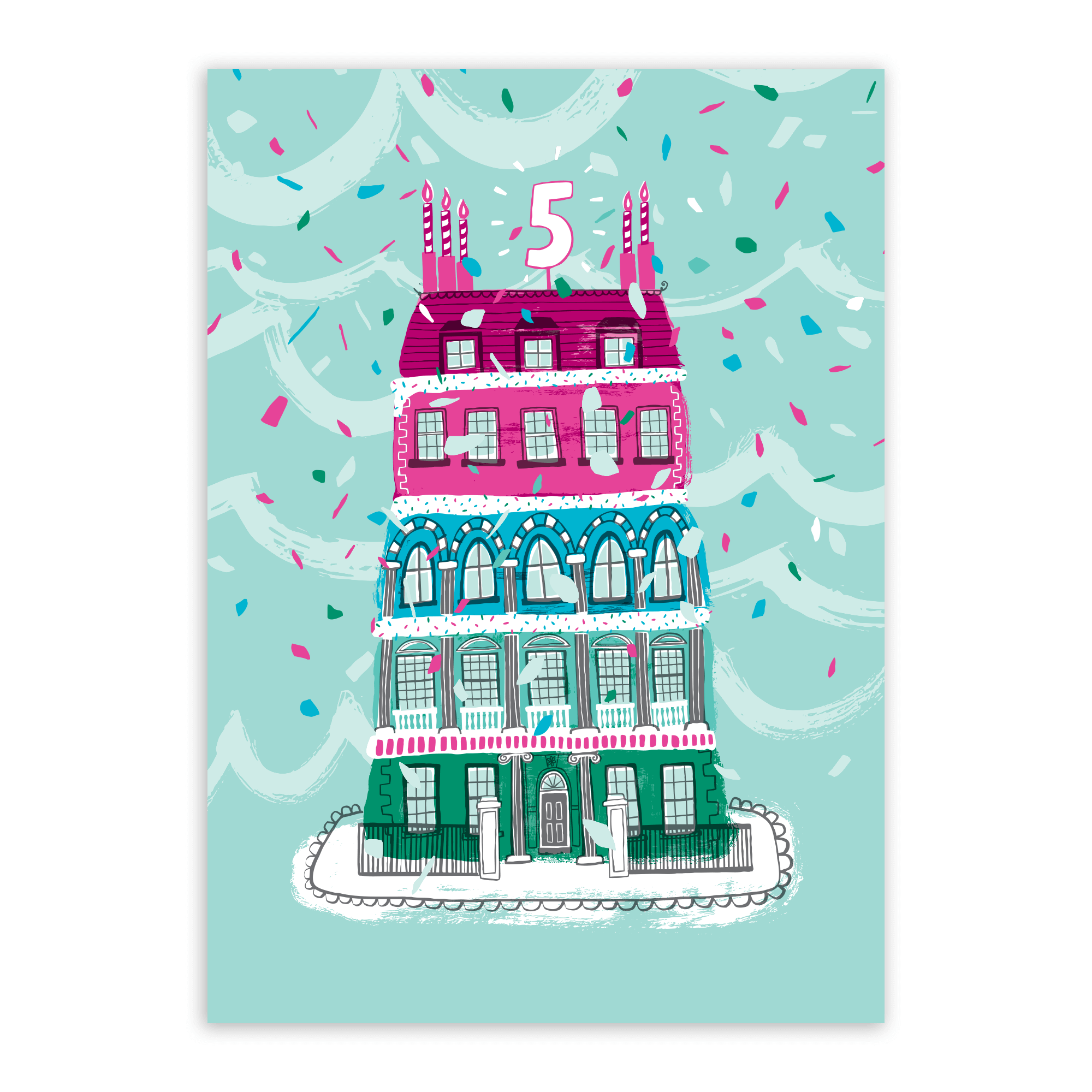
‘Rainbow Cake’ - Planning Ventures 5th Birthday drinks invite
‘Starry, Starry Night’ - Christmas card 2018
Th ‘Starry Starry Night ‘ design stands out as being different from the others, in that the design wasn’t strictly rooted to the PV colours, mainly because of the nature of the theme. It was printed on a deep blue stock in CMKY and white ink, with the resulting card having quite a tactile feel.
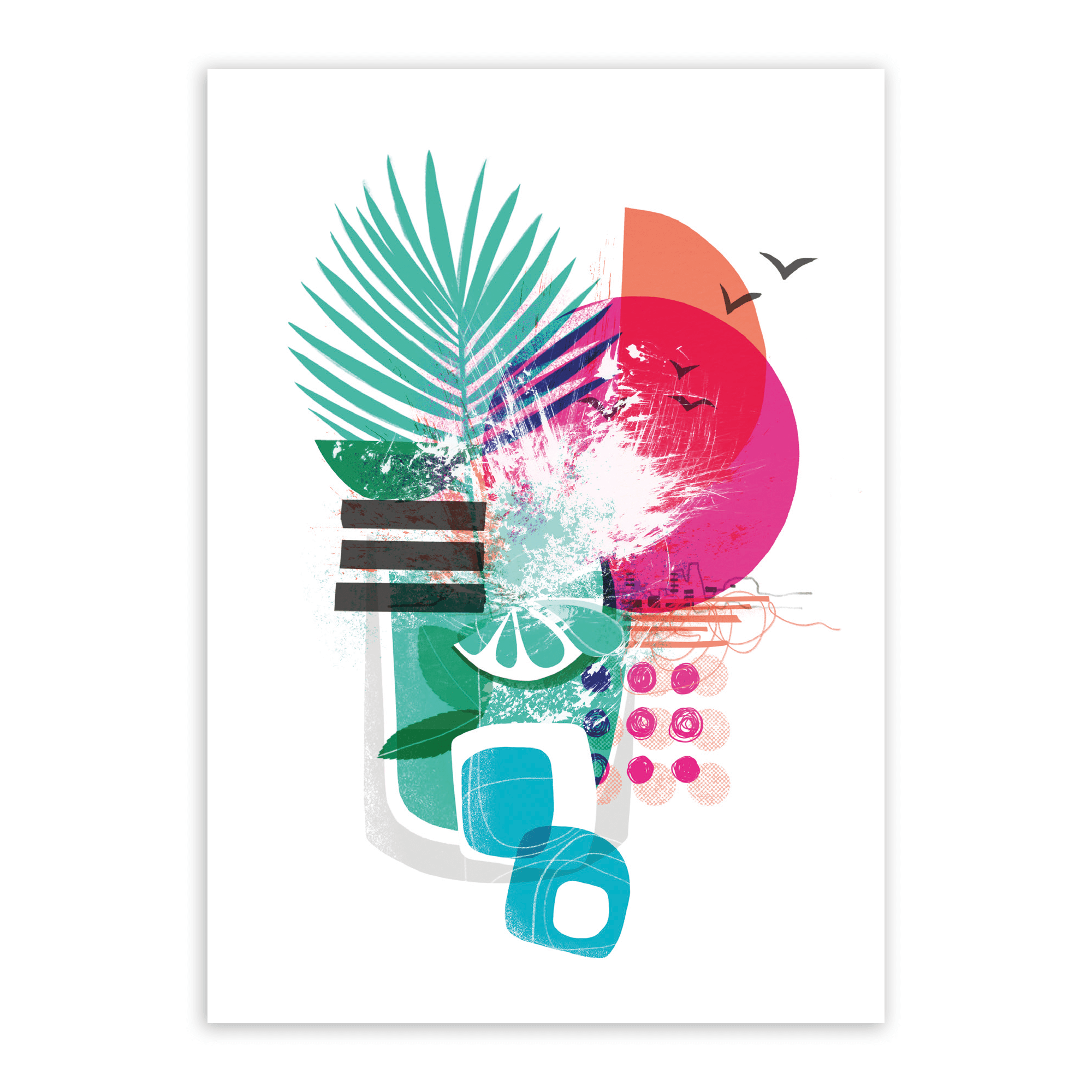
‘Summer Splash’ - Drinks event invite
Drinks event invite, back
Again, this invite was printed A6 size on velvet laminated, triple layered Lux card stock with a bright pink coloured core running through the centre, to tie in with the brand colours.


A little bit about process: The Summer Splash piece was created on an iPad Pro using Procreate, pulling in elements I created by hand and photographed. I love working like this as I enjoy bringing real texture and energy into my illustrations through analogue techniques, the resulting image can feel graphic without being too ‘computery’. This approach has followed through into most of the other pieces I have created for Planning Ventures, although some have been worked up in Illustrator, rather than using Procreate.

‘Skater Girl’ - Christmas card, 2017

‘Skater Girl’ - Full illustration, to wrap around front & back of the card
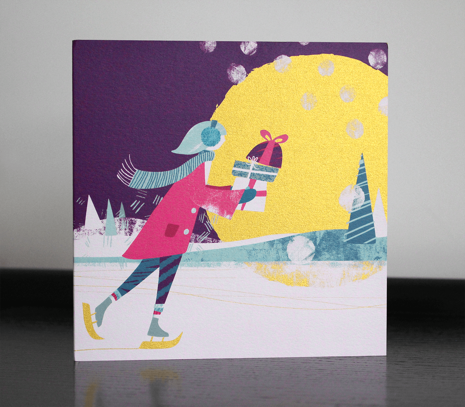
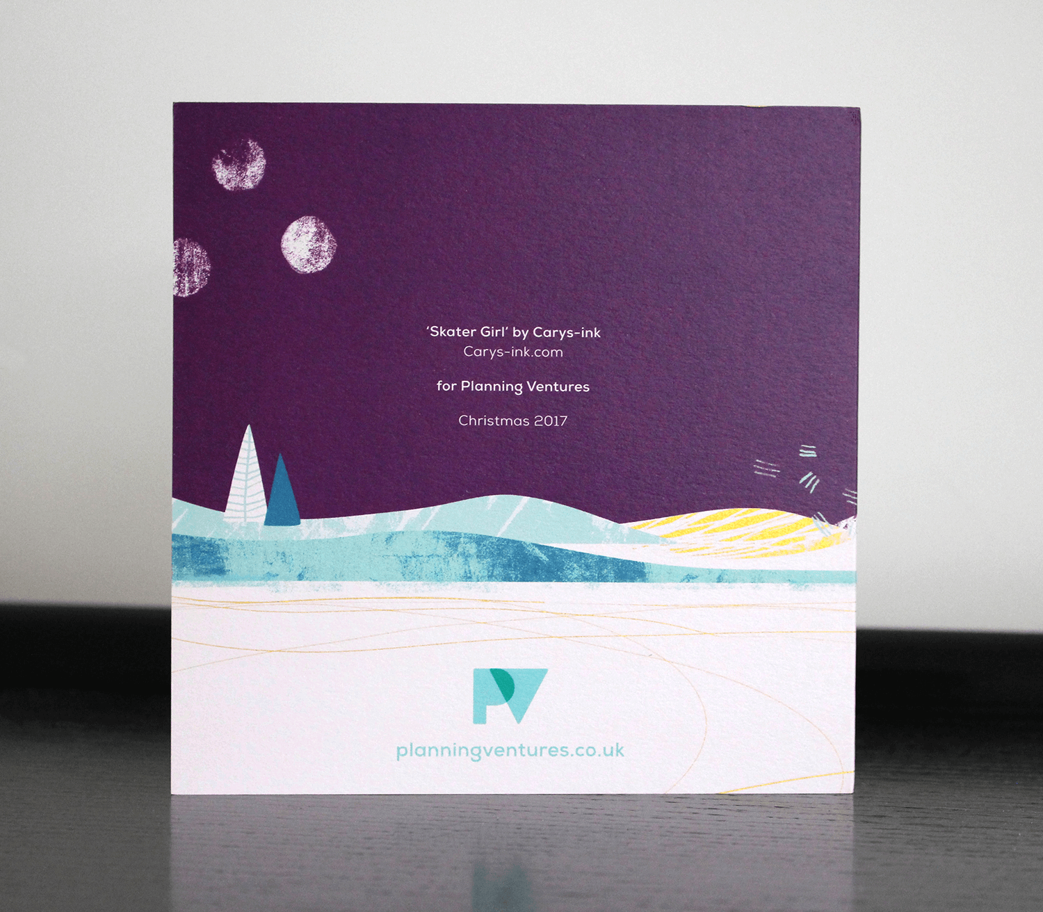
↑ This card was printed with white and colour inks onto Arjowiggins Curious Metallics Super Gold stock by With-Print

Christmas Card 2016

↑ This was the first illustration I created for Planning Ventures, back in 2016. As planners working on a wide range of building, development and regeneration projects, Jules & Lyn have a very strong interest in architecture and commissioned me to create a Christmas card design/illustration which would incorporate some of their favourite Bristol buildings and landmarks, ranging from the well-known to the more obscure (...If you’re interested in the buildings/landmarks referenced in the illustration, take a look here)
For a more festive feel, this design was printed on a slightly shimmery white card stock, so the whole image (particularly the white areas) had a subtle ‘frosty sparkle’!

Planning Ventures brand and colour palette
CLIENT FEEDBACK
"Gorgeous work as always! We really love working with you and value your input and the beautiful artwork that you create for us. Investment in great design adds so much to a business not just in terms of brand awareness but an appreciation of beauty, collaboration and the creative expression of others. Thanks as always Carys ”
- Julie Laming | Director, Planning Ventures
RELATED PROJECTS

BSUH NHS TRUST ART & WAYFINDING | Series of large scale mural artworks for Brighton’s new Royal Sussex County Hospital

BREATHE MAGAZINE | Editorial illustration