PROJECT: ART & WAYFINDING PROJECT
CLIENT: BRIGHTON & SUSSEX UNIVERSITY HOSPITALS NHS TRUST
The Art & Wayfinding project is part of CONNECT, the ambitious public art programme for University Hospitals Sussex NHS Foundation Trust’s Louisa Martindale Building, unveiled when the new building, part of the Royal Sussex County Hospital, opened in June 2023.
13 artists had been commissioned by Willis Newson on behalf of Brighton and Sussex University Hospitals NHS Trust, to create artworks that would be produced as large-scale feature wall prints and placed at key junctions to aid wayfinding around the redevelopment of Brighton’s Royal Sussex County Hospital.
OBJECTIVE
The aim of the project is to use large scale mural artwork, themed around recognisable Brighton and Sussex landmarks/locations to help patients and visitors navigate their way around the new Royal Sussex County Hospital in Brighton. I was one of the 13 artists/illustrators commissioned to be involved in the project, with each of us being set specific locations on which to base our work.
The hospital is designed around 3 main lift/stair cores, which lead to the various different medical areas and departments. Each lift core has a designated theme and colour palette to help define that section of the hospital. The themes are: Town (which includes Brighton & Hove), Sussex and Coastal.
My brief was to create 6 mural art pieces to reflect 3 locations in the Town core (so 2 designs for each location), and as they are in the same core, all these designs use the same colour palette. These are the locations that were assigned to me:
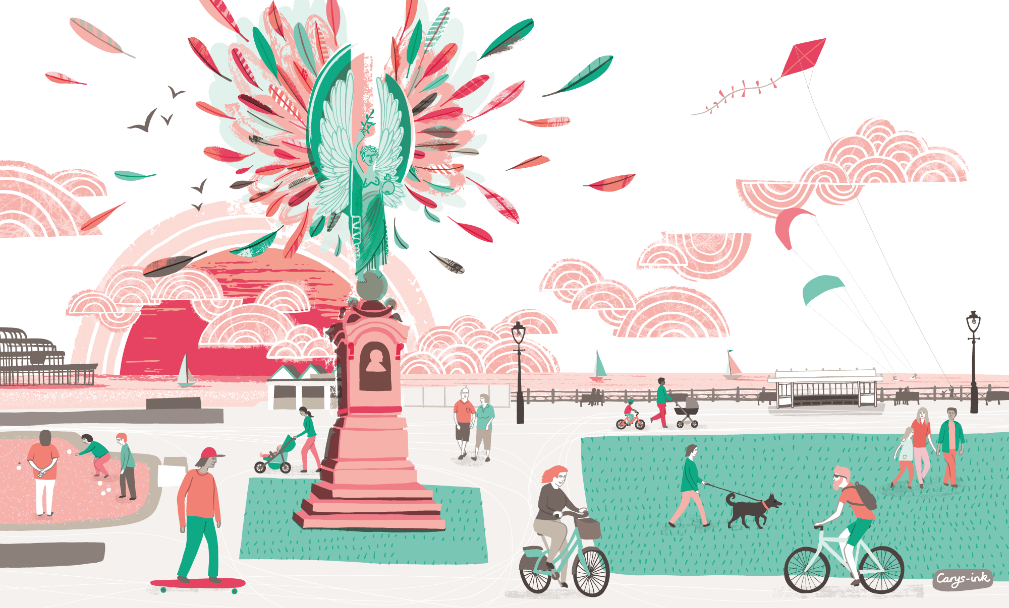
• Brighton’s Peace Statue - 2 x full height wall designs
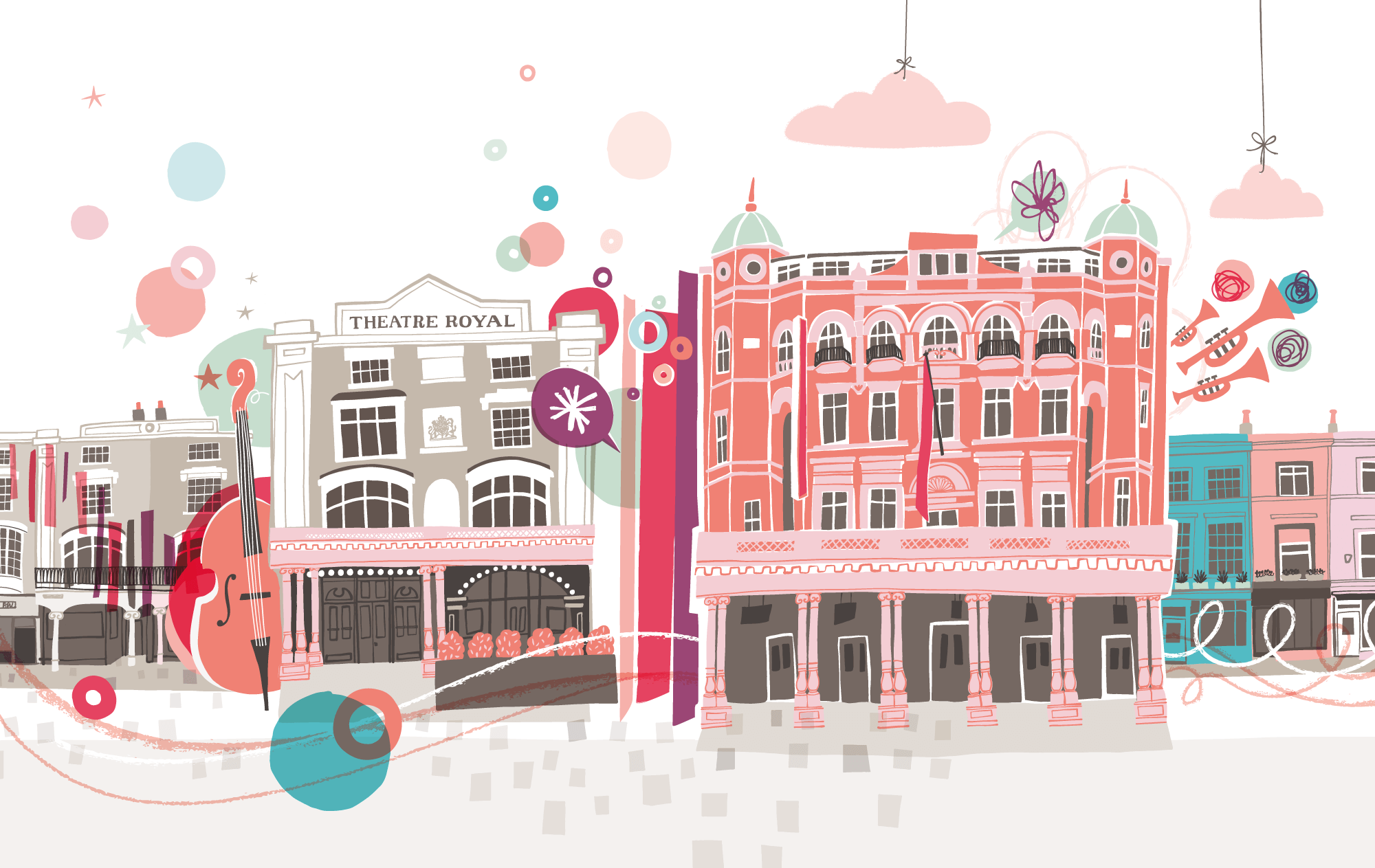
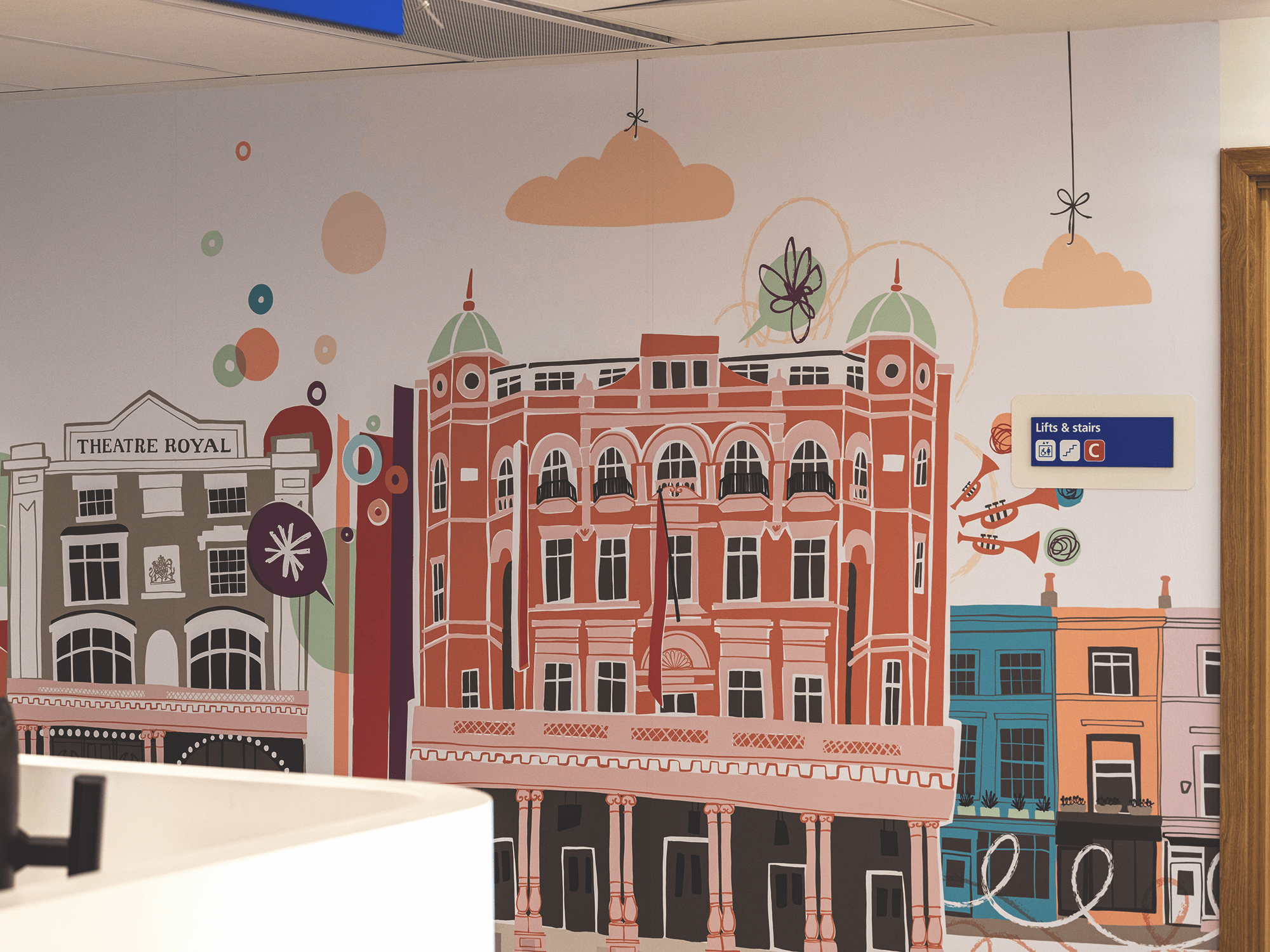
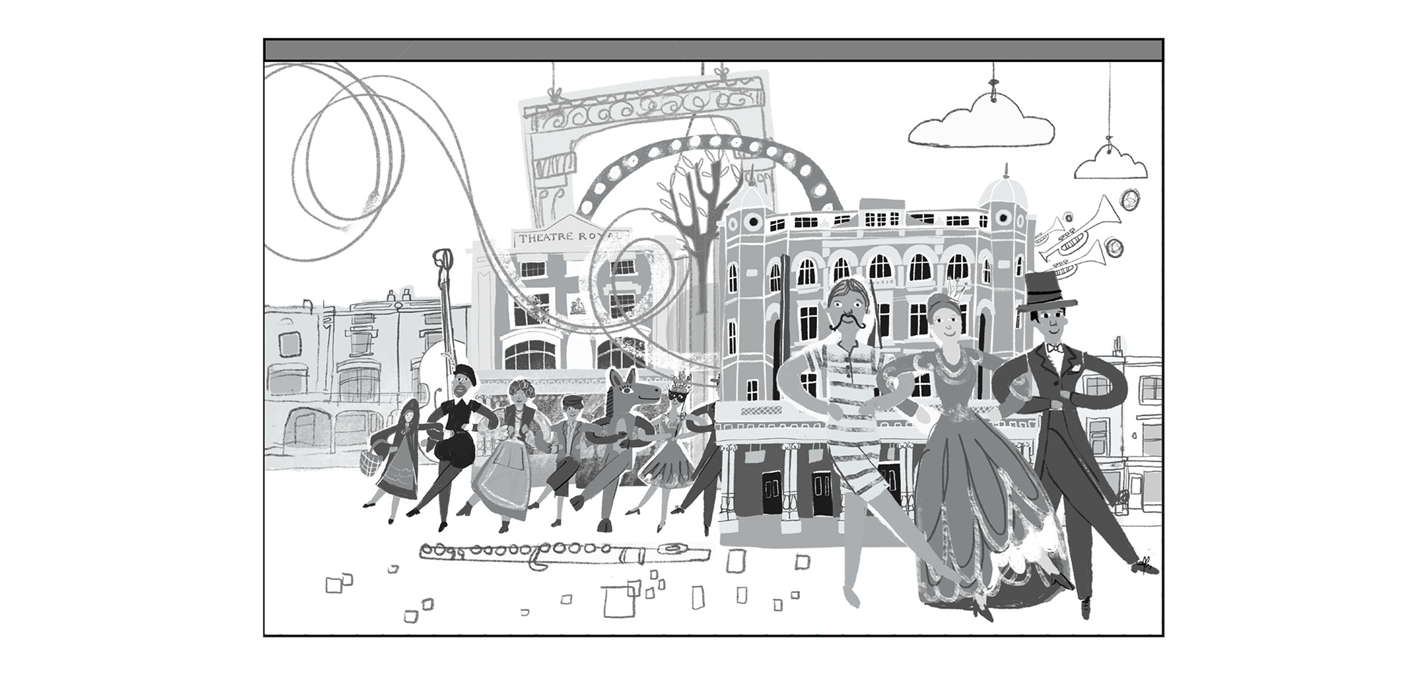
• The Theatre Royal, Brighton - 2 x full height wall designs, highlighting the Medical Ward Entrance
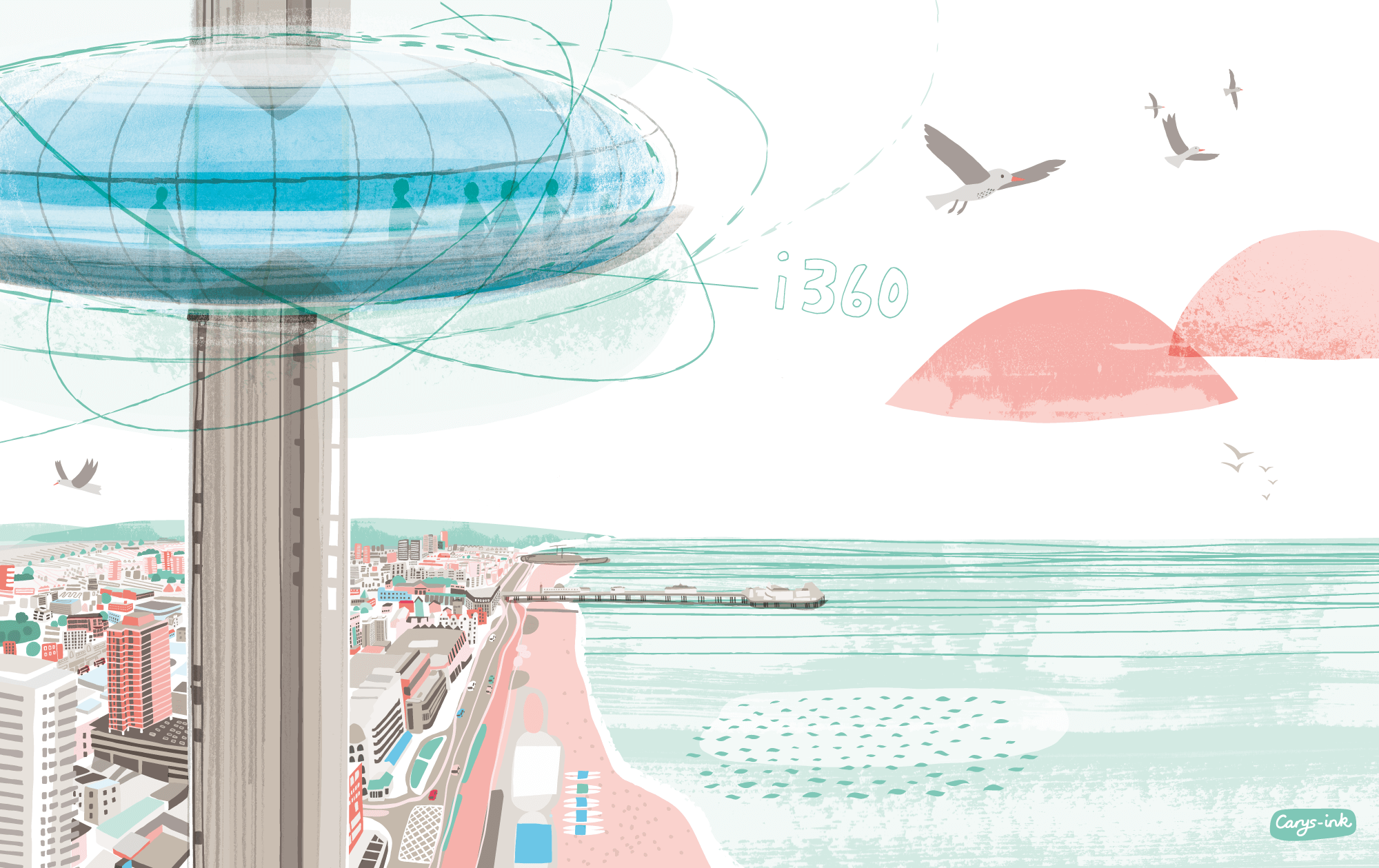
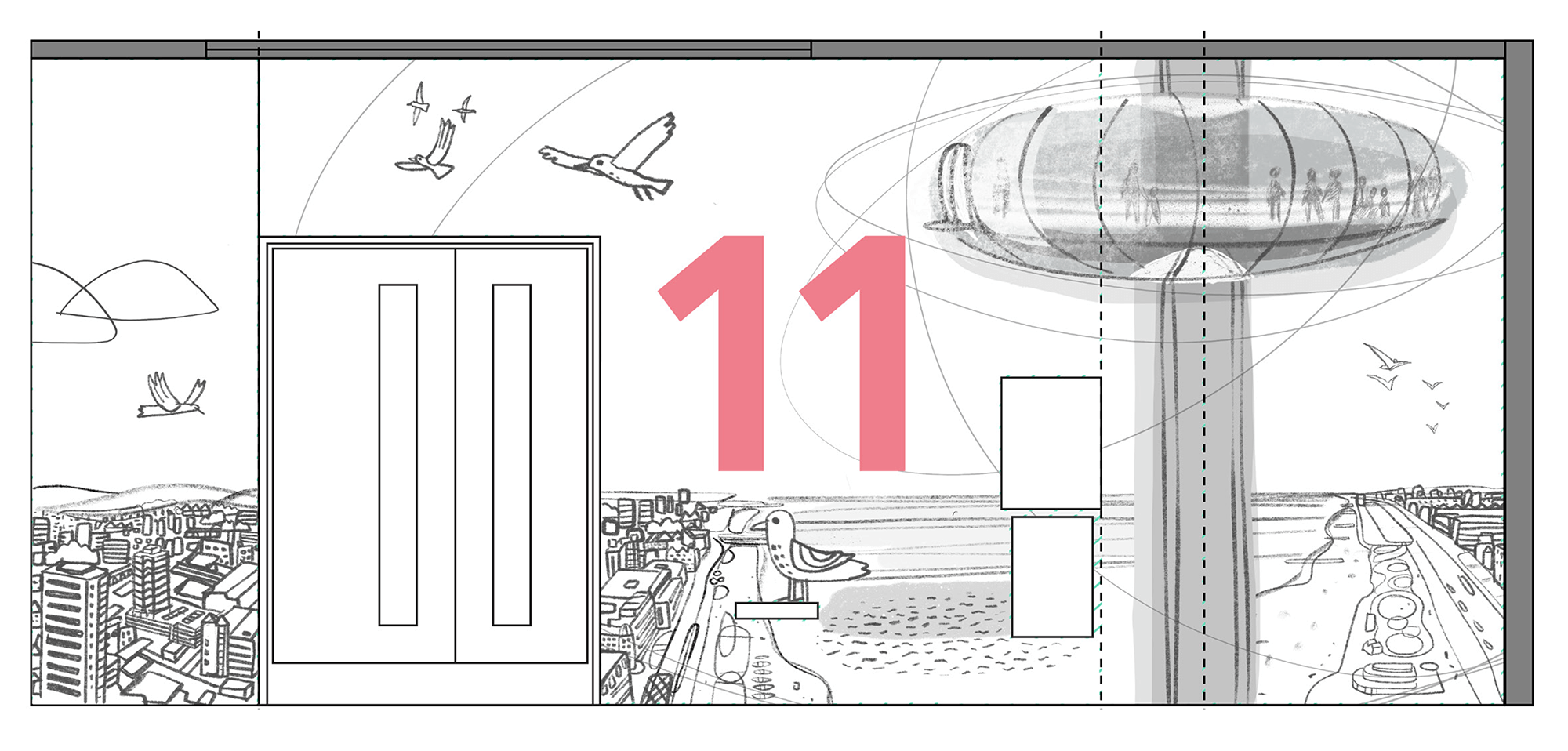
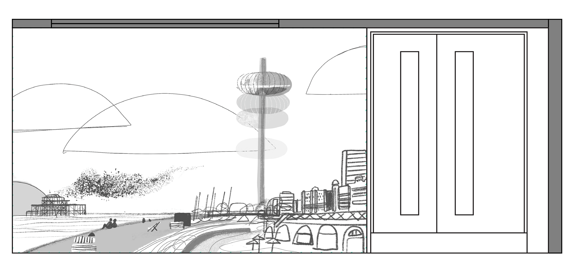
• The i360 - 2 x full height wall designs, highlighting the meeting and teaching suites
ARTWORK IN SITU
Below are some photos of 2 of my 3 themed commissions. All photos ©Matt Livey
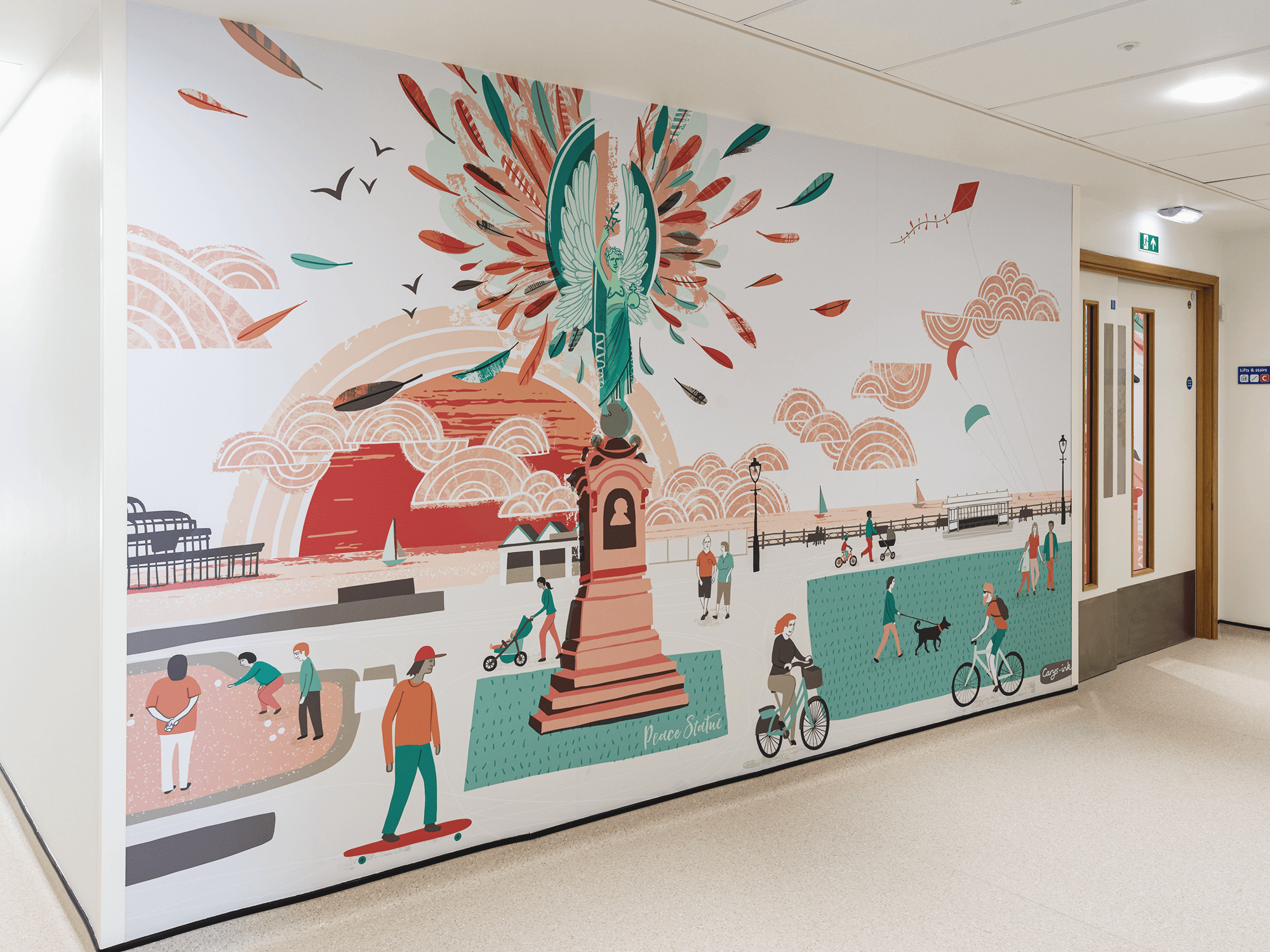
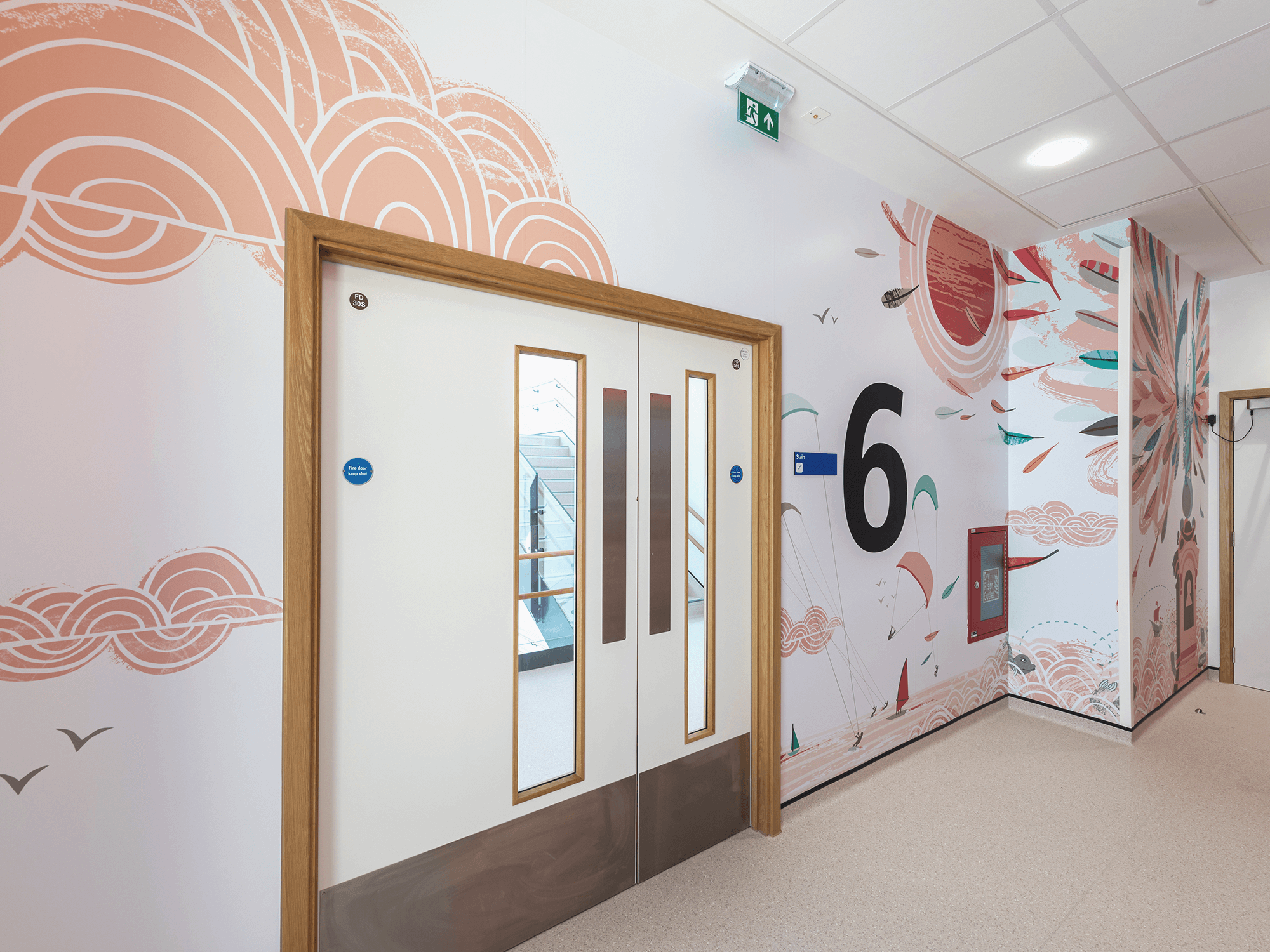
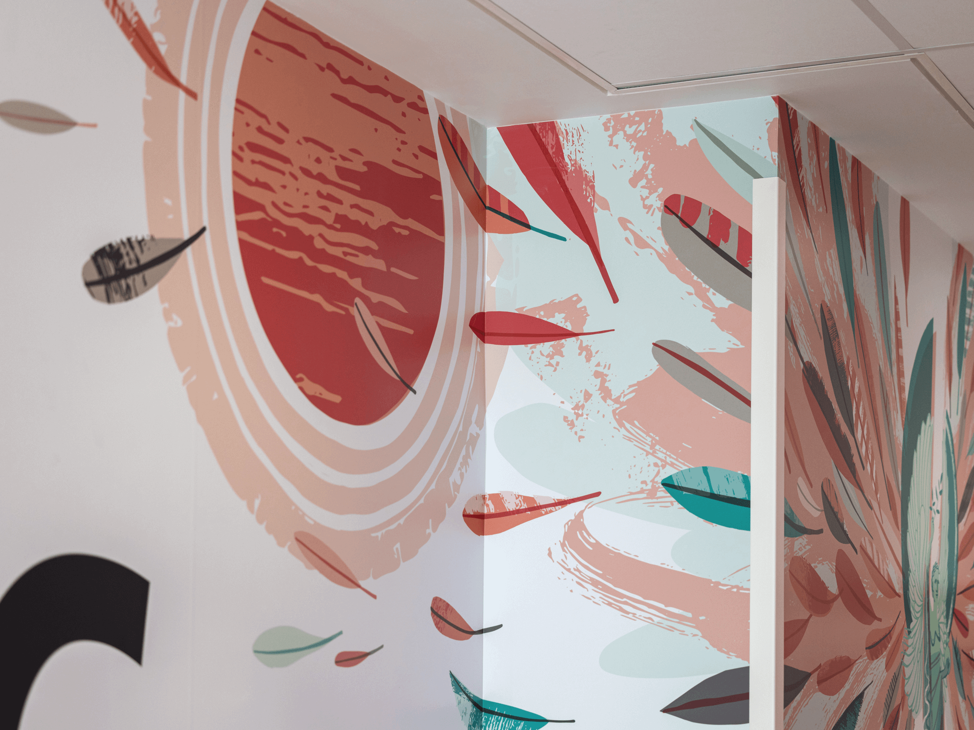
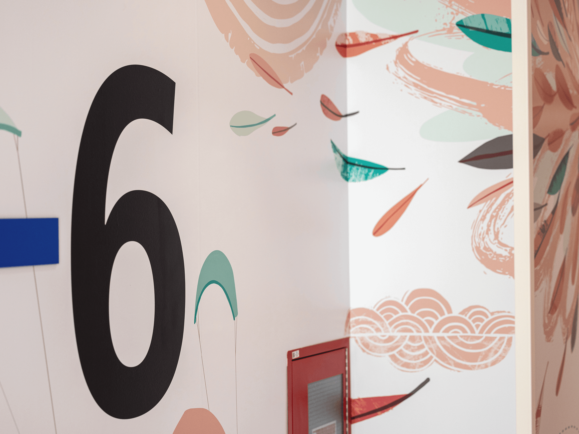
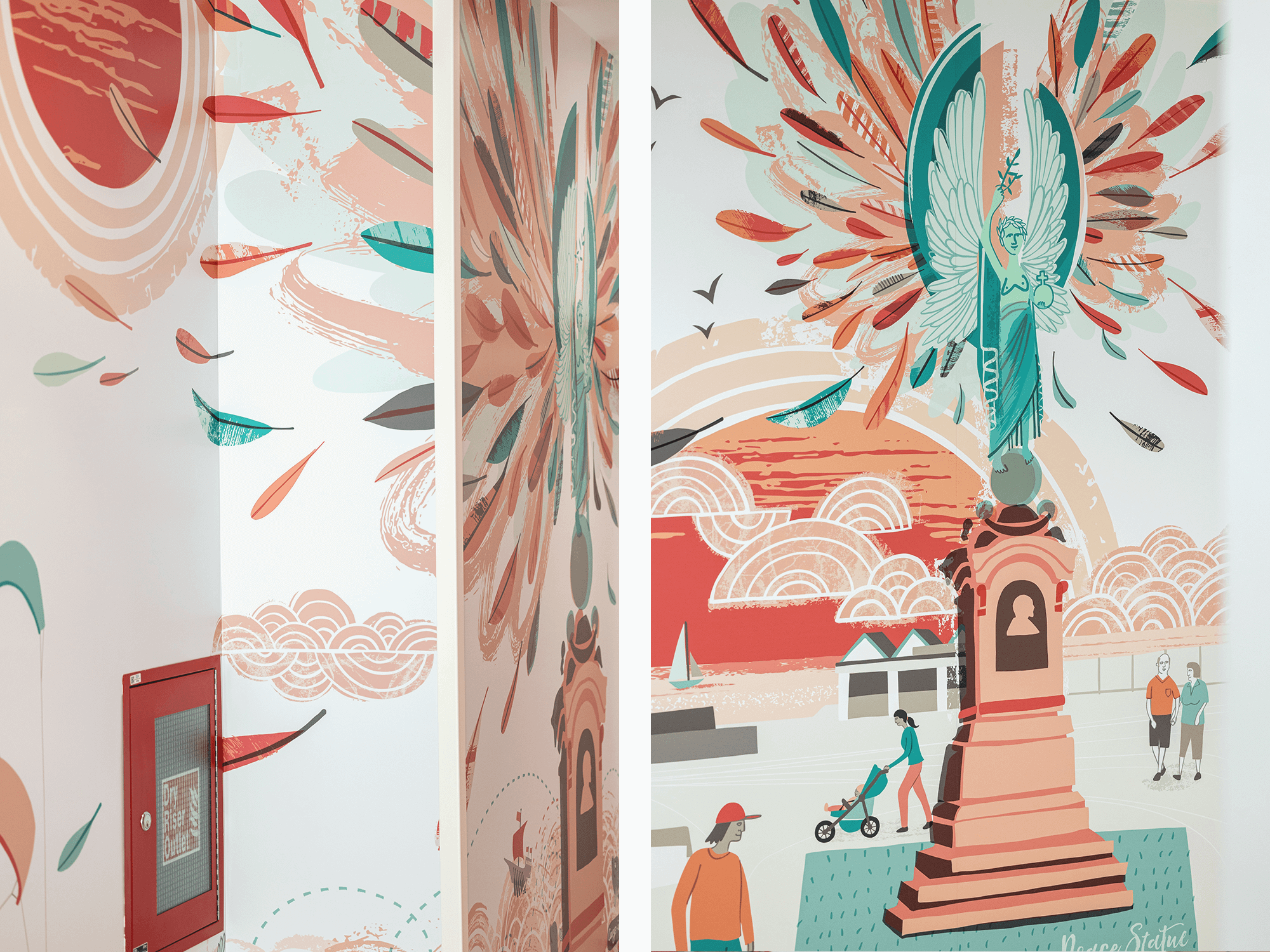
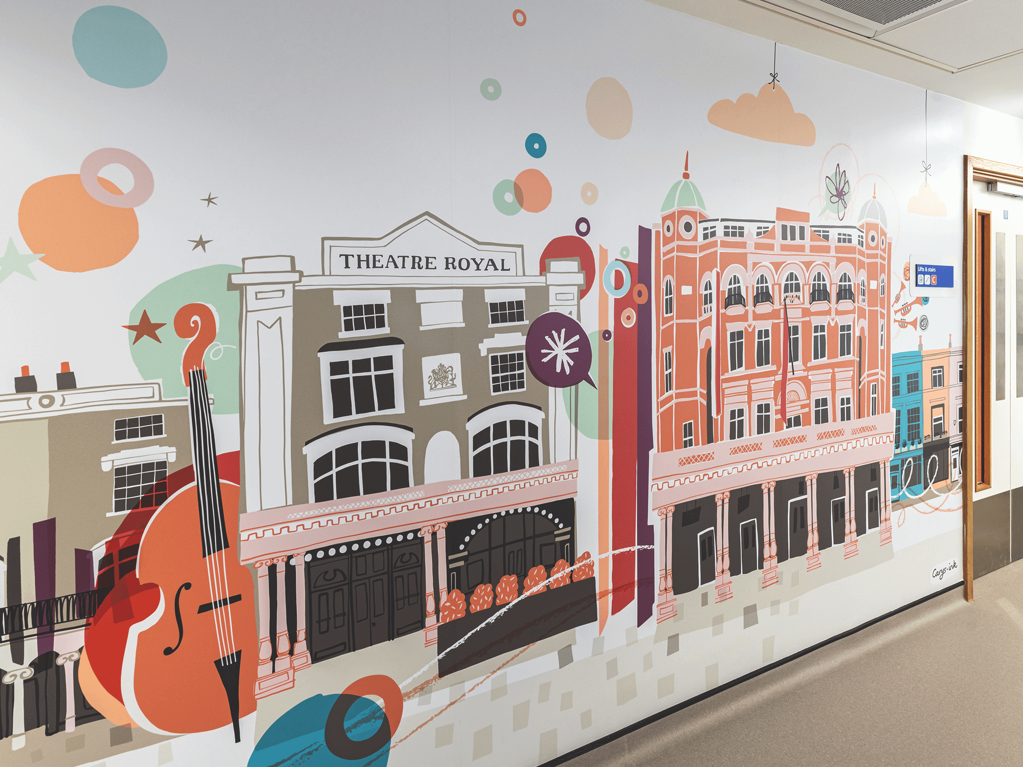
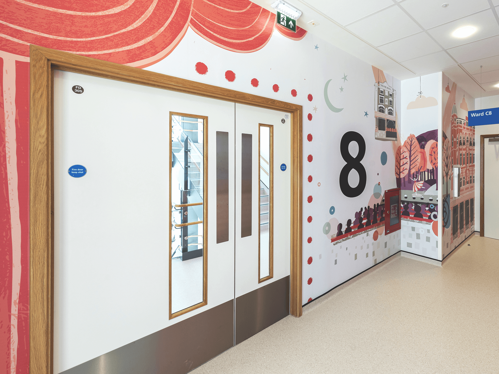
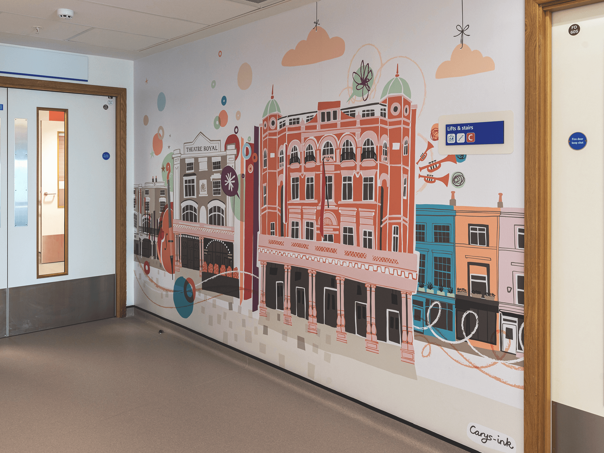
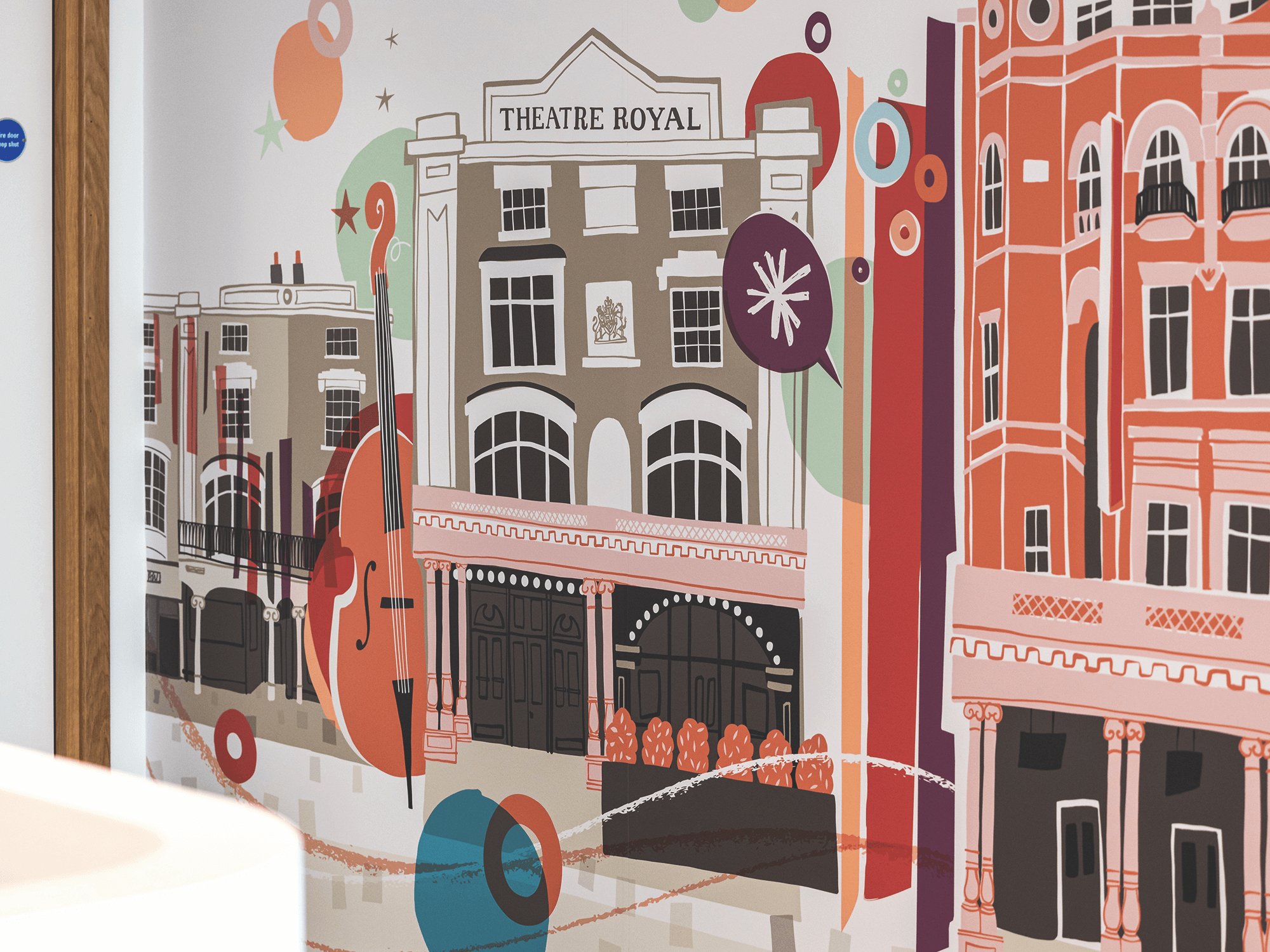
Below are my completed designs. Each of the wider pieces (which include a representation of a door) will be located opposite the lift on the relevant floor - so that basically when you arrive at a particular floor and the lift door opens, you can easily see what floor number you are on! The designs are intended to act as visual way-markers with numerous points of interest to help patients and visitors recognise and remember where they are within the hospital.
(Click on each image to enlarge…)
Peace Statue, Wall 1 - To include floor number
Peace Statue, Wall 2.
Theatre Royal, Wall 1 - To include floor number
Theatre Royal, Wall 2
i360, Wall 1 - To include floor number
i360, Wall 2
Each of my pieces used the supplied colour palette, along with a small number of additional colours which I specially selected to work with my designs. The directive was that the core palette should form the basis of all designs around the particular lift/stair core (with any other colours being added at the artist’s discretion) so there is a consistent and recognisable theme running between the floors.

Supplied colour palette for the Town Core
In embarking on the project, there were a number of specified criteria to be considered in creating work that would be suitable for the hospital setting and appropriate for a wide ranging audience. All artwork was to:
Be positive (and not upsetting or confusing in any way)
Be expansive
Show craft and attention to detail
Be human in scale or feeling
Be timeless
Be memorable
Be distinct
Embody multiple reference points
Taking all these criteria into account, pictured below are the initial sketches I developed for each assigned location. Each artist was supplied with architectural drawings for each wall they were to create designs for, and these include positioning of any wall furniture and indications of any corners which needed to be considered within the placement of the artwork
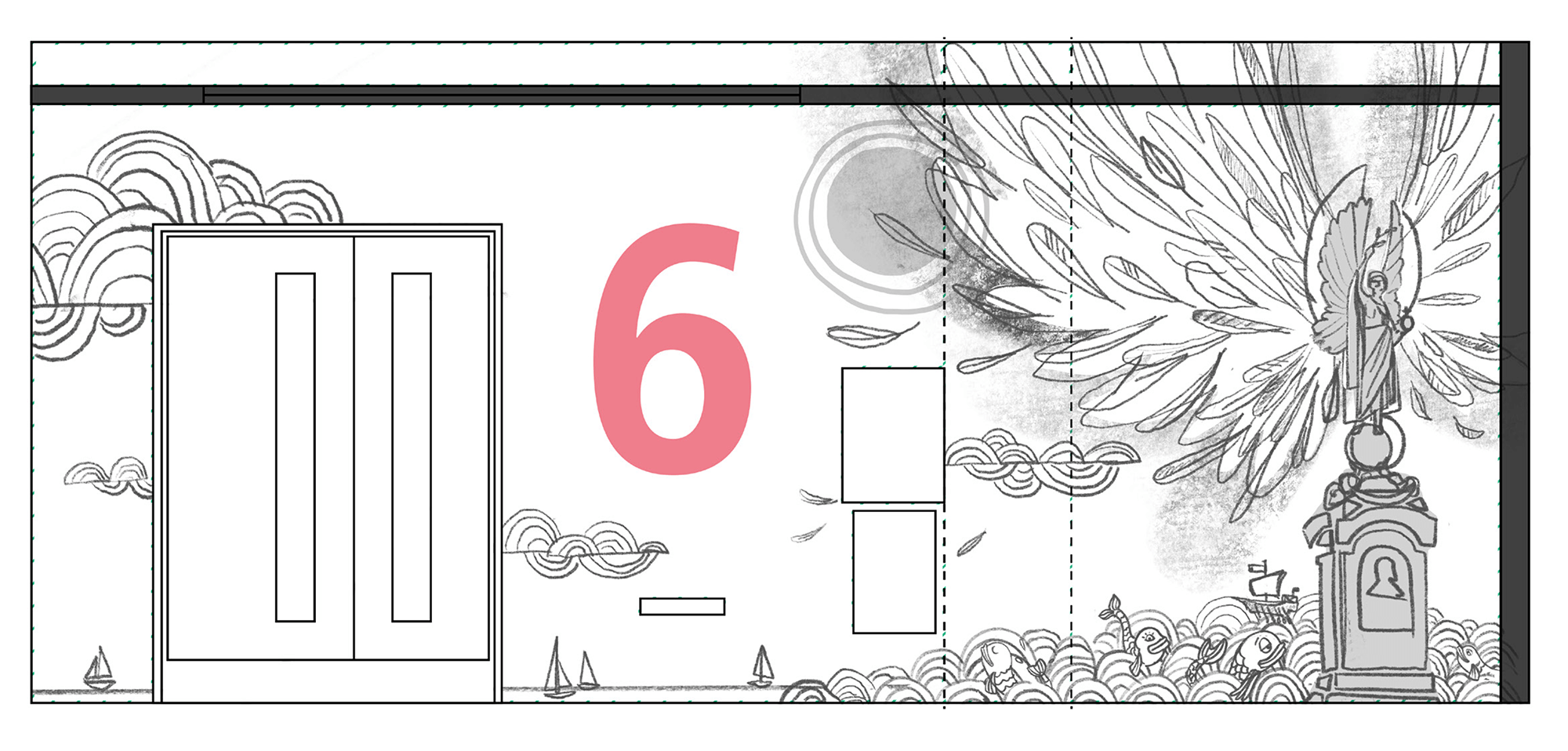


I thought it was interesting to show these initial sketches, to help explain considerations that were made within the process. For the most part my sketches were progressed directly to final artwork, but there were a few modifications and to highlight those:
To one of the Theatre Royal walls I had originally included a cast of characters to add interest and a sense of fun. Due to the intended placement of this design within a sensitive area and the likelihood of it being highly visible to many patients with dementia, it was decided the design potentially could be quite confusing. This design was therefore simplified and all the people characters removed.
There was some simplification on the other TheatreRoyal wall too - I had got carried away in trying to add in too many elements!
The i360 designs were re-worked/swapped around to account for changes in the number of structural corners breaking up the design of one of the walls
This has been a really interesting and worthwhile project to be involved in. I am excited to see my work installed in the hospital, alongside that from all the other artists. Overall it will be a huge body of work, with the potential to have a massive impact on the experience of people visiting and spending time in the hospital - I hope it is well received!
RELATED PROJECTS

RUTHERFORD CANCER CENTRES | Full room mural artwork for the children’s & young peoples waiting room

BREATHE MAGAZINE | Editorial illustration