To power the community of Thornbury and surrounding areas to a brighter climate future
CATSA – Climate Action for Thornbury and Surrounding Areas – is a community interest company focussed on sustainable energy. I live in Thornbury so have a keen interest in the positive work they’re doing locally around green energy.
CATSA’s primary purpose is to form a bridge between local needs and opportunities, and national funding and projects.
They help local households and businesses save on their energy bills and future proof their energy use, for the benefit of the whole community.
I was asked to create a simple logo and visual identity for this small, community organisation who were looking to grow and project a professional image. They want to connect with local residents and businesses, and be seen as a trusted, democratic and highly localised resource, enabling more renewable energy use and generation in our local area.
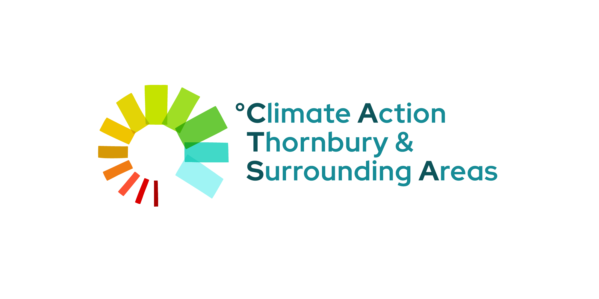
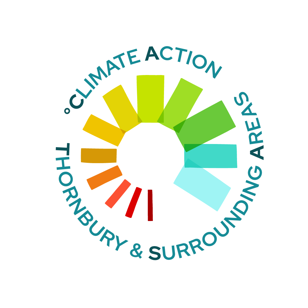
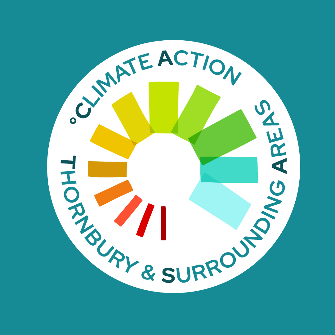
The design concept plays on the idea of pulling together to dial up green energy and start cooling the earth’s temperature.
Although I arrived at a graphic solution, I wanted to retain a human feel. To help with this, the shapes within the logo have a slightly organic feel, rather than being overly geometric and angular.
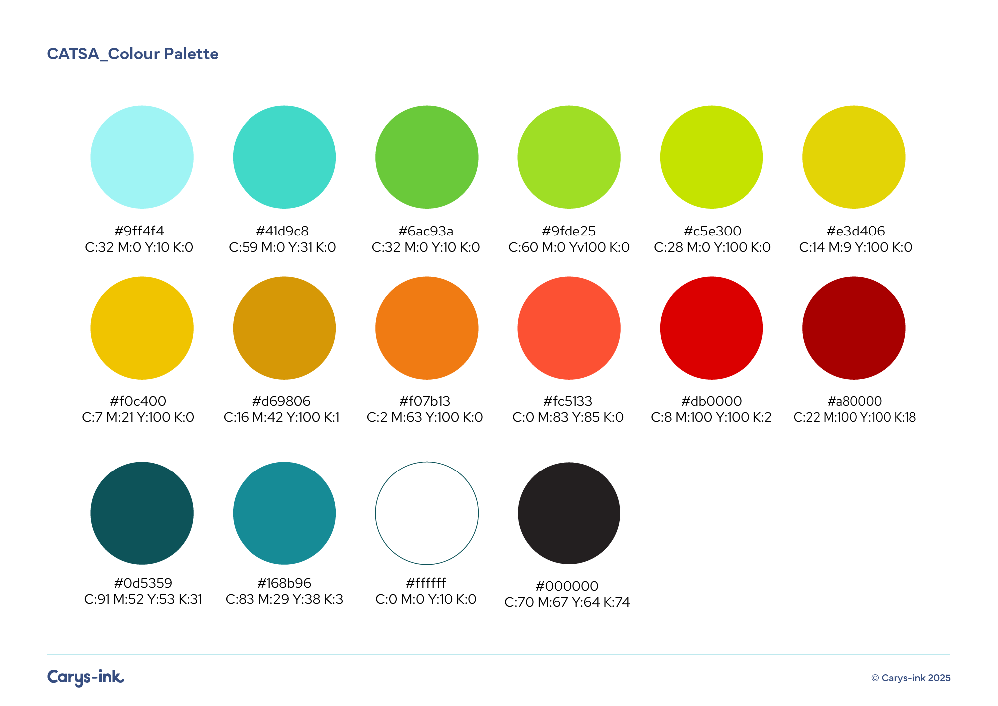
I selected colours with a contemporary feel which work together to visualise the potential temperature shift achieved through transitioning from fossil fuels to more sustainable energy.
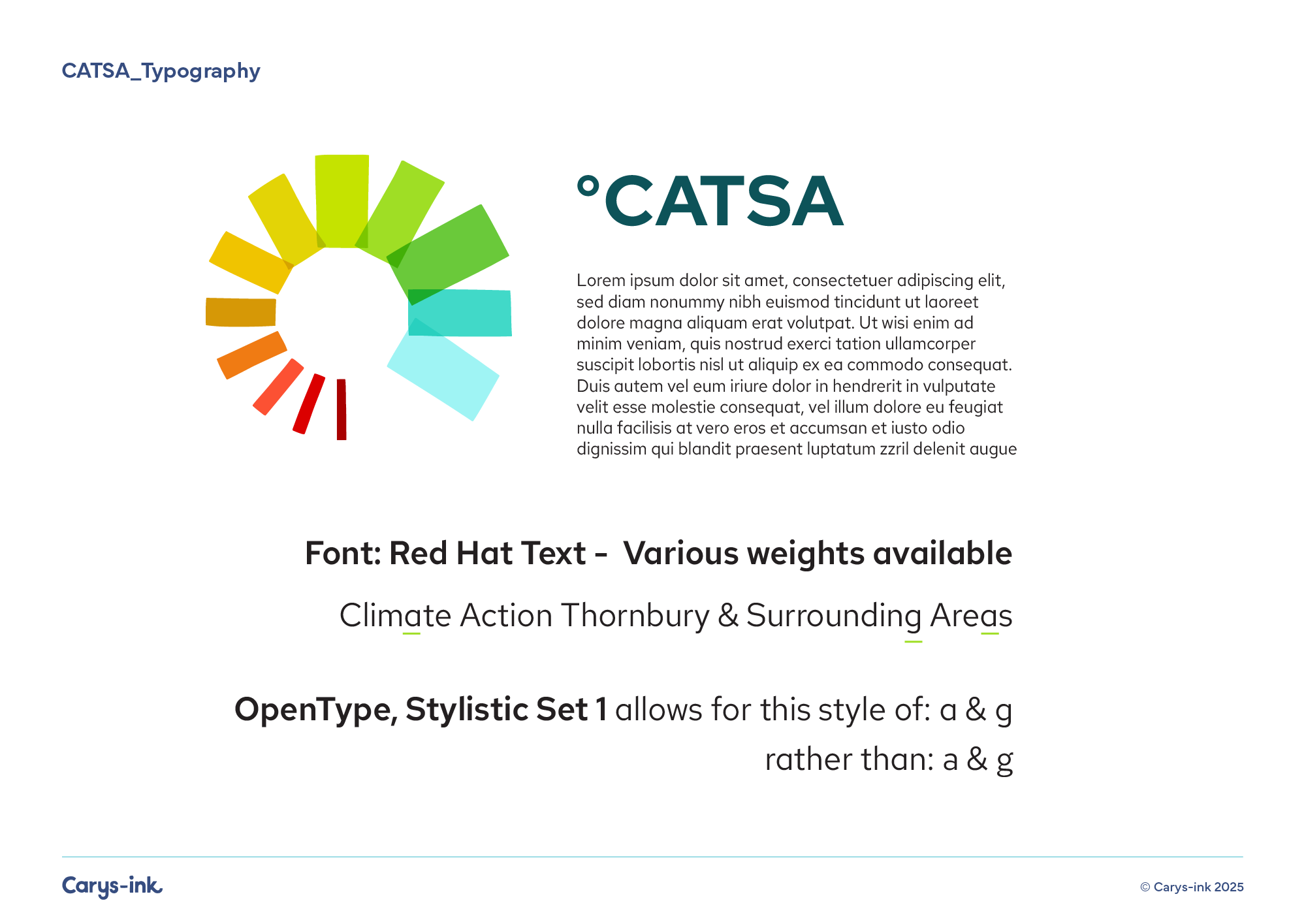
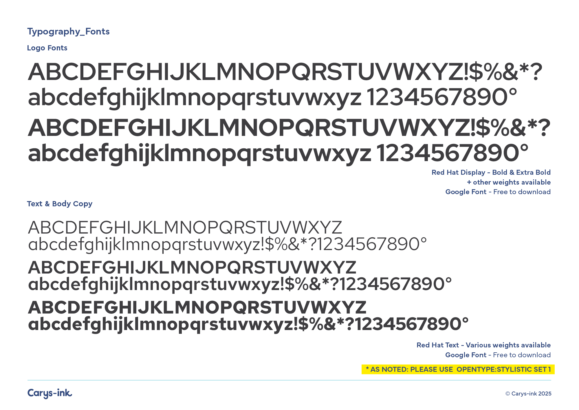
Some pages from the CATSA brand guide, created for the client and supplied along with finalised artwork:
This set of icons were developed later for use across printed materials and online. Following on from the brand mark, they bring a colourful and friendly feel to help emphasise the idea of ‘powering up’ with green energy.
CATSA Brand mark
House and Home
Energy
Wind Power
Solar
Money
Nature
Community
CATSA are welcoming and inclusive rather than cold and corporate. These designs are helping them establish their position within the community as an organisation who are trustworthy, encouraging, knowledgeable and well connected in the environmental sector.
This project followed on from a previous project I’ve done for another local community group Sustainable Thornbury
We love Carys’ work: she understands what we’re trying to achieve and channels that understanding into her beautiful designs. She’s also thoroughly professional, and communicates aspects of the design process well and in a timely way.