To continue the growth from what was originally a small open farm, to being one of the best family attractions in the area, whilst maintaining a strong focus on conservation and sustainability
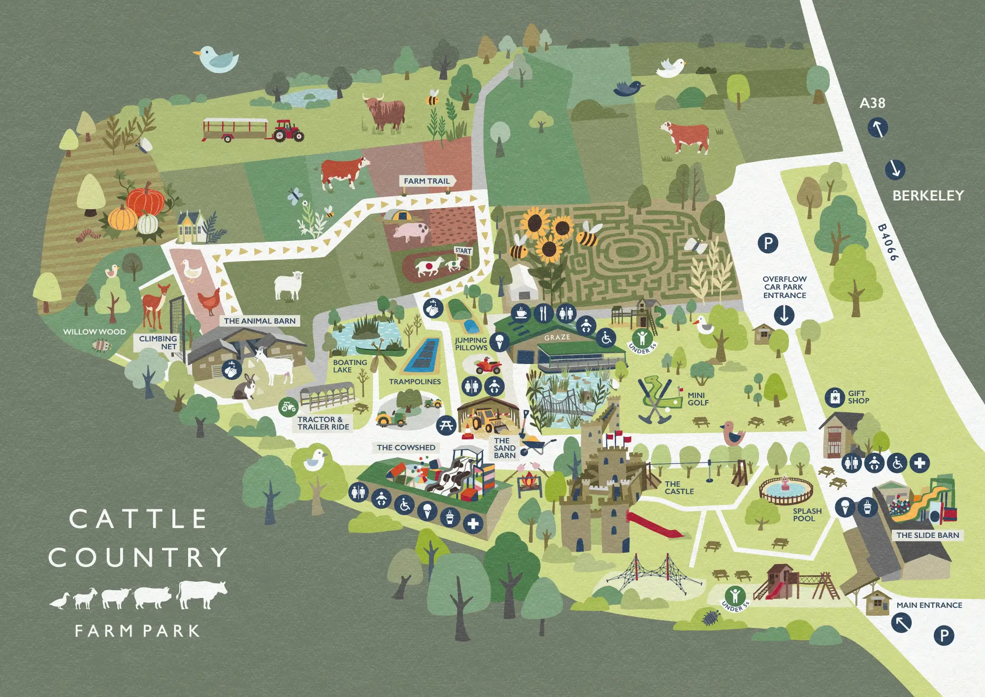
Cattle Country is a fun, farm-based family attraction based in Berkeley, Gloucestershire. It is a large site which includes a farm trail featuring rare breeds of cattle (and other animals), along with a range of indoor and outdoor play/activities.
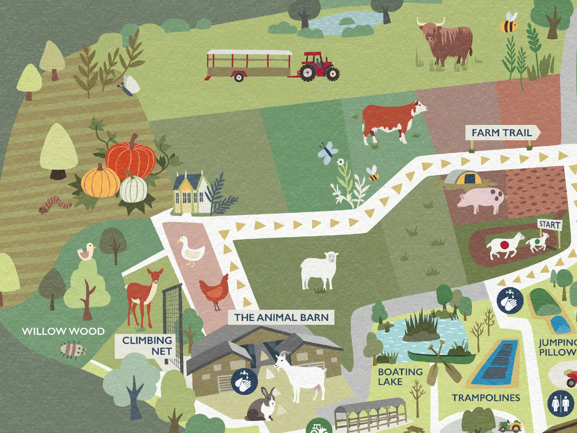
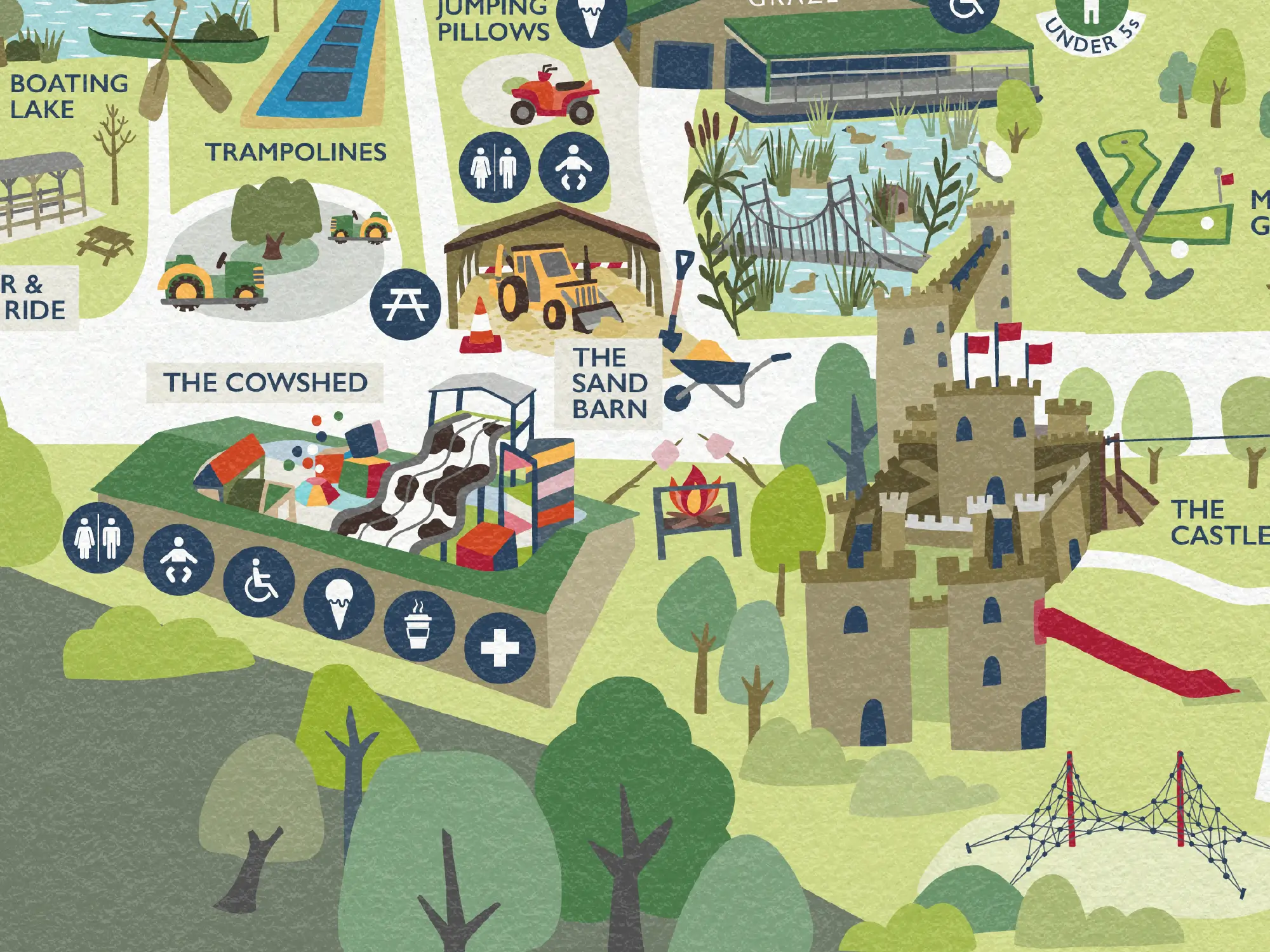
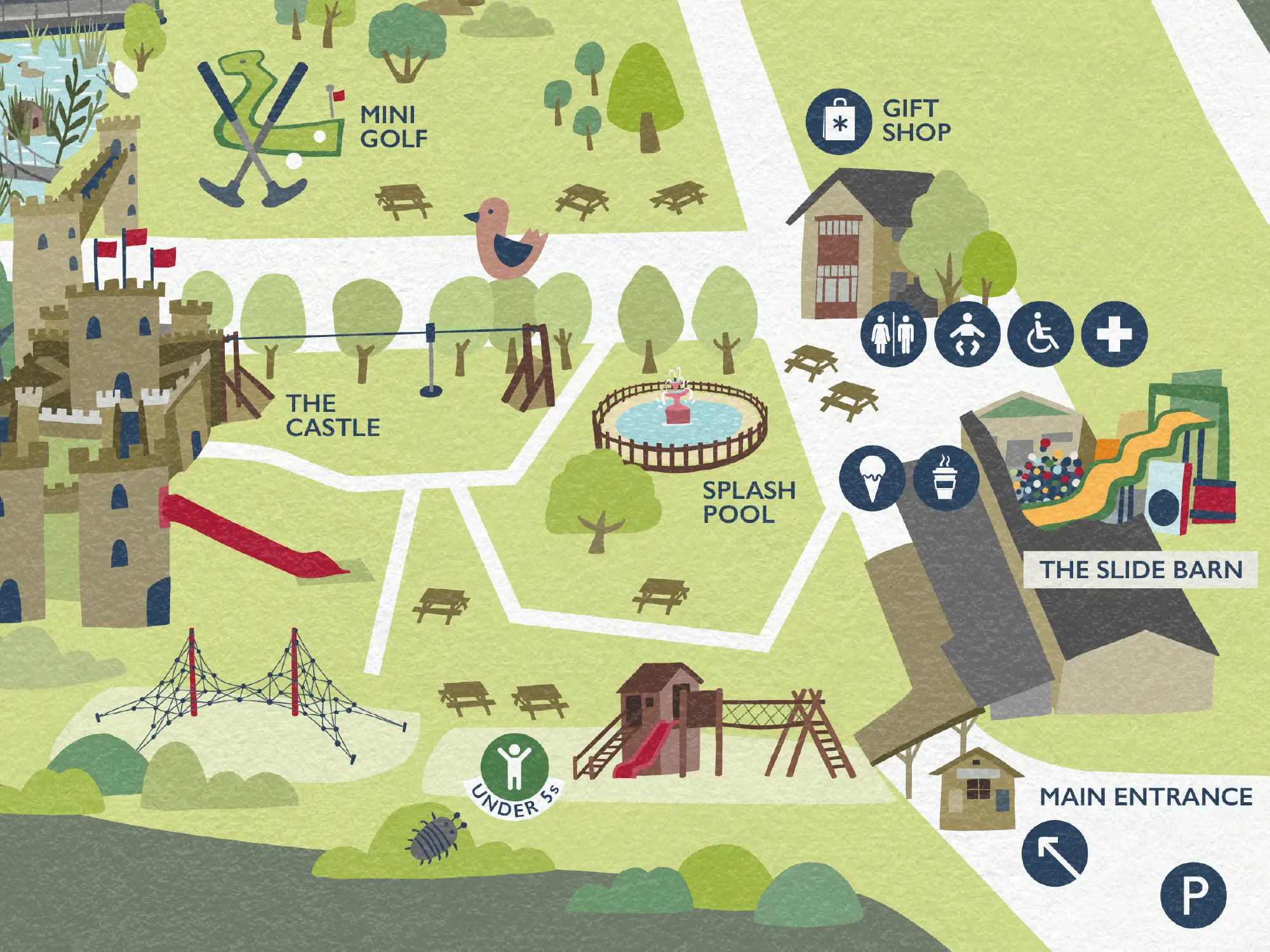
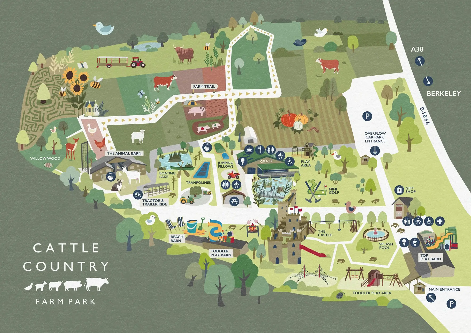
I was briefed to create an illustrated park map which will help people navigate around Cattle Country Farm Park and plan their visit before arriving, as well as to showcase the wide range of attractions available.
The map’s designed to be fun and friendly, with a natural, outdoorsy feel, to reflect the park’s rural location and tie in with Cattle Country’s existing brand.
It can be found as large-scale signage and prints around the park, and on the Cattle Country website. The map hasn’t been printed as handout leaflets for environmental reasons, saving unnecessary waste.
Additional artwork
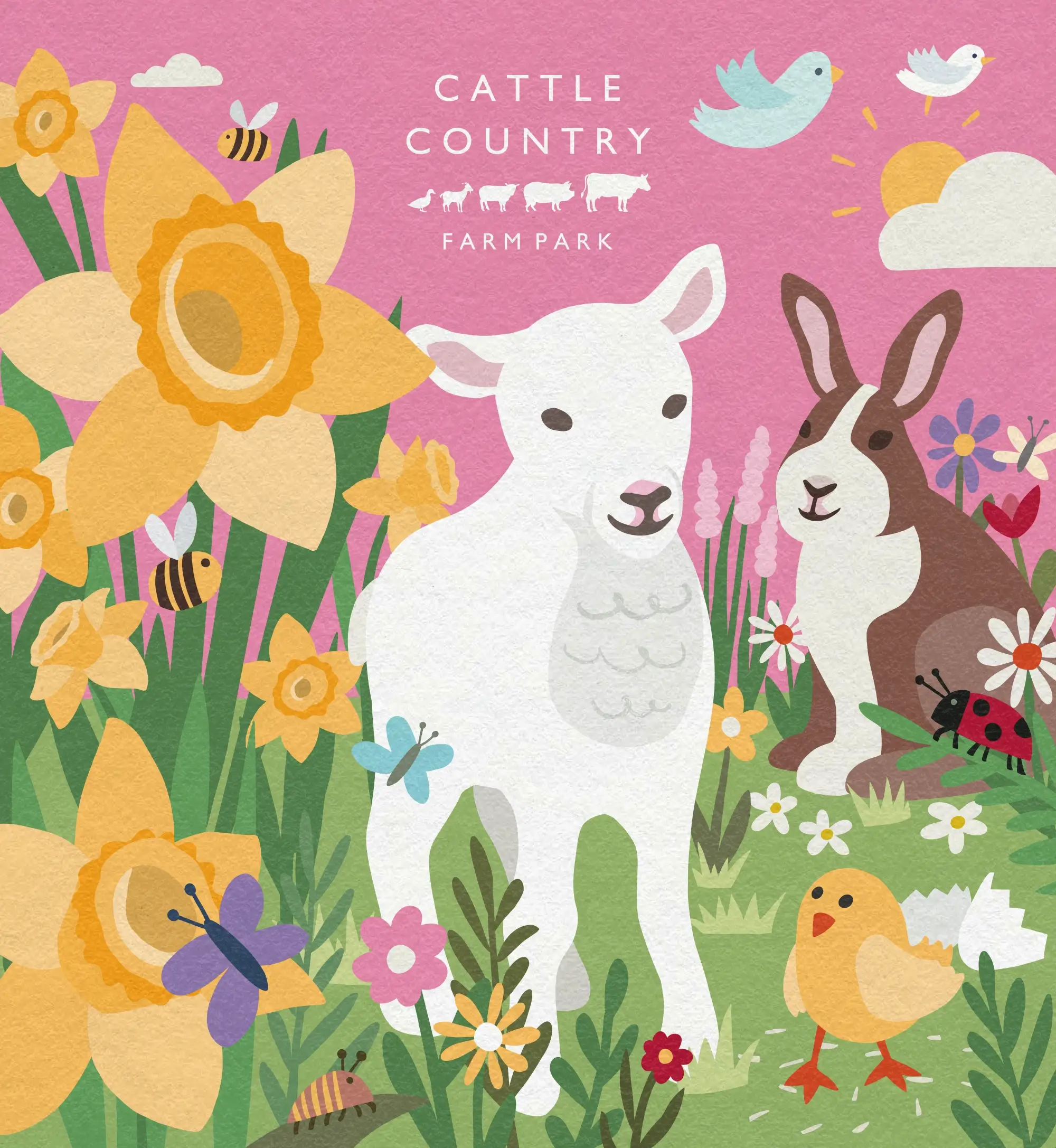
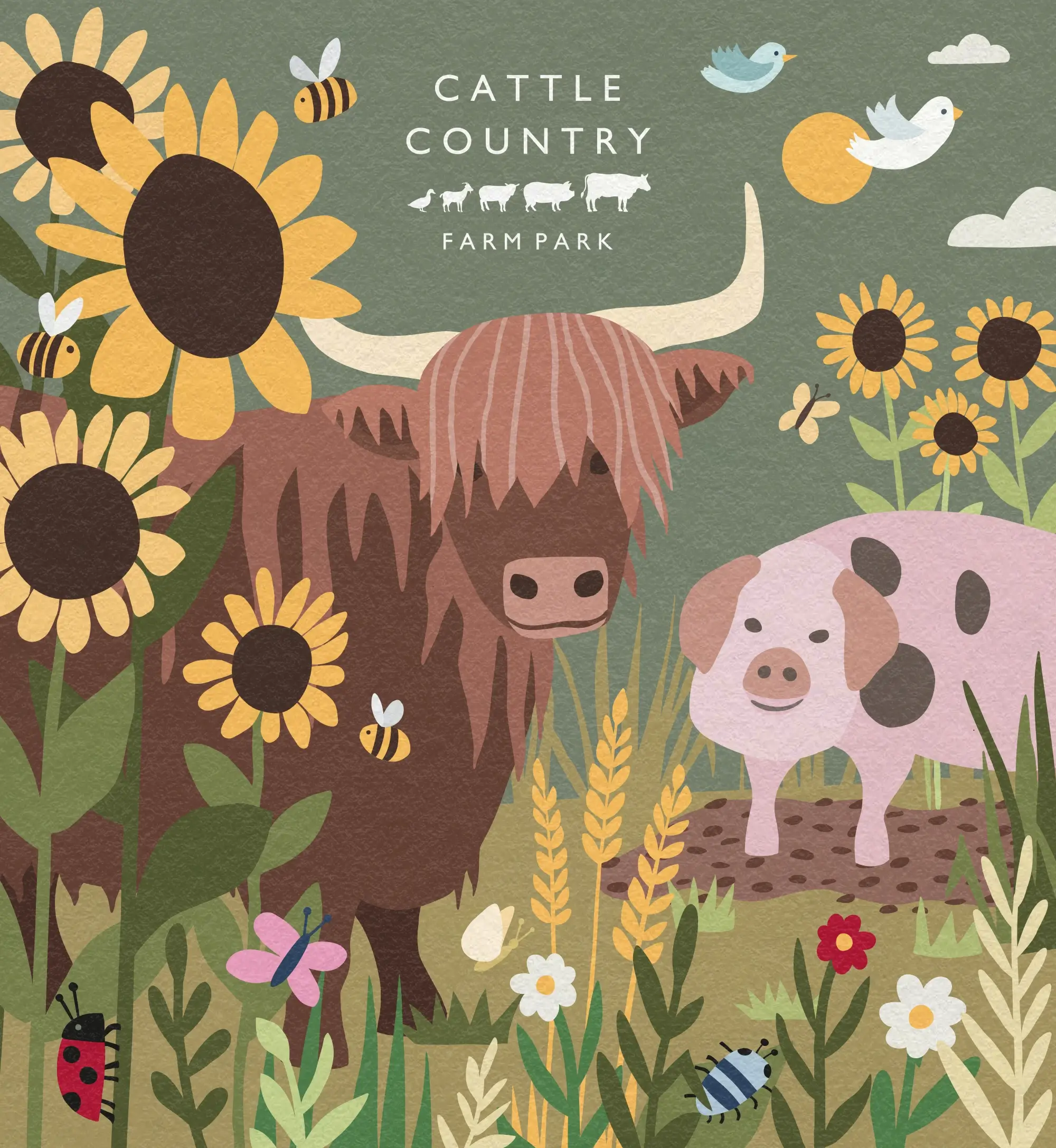
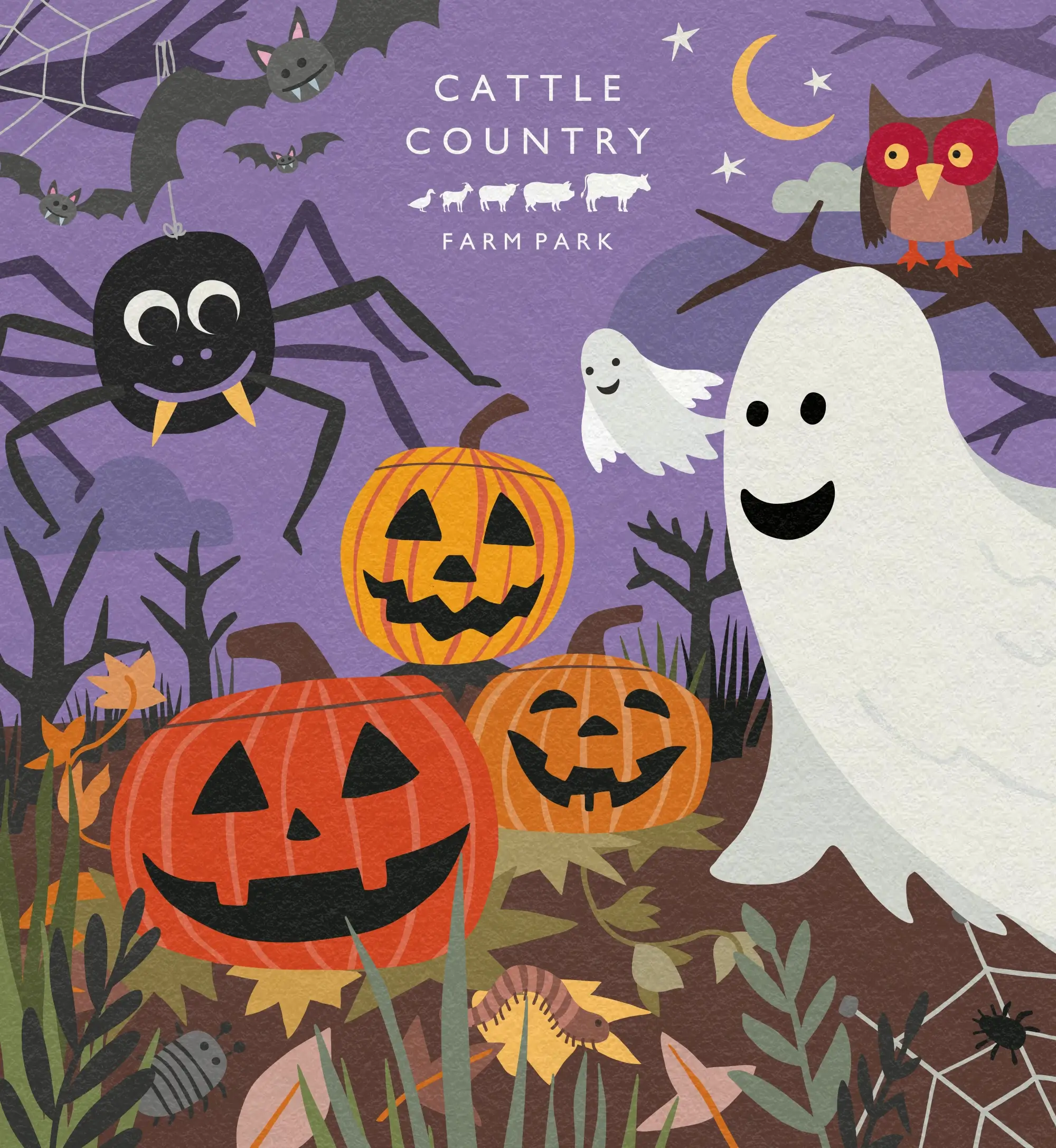
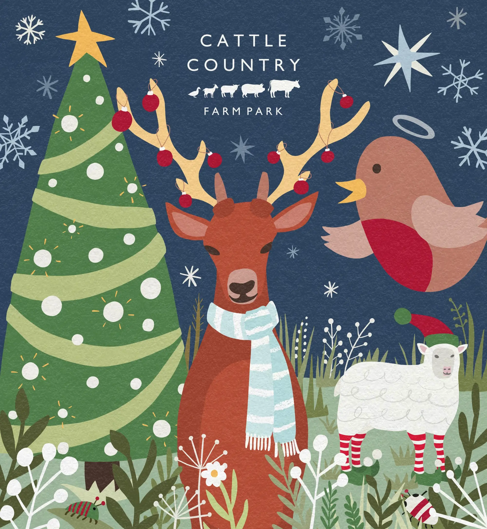
As a separate project, I was later commissioned to create a series of artworks, featuring key seasonal themes – Spring, Summer, Halloween and Christmas.
These were used for marketing materials and across social media, as well as being printed as large photoboards on-site. In fact this was what they were originally designed for – holes were cut out where the animal faces are, for visitors to put their own faces through, as a fun, farm-themed photo opportunity!
Process
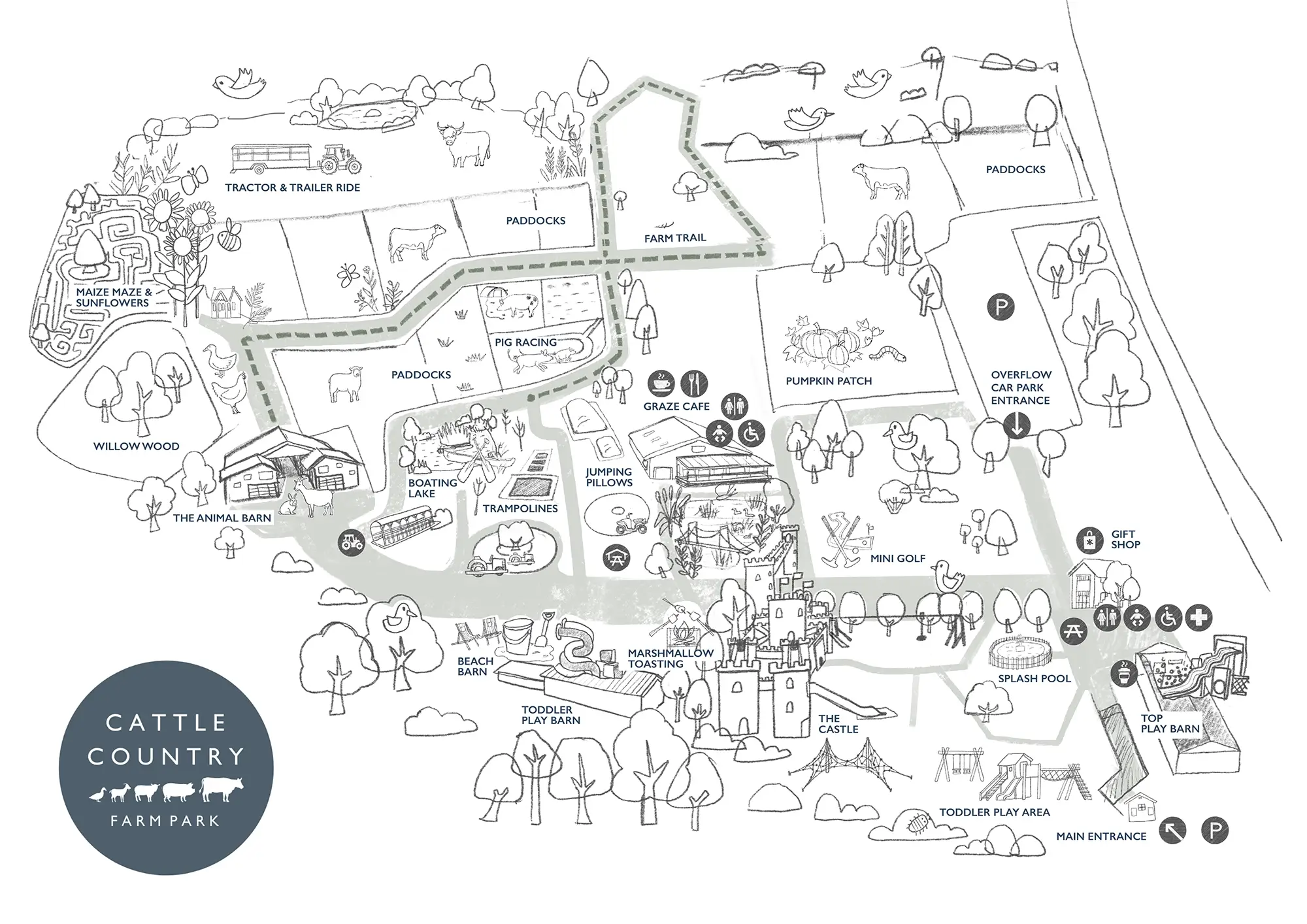
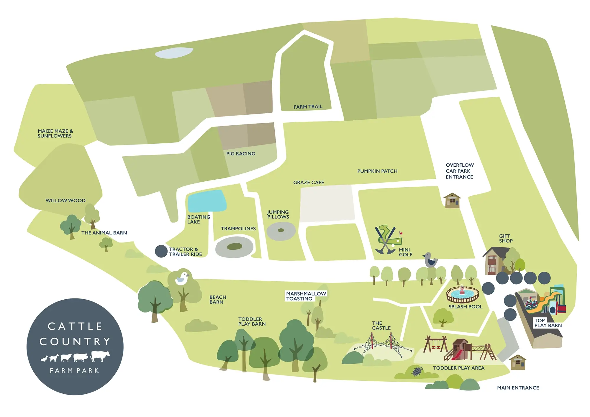
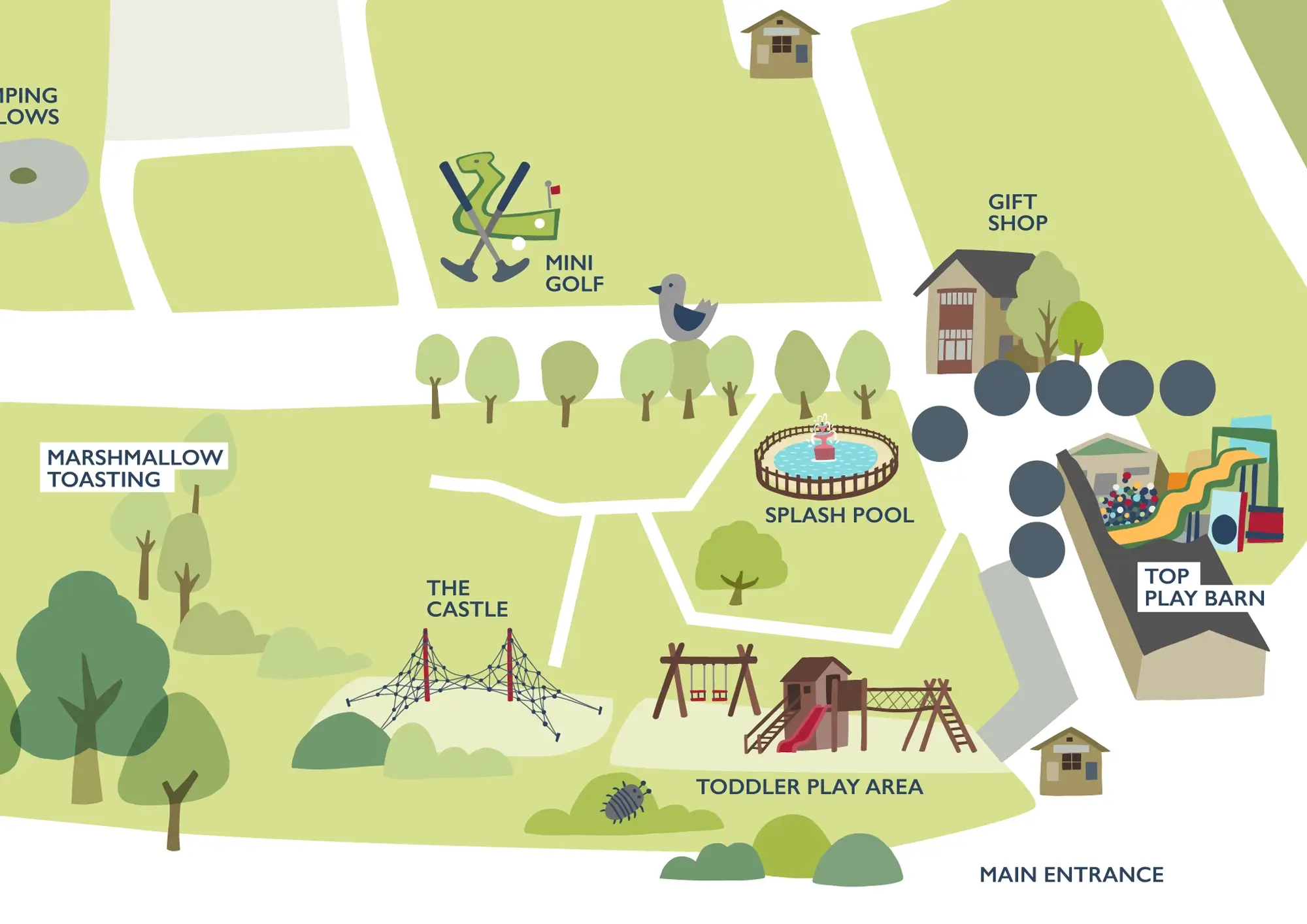
Here are the various stages involved in creating the map, from initial sketches, to final artwork with paper texture added, for a more organic feel.
The eagle-eyed amongst you may notice that this version is slightly different to the one pictured higher up the page. A couple of years after the map was originally created, I updated it to include new features at the park – most notably the HUGE new indoor play barn!
We recently rebranded Cattle Country and needed a new Park Map that reflected this, to show off all the great attractions within the park and help people to plan their visit. Carys has brought Cattle Country Farm Park to life with her illustrations – the map is exactly what I was hoping for and more!