To produce delicious, ethically sourced, bean-to-bar chocolate
Ruby Hue are ‘bean to bar’ chocolate makers – A luxury brand, making delicious, ethical chocolate from single origin, specially sourced raw cacao beans in a range of exciting and innovative flavours. Their products and ingredients are fully traceable with great care taken to ensure everything is farmed and produced in a highly sustainable way.
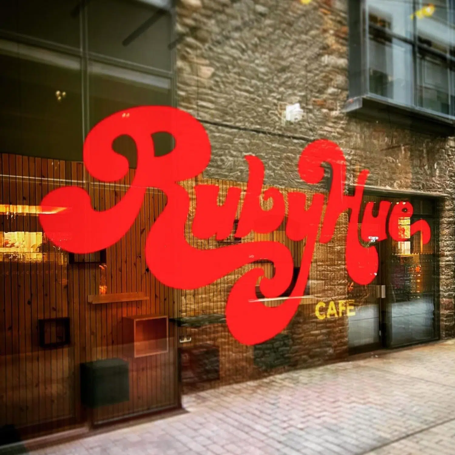
A bold and playful brand identity for Ruby Hue – a small business based in Bristol, with a chocolate shop and cafe in Finzel’s Reach, near the harbourside. As well as branding for the shop and online, the identity is used across their range of chocolate products.
The founders of Ruby Hue, Ruth and Tom, wanted the brand to reflect the quality and luxury of their products, but not in a clinical way. They were keen for a retro-inspired vibe to portray their brand as approachable, fun, loud, and ‘bouncy’. Their products are quality, quirky and very tasty!
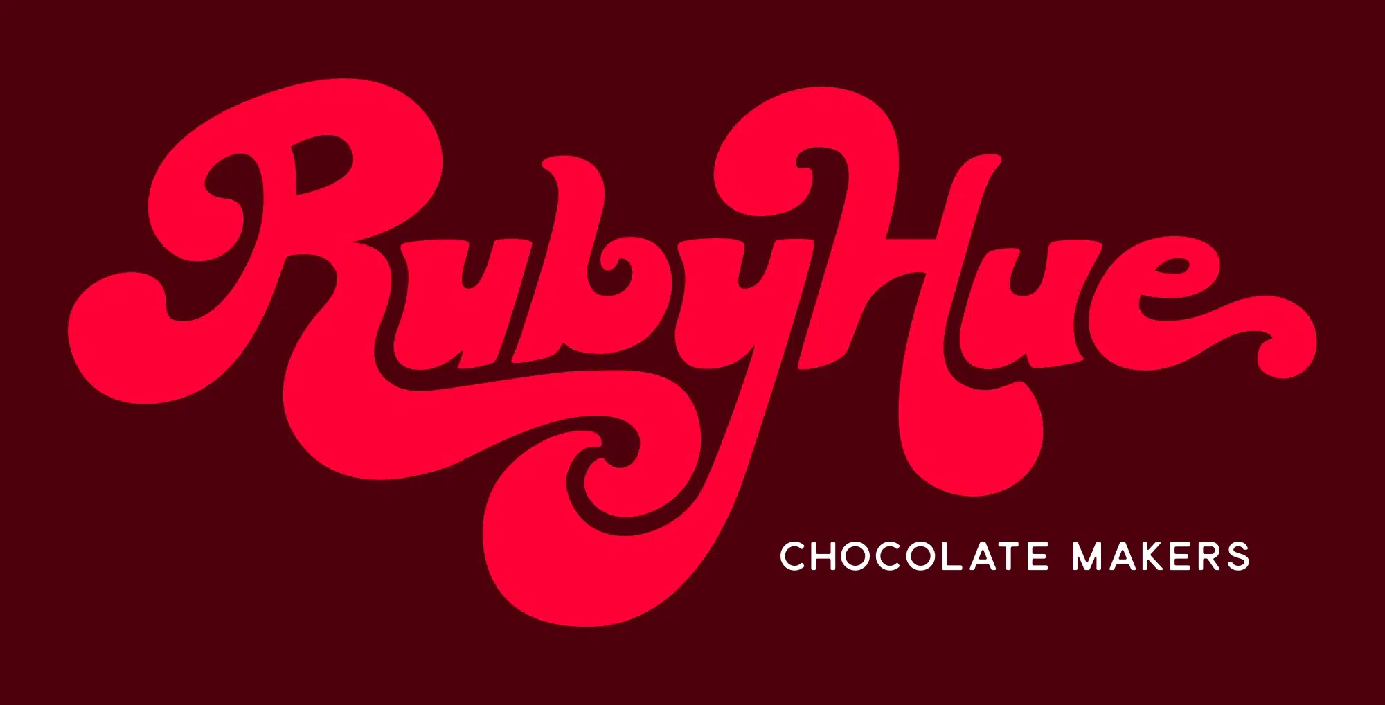
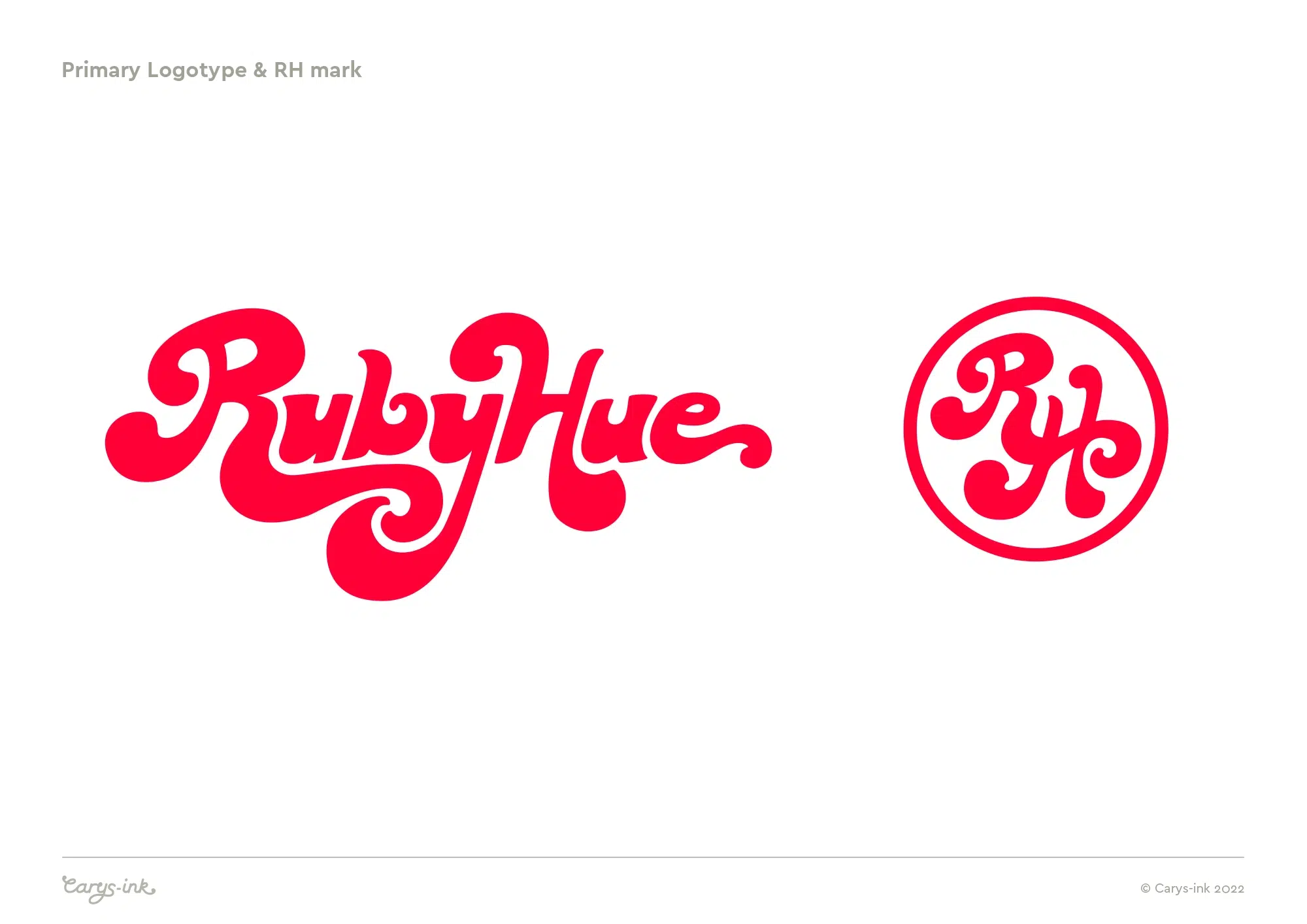
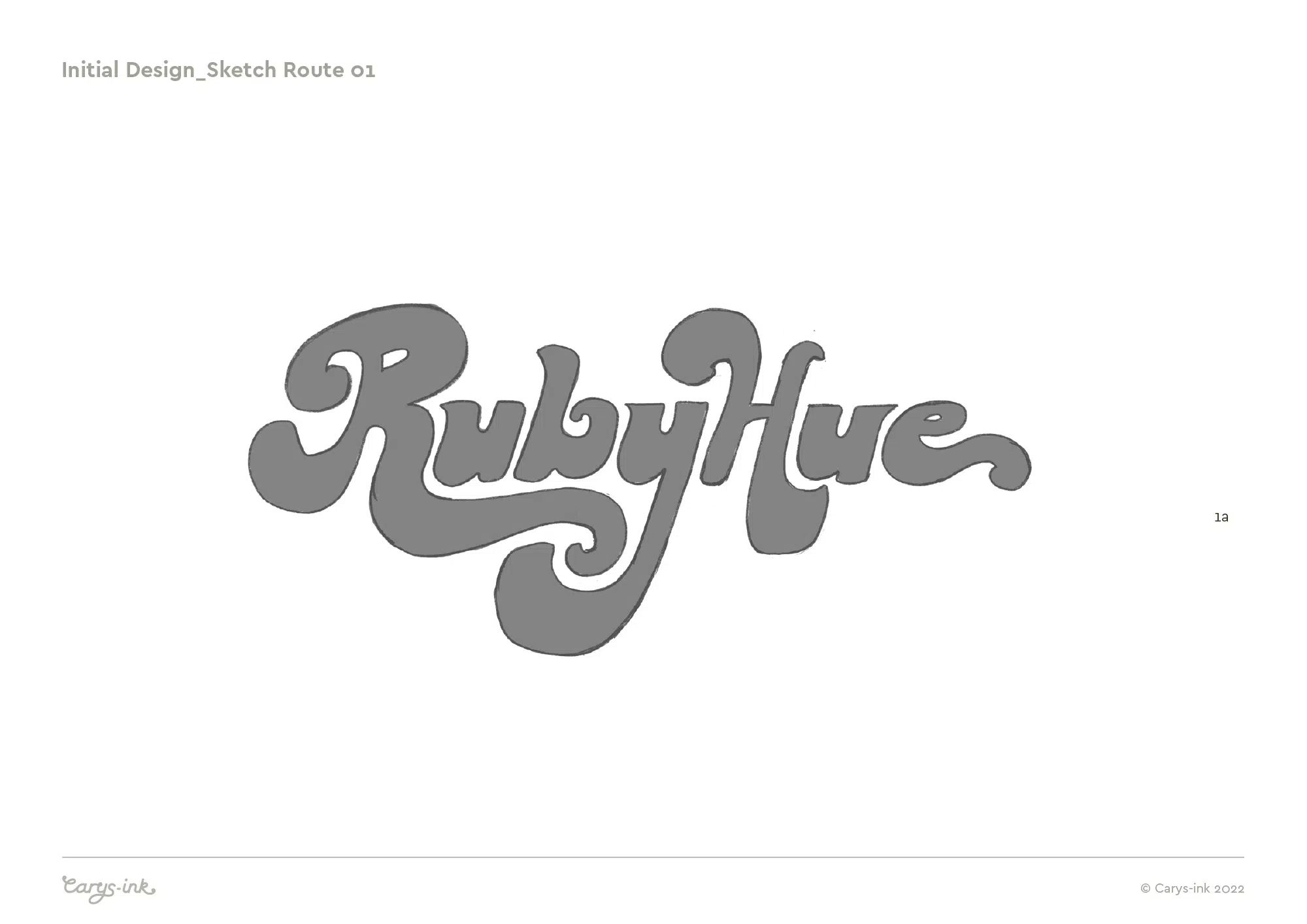
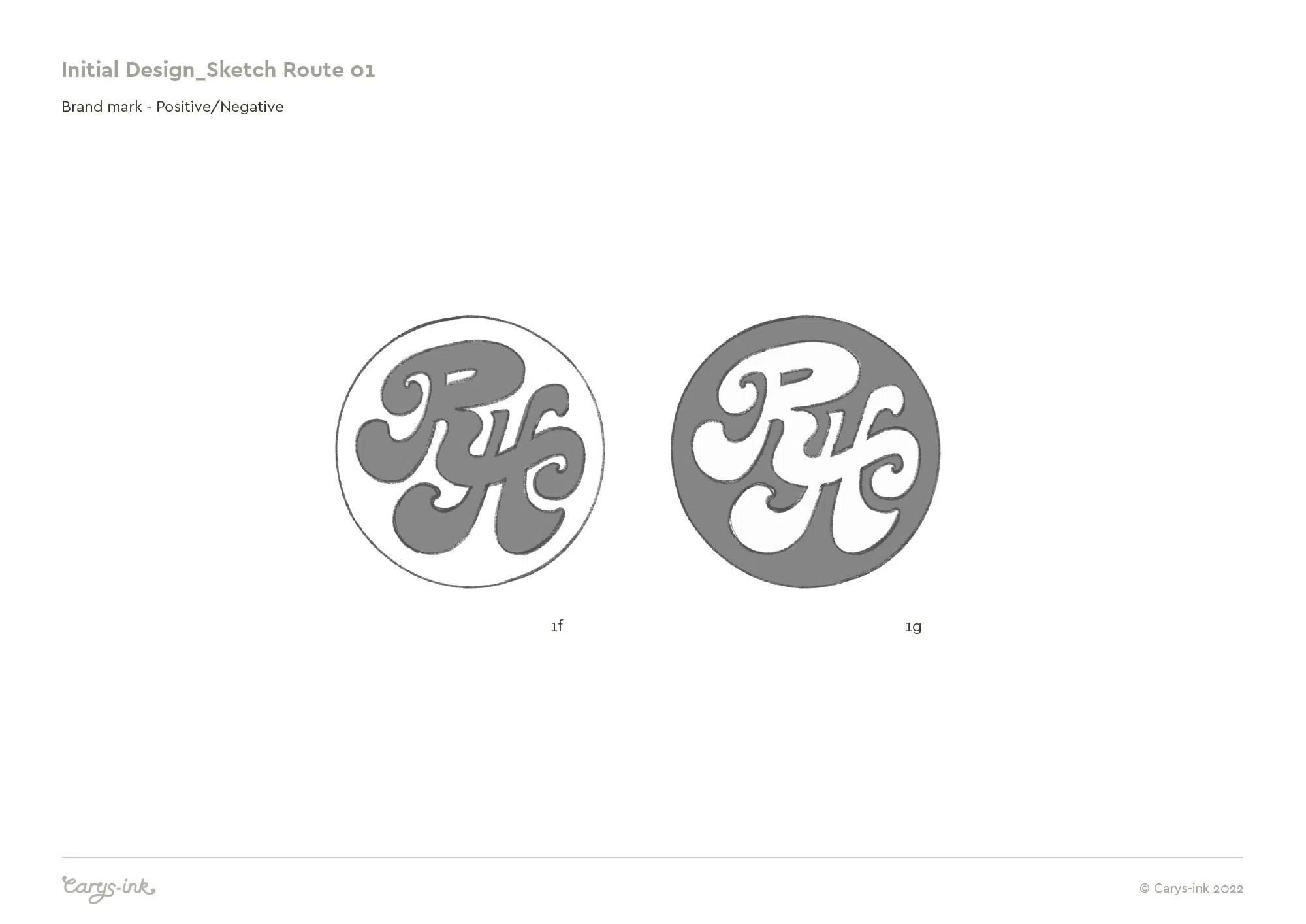
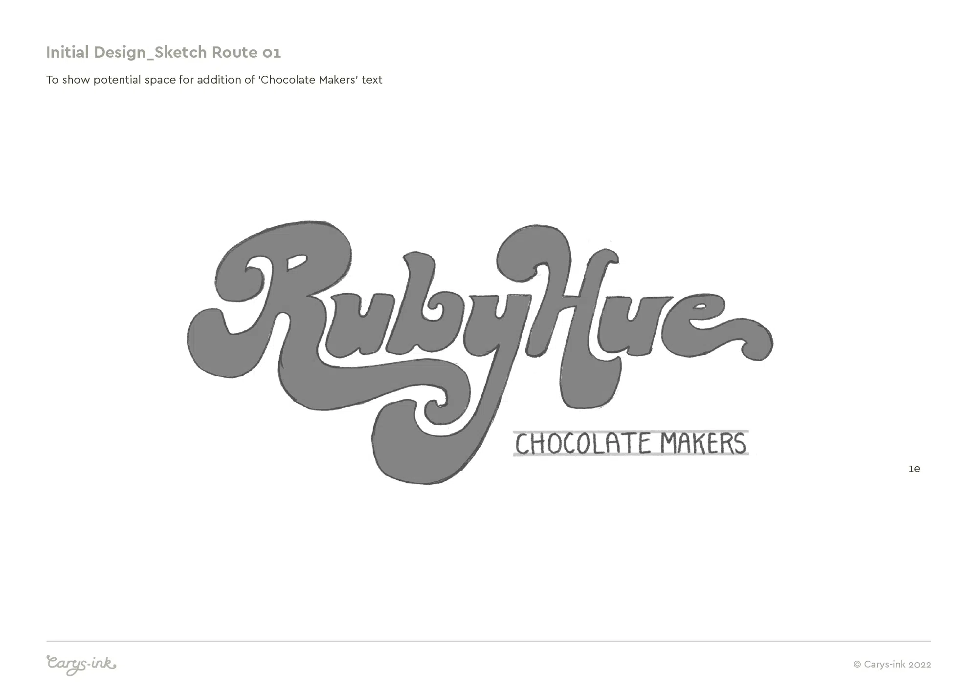
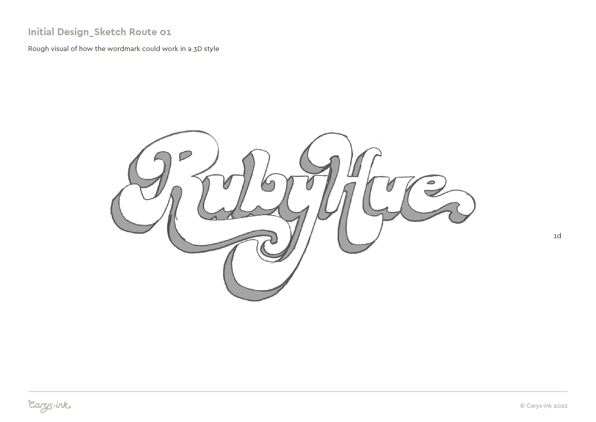
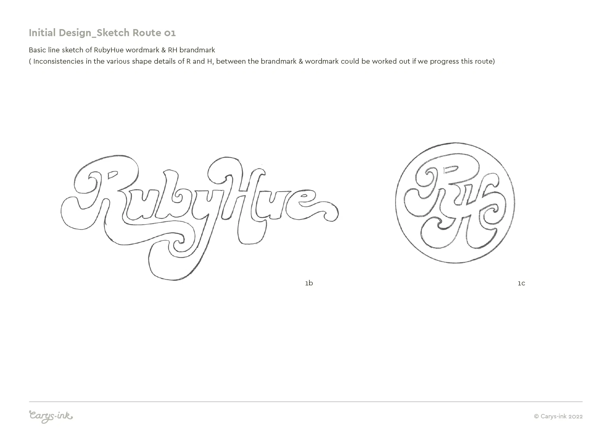
The logotype and brandmark are both based on my original hand-drawn versions of the lettering, with inspiration from retro-style typography and the flow of swirly, molten chocolate inspiring the letterforms.
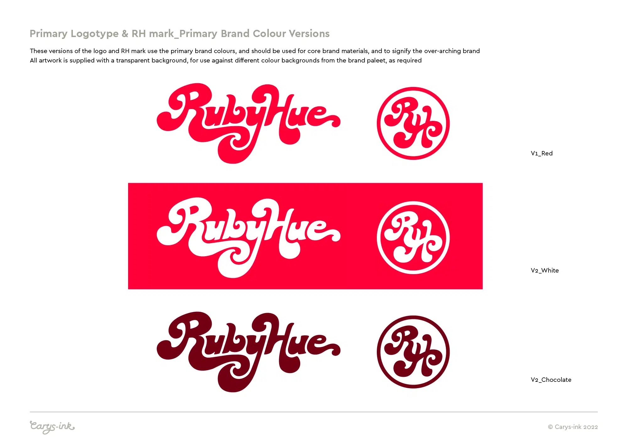
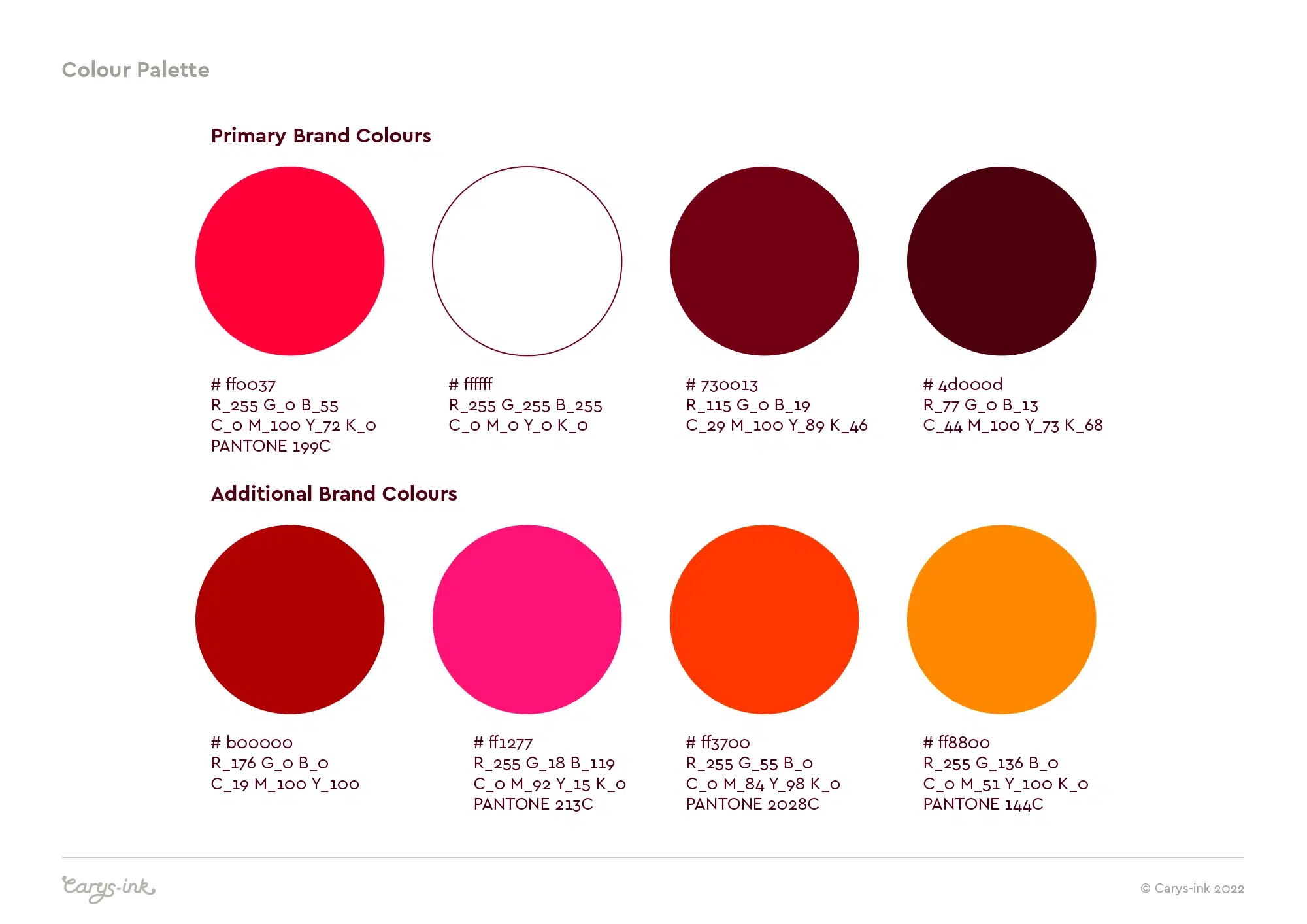
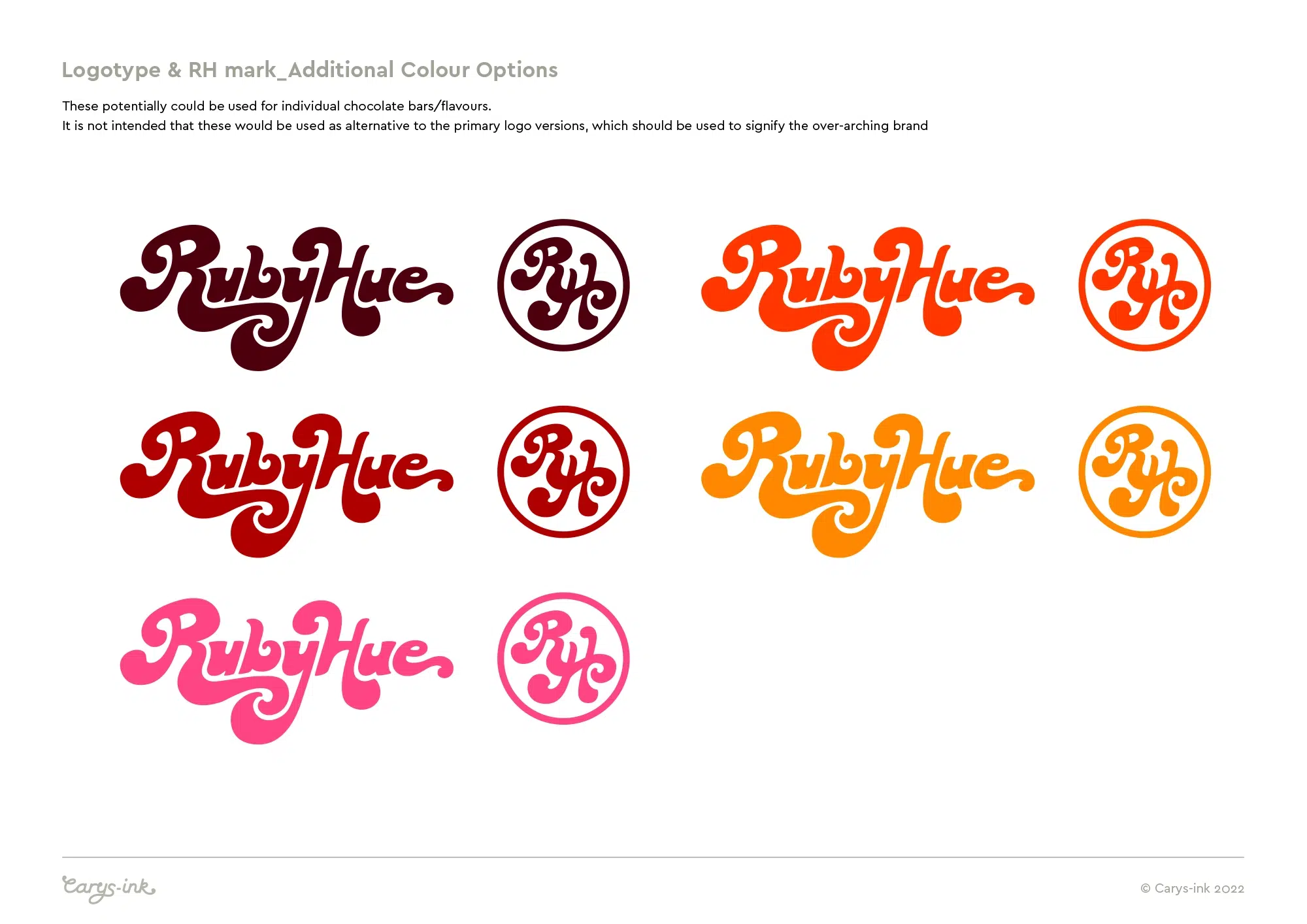
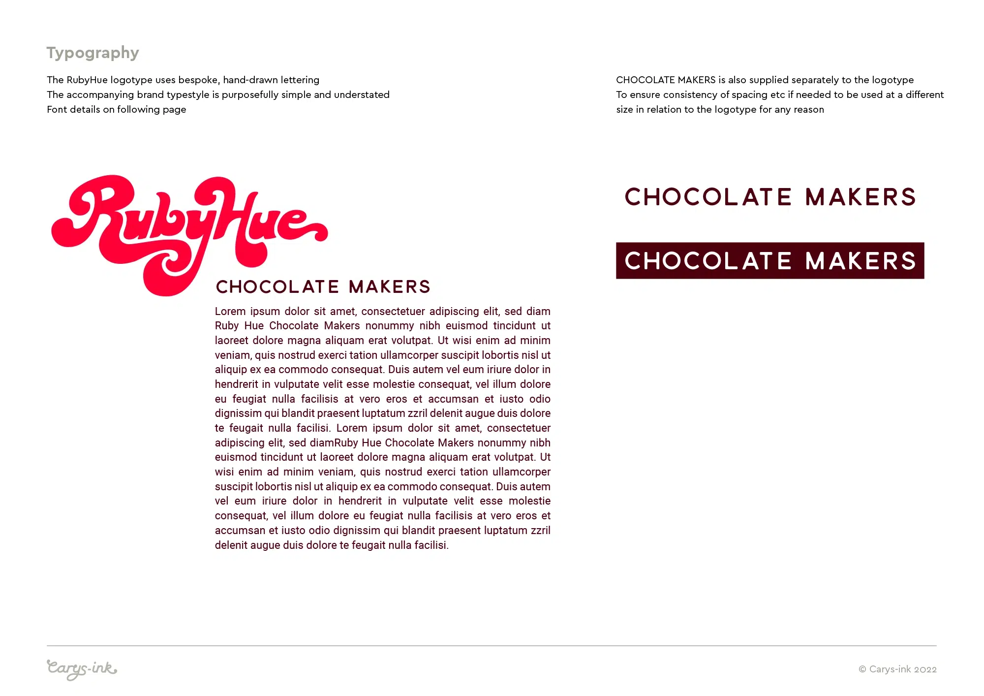
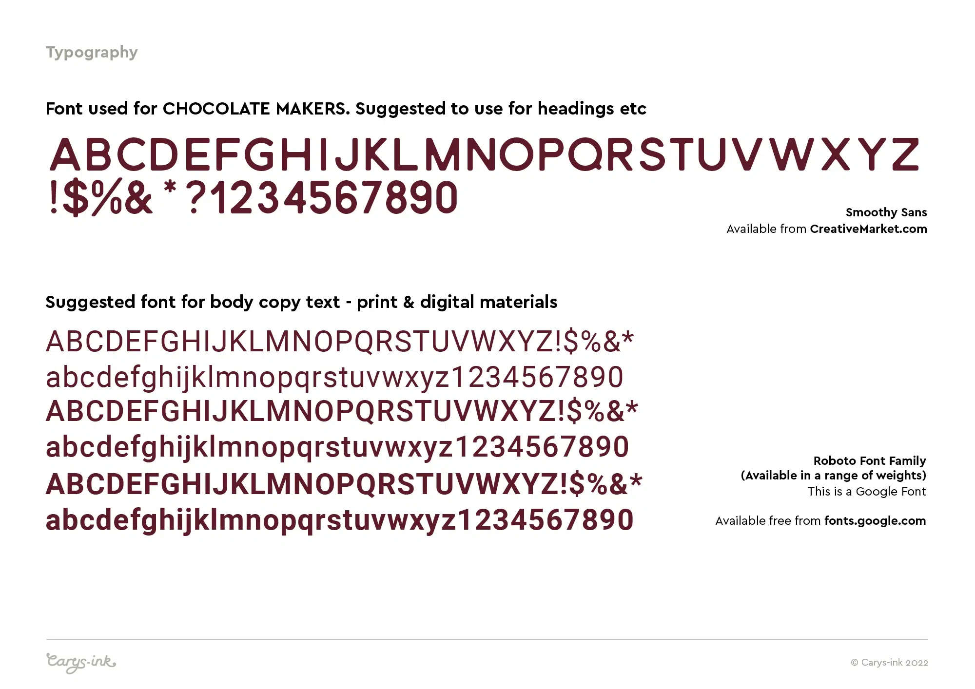
Below: Pages from the brand delivery guide.
Ruby red, white and chocolate are the primary brand colours, but additional colours have been included as part of the brand, to provide scope for flexibility in the product packaging – to denote different origins of chocolate, %age Cocoa and flavours. Colours can be applied with a ‘ mix’n’match’ approach, as appropriate, and the client has further developed this through the use of patterns alongside the logo, which can be seen in their current chocolate-based product range.
The experience was effortless. Carys is clearly very experienced and interpreted our wishes so well. She gave us options so we could have the opportunity to see a few ideas and how they may work… the finished designs are perfect. Ru and I often say to people that the logo(s) are the only thing we have never thought of changing!